Graphics with base R
Summarising your data, either numerically or graphically, is an important (if often overlooked) component of any data analysis. Fortunately, R has excellent graphics capabilities and can be used whether you want to produce plots for initial data exploration, model validation or highly complex publication quality figures. There are three main systems for producing graphics in R; base R graphics, lattice graphics and ggplot2. Each of these systems have their strengths and weaknesses and we often use them interchangeably. In this Chapter we’ll focus mostly on base R graphics with a sprinkling of lattice graphics for added variety. In the next chapter we’ll introduce you to the ggplot2 package.
The base R graphics system is the original plotting system that’s been around (and has evolved) since the first days of R. When creating plots with base R we tend to use high level functions (like the plot() function) to first create our plot and then use one or more low level functions (like lines() and text() etc) to add additional information to these plots. This can seem a little weird (and time consuming) when you first start creating fancy plots in R, but it does allow you to customise almost every aspect of your plot and build complexity up in layers. The flip side to this flexibility is that you’ll often need to make many decisions about how you want your plot to look rather than rely on the software to make these decisions for you. Having said that, it’s generally very quick and easy to generate simple exploratory plots with base R graphics.
The lattice system is implemented in the lattice() package that comes pre-installed with the standard installation of R. However, it won’t be loaded by default so you’ll first need to use library(lattice) to access all the plotting functions. Unlike base R graphics, lattice plots are mostly generated all in one go using a single function so there’s no need to use high and low level plotting functions to customise the look of a plot. This can be a real advantage as things like margin sizes and plot spacing are adjusted automatically. Lattice plots also make a few more decisions for you about how the plots will look but this comes with a slight cost as customising lattice plots to get them to look exactly how you want can become quite involved. Where lattice plots really shine is plotting complex multi-dimensional data using panel plots (also called trellis plots). We’ll see a couple of examples of these types of plots later in the Chapter.
Getting started
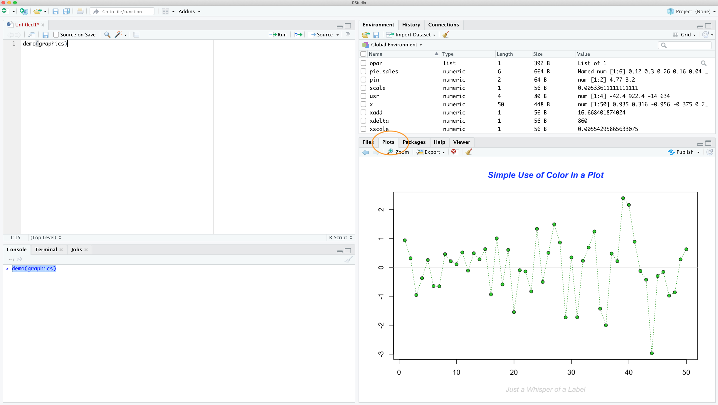
When you create a plot in RStudio the plot will be displayed in the ‘Plots’ tab by default which is usually located in the bottom right pane in RStudio.
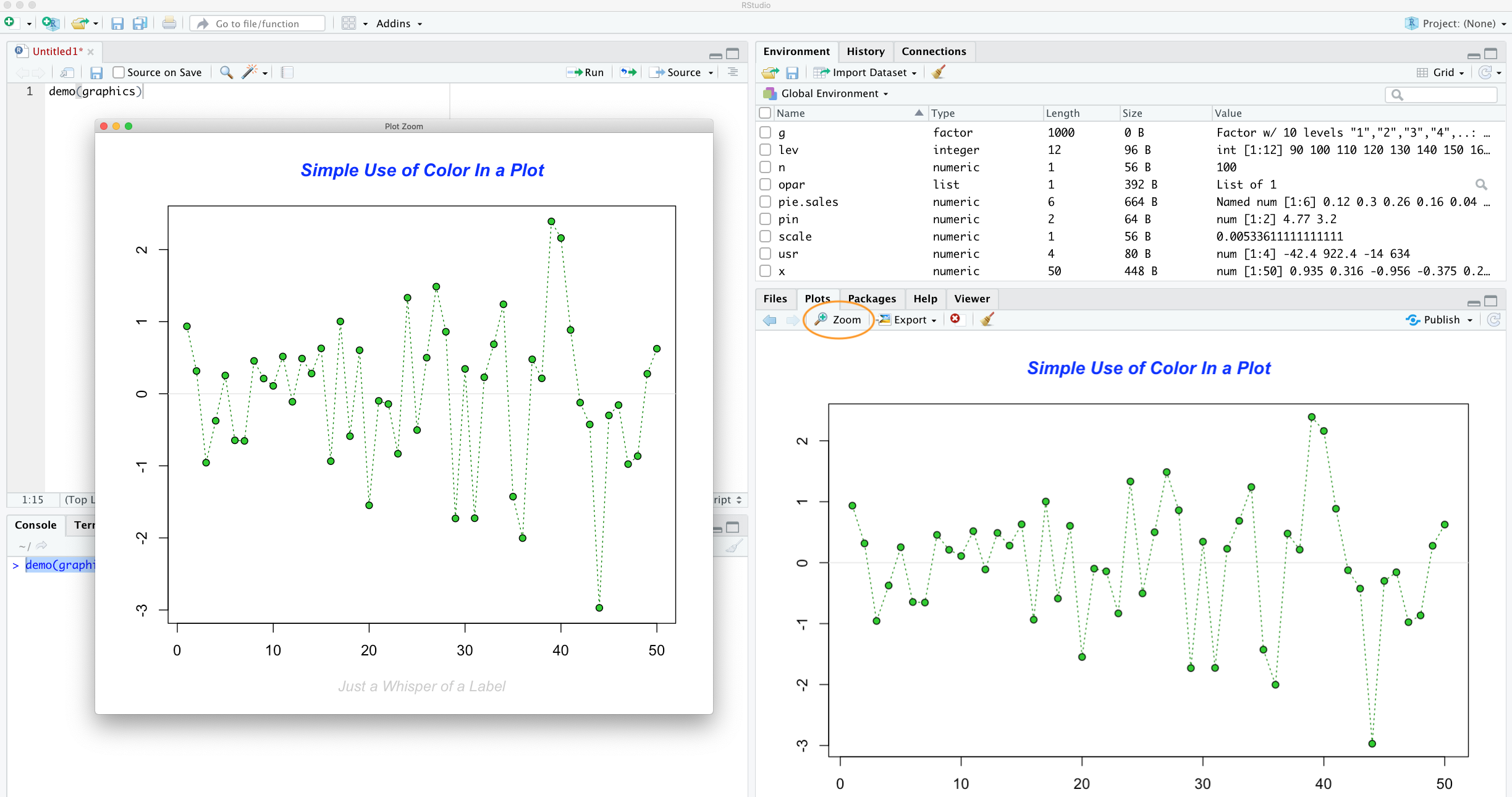
You can zoom in on a plot by clicking the ‘Zoom’ button which will display your plot in a separate window. This can be really useful if you have a particularly large or complex plot (we’ve noticed that RStudio sometimes fails to display a plot if it’s ‘big’). You can also scroll through plots you’ve previously created by clicking on one of the ‘arrow’ buttons.
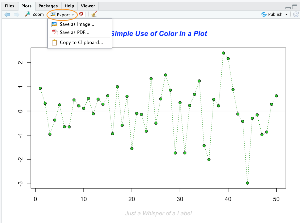
Plots can also be saved in a variety of formats (pdf, png, tiff, jpeg etc) by clicking on the ‘Export’ button and selecting your desired format. You can also redirect your plots to an external file using R code which we’ll cover later in this Chapter.
Simple base R plots
There are many functions in R to produce plots ranging from the very basic to the highly complex. It’s impossible to cover every aspect of producing graphics in R in this introductory book so we’ll introduce you to most of the common methods of graphing data and describe how to customise your graphs later on in this Chapter.
Scatterplots
The most common high level function used to produce plots in R is (rather unsurprisingly) the plot() function. For example, let’s plot the weight of petunia plants from our flowers data frame which we imported in data chapter.
flowers <- read.table(file = 'data/flower.txt',
                        header = TRUE, sep = "\t",
                        stringsAsFactors = TRUE)

plot(flowers$weight)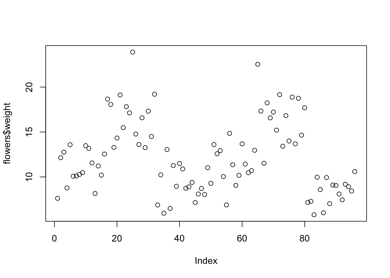
R has plotted the values of weight (on the y axis) against an index since we are only plotting one variable to plot. The index is just the order of the weight values in the data frame (1 first in the data frame and 97 last). The weight variable name has been automatically included as a y axis label and the axes scales have been automatically set.
If we’d only included the variable weight rather than flowers$weight, the plot() function will display an error as the variable weight only exists in the flowers data frame object.
plot(weight)
Error in plot(weight) : object 'weight' not found
As many of the base R plotting functions don’t have a data = argument to specify the data frame name directly we can use the with() function in combination with plot() as a shortcut.
with(flowers, plot(weight)) To plot a scatterplot of one numeric variable against another numeric variable we just need to include both variables as arguments when using the plot() function. For example to plot shootarea on the y axis and weight of the x axis.
plot(x = flowers$weight, y = flowers$shootarea)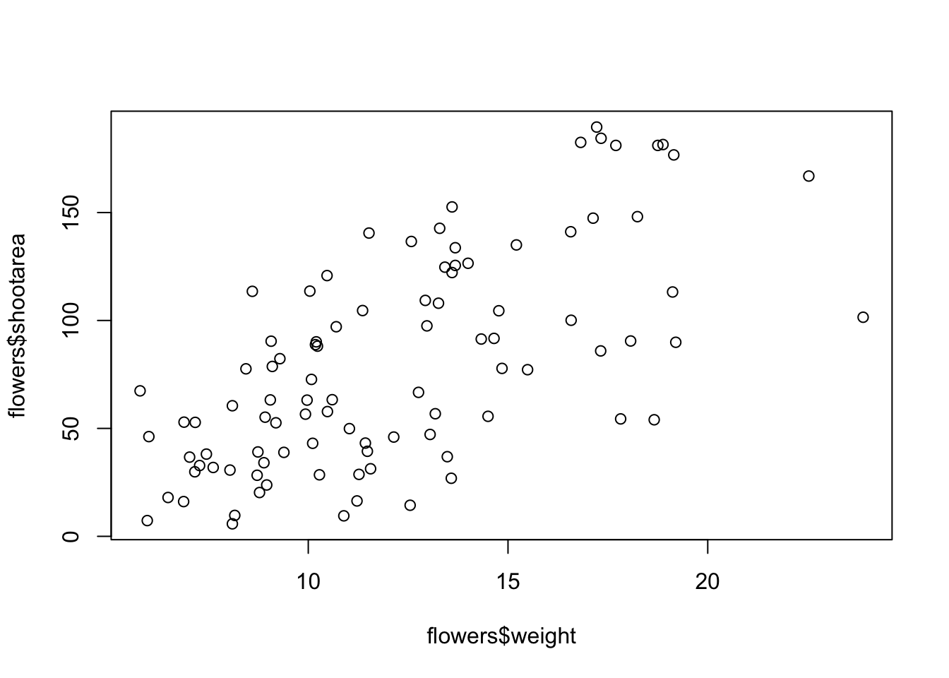
There is an equivalent approach for these types of plots which often causes some confusion at first. You can also use the formula notation when using the plot() function. However, in contrast to the previous method the formula method requires you to specify the y axis variable first, then a ~ and then our x axis variable.
plot(flowers$shootarea ~ flowers$weight)
Both of these two approaches are equivalent so we suggest that you just choose the one you prefer and go with it.
You can also specify the type of graph you wish to plot using the argument type =. You can plot just the points (type = "p", this is the default), just lines (type = "l"), both points and lines connected (type = "b"), both points and lines with the lines running through the points (type = "o") and empty points joined by lines (type = "c"). For example, let’s use our skills from previous chapter to generate two vectors of numbers (my_x and my_y) and then plot one against the other using different type = values to see what type of plots are produced. Don’t worry about the par(mfrow = c(2, 2)) line of code yet. We’re just using this to split the plotting device so we can fit all four plots on the same device to save some space. See later in the Chapter for more details about this. The top left plot is type = "l", the top right type = "b", bottom left type = "o" and bottom right is type = "c".
my_x <- 1:10
my_y <- seq(from = 1, to = 20, by = 2)

par(mfrow = c(2, 2))
plot(my_x, my_y, type = "l")
plot(my_x, my_y, type = "b")
plot(my_x, my_y, type = "o")
plot(my_x, my_y, type = "c")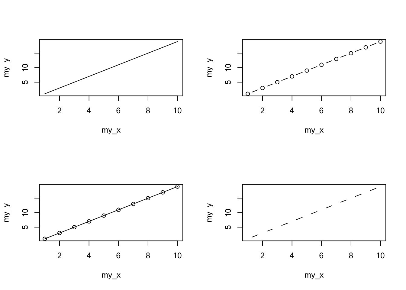
Play around: Try to create four more plots by using type = 'p', type = 'h', type = 's', and type = 'n' arguments in plot() function.
Admittedly the plots we’ve produced so far don’t look anything particularly special. However, the plot() function is incredibly versatile and can generate a large range of plots which you can customise to your own taste. We’ll cover how to customise plots later in the Chapter. As a quick aside, the plot() function is also what’s known as a generic function which means it can change its default behaviour depending on the type of object used as an argument. You will see an example of this in regression where we use the plot() function to generate diagnostic plots of residuals from a linear model object (bet you can’t wait!).
Histograms
Frequency histograms are useful when you want to get an idea about the distribution of values in a numeric variable. The hist() function takes a numeric vector as its main argument. Let’s generate a histogram of the height values.
hist(flowers$height)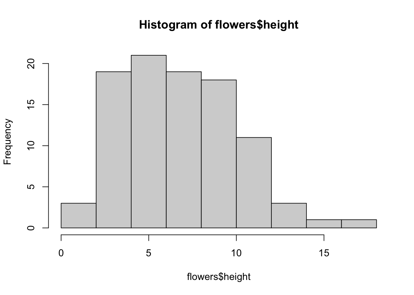
The hist() function automatically creates the breakpoints (or bins) in the histogram using the [Sturges][sturges] formula unless you specify otherwise by using the break = argument. For example, let’s say we want to plot our histogram with breakpoints every 1 cm flower height. We first generate a sequence from zero to the maximum value of height (18 rounded up) in steps of 1 using the seq() function. We can then use this sequence with the breaks = argument. While we’re at it, let’s also replace the ugly title for something a little better using the main = argument
brk <- seq(from = 0, to = 18, by = 1)
hist(flowers$height, breaks = brk, main = "petunia height")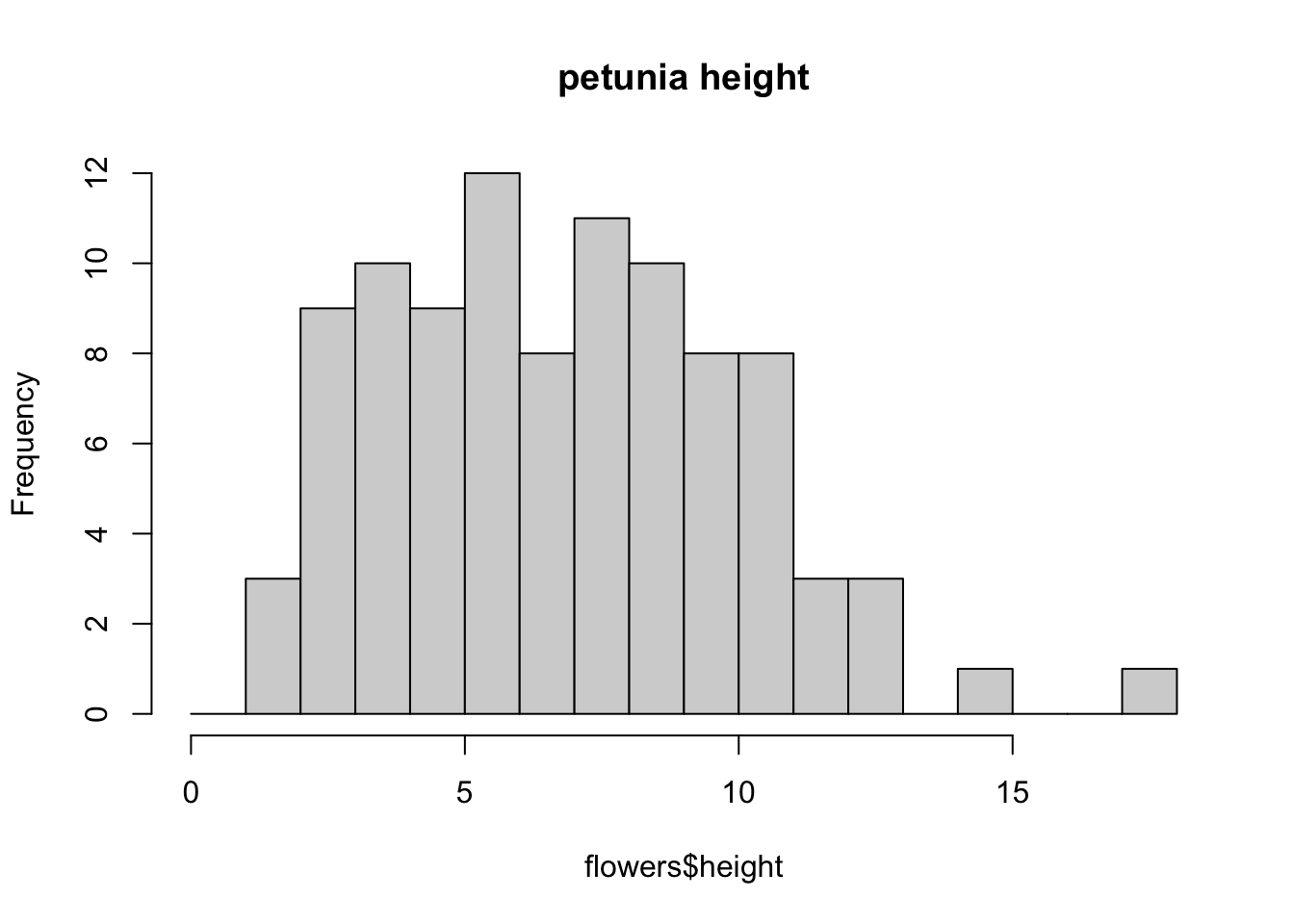
You can also display the histogram as a proportion rather than a frequency by using the freq = FALSE argument.
brk <- seq(from = 0, to = 18, by = 1)
hist(flowers$height, breaks = brk, main = "petunia height",
      freq = FALSE)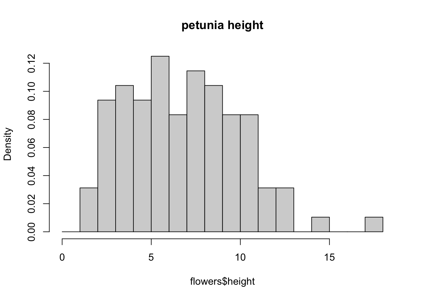
An alternative to plotting just a straight up histogram is to add a [kernel density][kernel-dens] curve to the plot. You can superimpose a density curve onto the histogram by first using the density() function to compute the kernel density estimates and then use the low level function lines() to add these estimates onto the plot as a line.
dens <- density(flowers$height)
hist(flowers$height, breaks = brk, main = "petunia height",
      freq = FALSE)
lines(dens)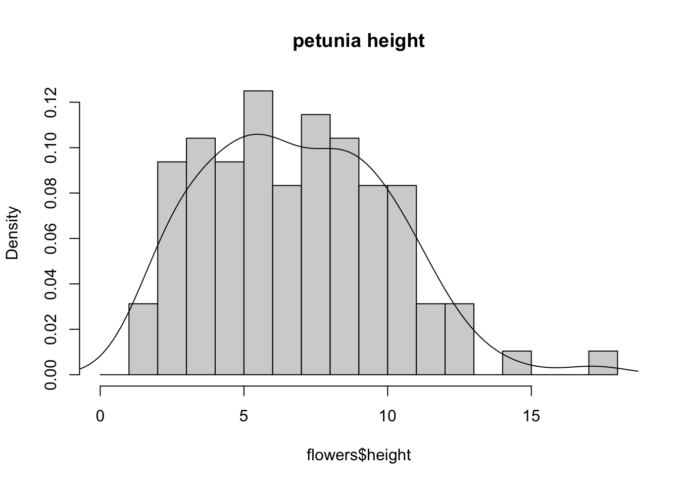
Box and violin plots
OK, we’ll just come and out and say it, we love boxplots and their close relation the violin plot. Boxplots (or box-and-whisker plots to give them their full name) are very useful when you want to graphically summarise the distribution of a variable, identify potential unusual values and compare distributions between different groups. The reason we love them is their ease of interpretation, transparency and relatively high data-to-ink ratio (i.e. they convey lots of information efficiently). We suggest that you try to use boxplots as much as possible when exploring your data and avoid the temptation to use the more ubiquitous bar plot (even with standard error or 95% confidence intervals bars). The problem with bar plots (aka dynamite plots) is that they hide important information from the reader such as the distribution of the data and assume that the error bars (or confidence intervals) are symmetric around the mean. Of course, it’s up to you what you do but if you’re tempted to use bar plots just Google ‘dynamite plots are evil’ or see [here][dynamite-plot1] or [here][dynamite-plot2] for a fuller discussion.
To create a boxplot in R we use the boxplot() function. For example, let’s create a boxplot of the variable weight from our flowers data frame. We can also include a y axis label using the ylab = argument.
boxplot(flowers$weight, ylab = "weight (g)")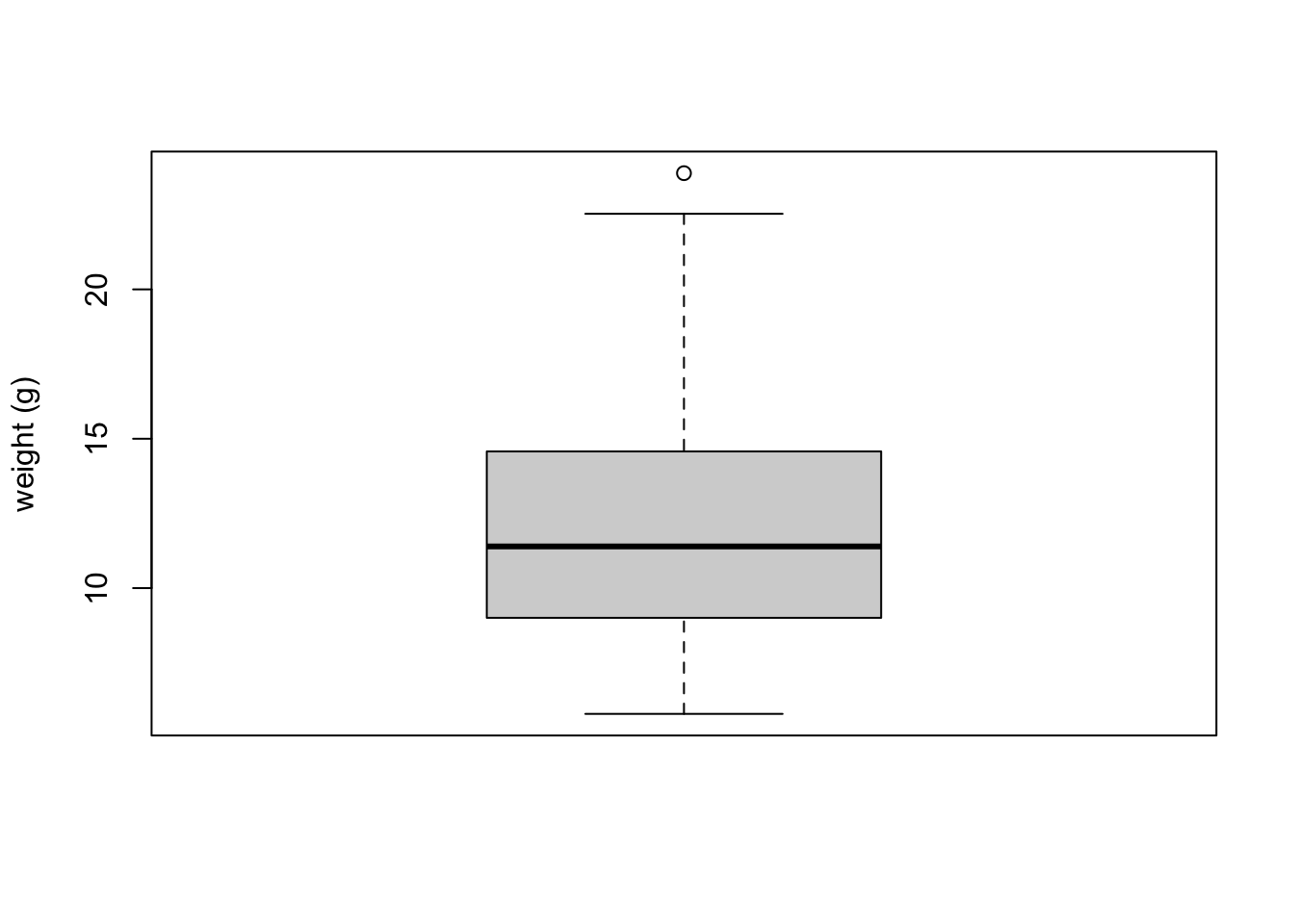
The thick horizontal line in the middle of the box is the median value of weight (around 11 g). The upper line of the box is the upper quartile (75th percentile) and the lower line is the lower quartile (25th percentile). The distance between the upper and lower quartiles is known as the inter quartile range and represents the values of weight for 50% of the data. The dotted vertical lines are called the whiskers and their length is determined as 1.5 x the inter quartile range. Data points that are plotted outside the the whiskers represent potential unusual observations. This doesn’t mean they are unusual, just that they warrant a closer look. We recommend using boxplots in combination with Cleveland dotplots to identify potential unusual observations (see the next section of this Chapter for more details). The neat thing about boxplots is that they not only provide a measure of central tendency (the median value) they also give you an idea about the distribution of the data. If the median line is more or less in the middle of the box (between the upper and lower quartiles) and the whiskers are more or less the same length then you can be reasonably sure the distribution of your data is symmetrical.
If we want examine how the distribution of a variable changes between different levels of a factor we need to use the formula notation with the boxplot() function. For example, let’s plot our weight variable again, but this time see how this changes with each level of nitrogen. When we use the formula notation with boxplot() we can use the data = argument to save some typing. We’ll also introduce an x axis label using the xlab = argument.
boxplot(weight ~ nitrogen, data = flowers,
         ylab = "weight (g)", xlab = "nitrogen level")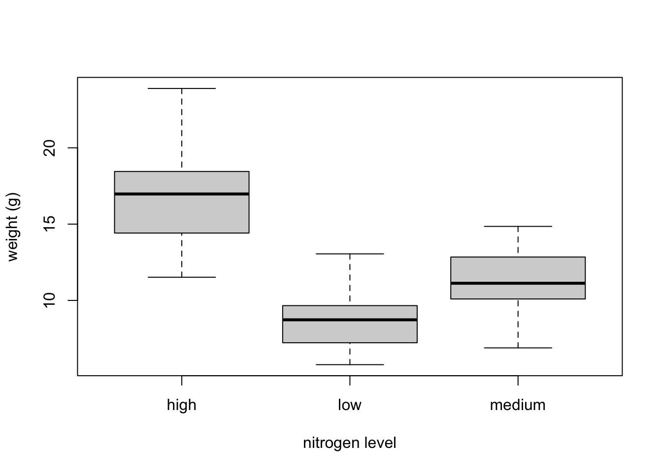
The factor levels are plotted in the same order defined by our factor variable nitrogen (often alphabetically). To change the order we need to change the order of our levels of the nitrogen factor in our data frame using the factor() function and then re-plot the graph. Let’s plot our boxplot with our factor levels going from low to high.
flowers$nitrogen <- factor(flowers$nitrogen,
                            levels = c("low", "medium", "high"))
boxplot(weight ~ nitrogen, data = flowers,
          ylab = "weight (g)", xlab = "nitrogen level")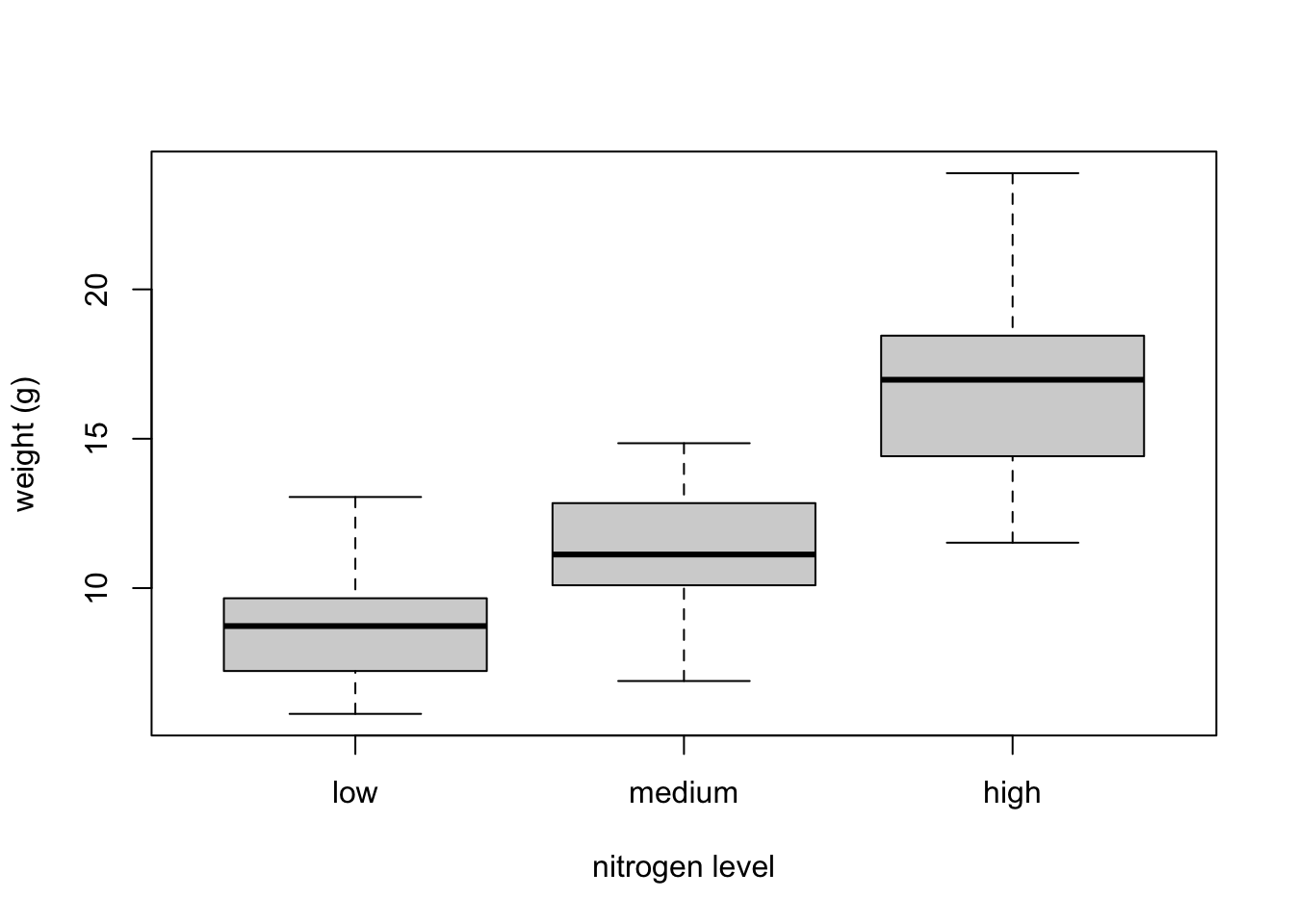
We can also group our variables by two factors in the same plot. Let’s plot our weight variable but this time plot a separate box for each nitrogen and treatment (treat) combination.
boxplot(weight ~ nitrogen * treat, data = flowers,
         ylab = "weight (g)", xlab = "nitrogen level")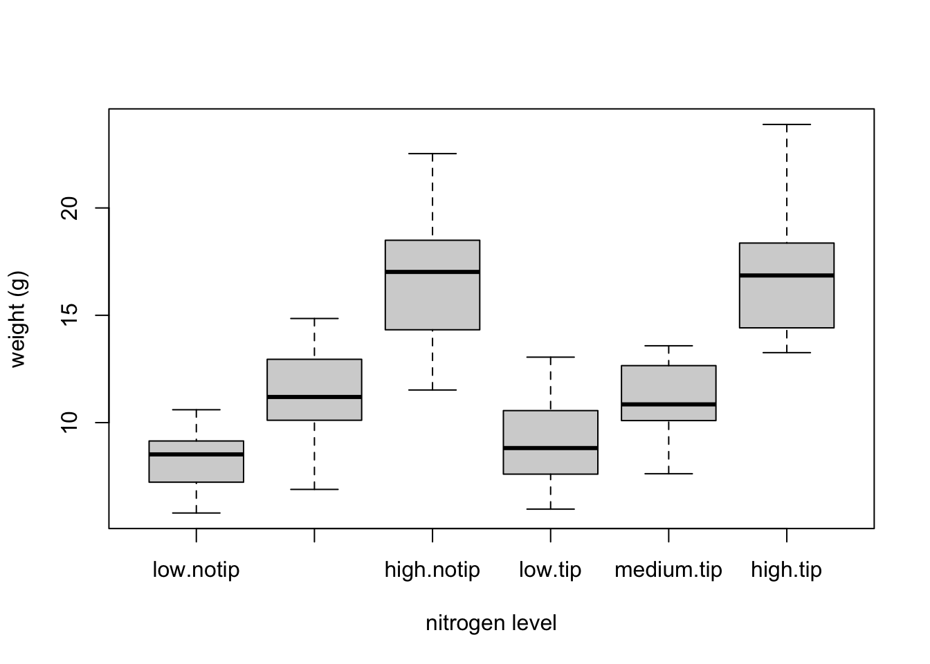
This plot looks OK, but some of the group labels are hidden as they’re too long to fit on the plot. There are a couple of ways to deal with this. Perhaps the easiest is to reduce the font size of the tick mark labels in the plot so they all fit using the cex.axis = argument. Let’s set the font size to be 30% smaller than the default with cex.axis = 0.7. We’ll show you how to further customise plots later on in the Chapter.
boxplot(weight ~ nitrogen * treat, data = flowers,
         ylab = "weight (g)", xlab = "nitrogen level",
         cex.axis = 0.7)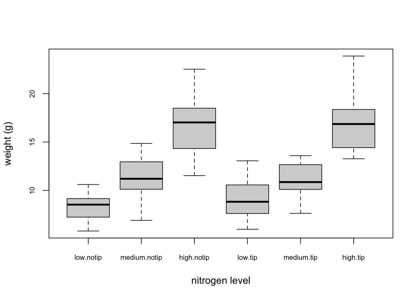
Violin plots are like a combination of a boxplot and a kernel density plot (you saw an example of a kernel density plot in the histogram section above) all rolled into one figure. We can create a violin plot in R using the vioplot() function from the vioplot package. You’ll need to first install this package using install.packages('vioplot') function as usual. The nice thing about the vioplot() function is that you use it in pretty much the same way you would use the boxplot() function. We’ll also use the argument col = "lightblue" to change the fill colour to light blue.
library(vioplot)
vioplot(weight ~ nitrogen, data = flowers,
         ylab = "weight (g)", xlab = "nitrogen level",
         col = "lightblue")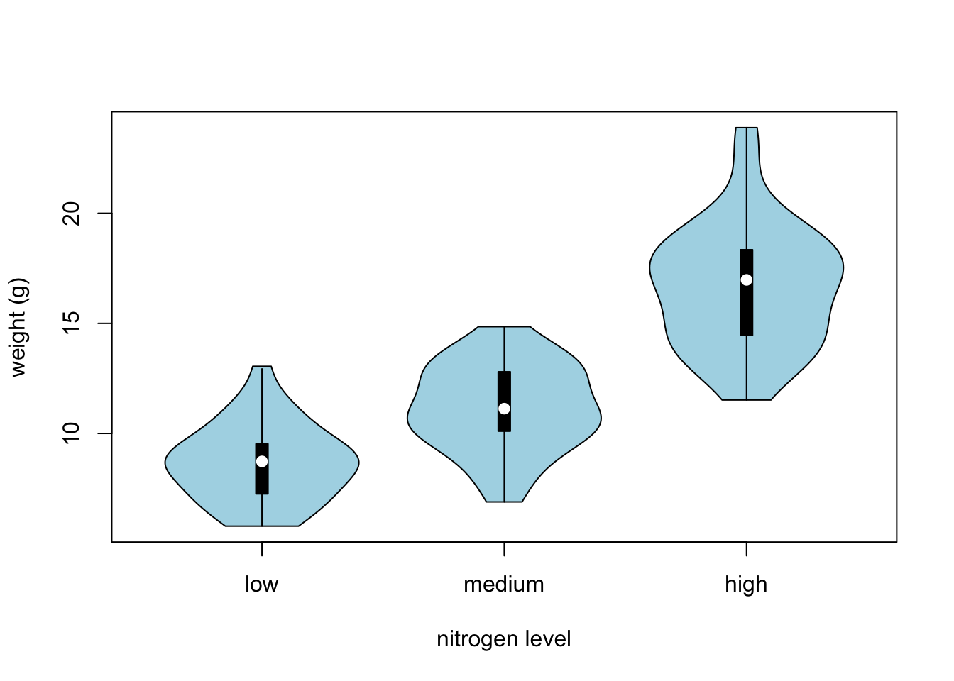
In the violin plot above we have our familiar boxplot for each nitrogen level but this time the median value is represented by a white circle. Plotted around each boxplot is the kernel density plot which represents the distribution of the data for each nitrogen level.
Dot charts
Identifying unusual observations (aka outliers) in numeric variables is extremely important as they may influence parameter estimates in your statistical model or indicate an error in your data. A really useful (if undervalued) plot to help identify outliers is the Cleveland dotplot. You can produce a dotplot in R very simply by using the dotchart() function.
dotchart(flowers$height)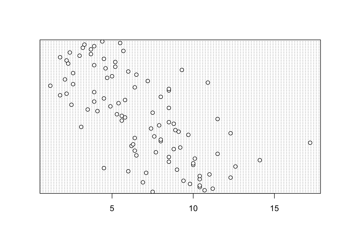
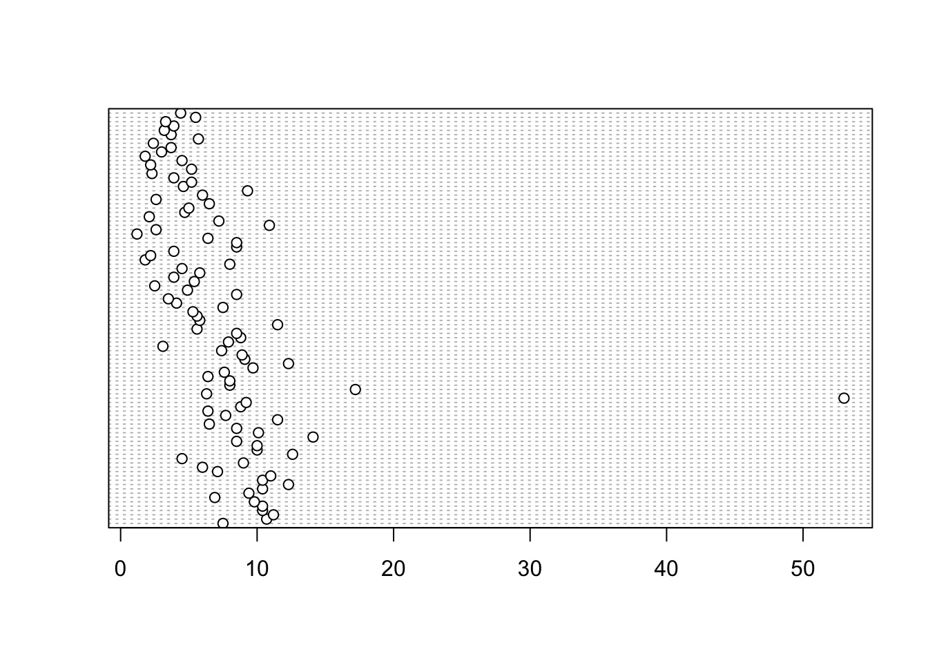
In the dotplot above the data from the height variable is plotted along the x axis and the data is plotted in the order it occurs in the flowers data frame on the y axis (values near the top of the y axis occur later in the data frame with those lower down occurring at the beginning of the data frame). In this plot we have a single value extending to the right at about 17 cm but it doesn’t appear particularly large compared to the rest. An example of a dotplot with an unusual observation is given below.
We can also group the values in our height variable by a factor variable such as nitrogen using the groups = argument. This is useful for identifying unusual observations within a factor level that might be obscured when looking at all the data together.
dotchart(flowers$height, groups = flowers$nitrogen)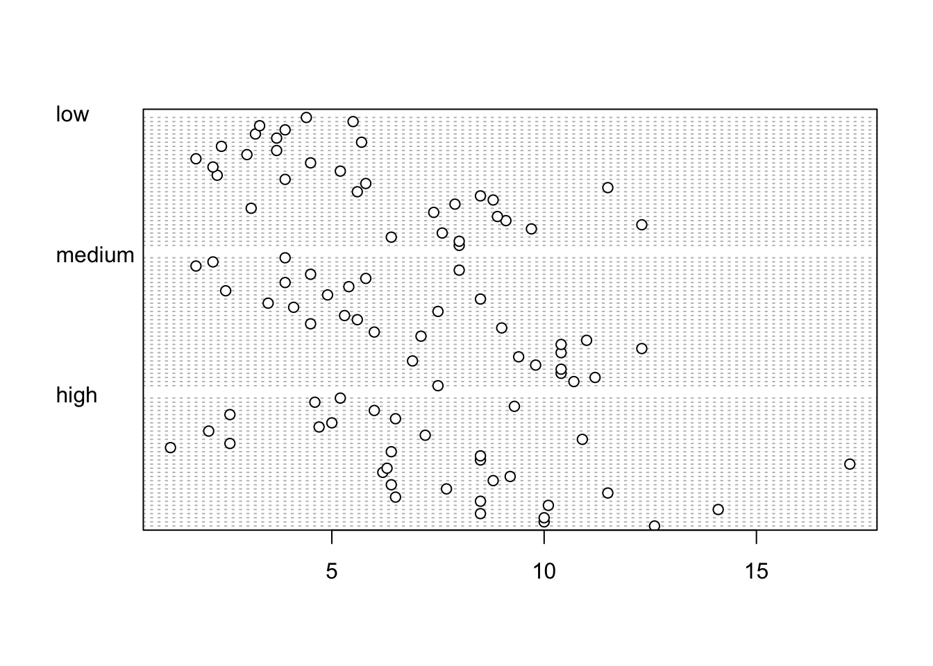
Pairs plots
Previously in this Chapter we used the plot() function to create a scatterplot to explore the relationship between two numeric variables. With datasets that contain many numeric variables, it’s often handy to create multiple scatterplots to visualise relationships between all these variables. We could use the plot() function to create each of these plot individually, but a much easier way is to use the pairs() function. The pairs() function creates a multi-panel scatterplot (sometimes called a scatterplot matrix) which plots all combinations of variables. Let’s create a multi-panel scatterplot of all of the numeric variables in our flowers data frame. Note, you may need to click on the ‘Zoom’ button in RStudio to display the plot clearly.
pairs(flowers[, c("height", "weight", "leafarea",
                "shootarea", "flowers")])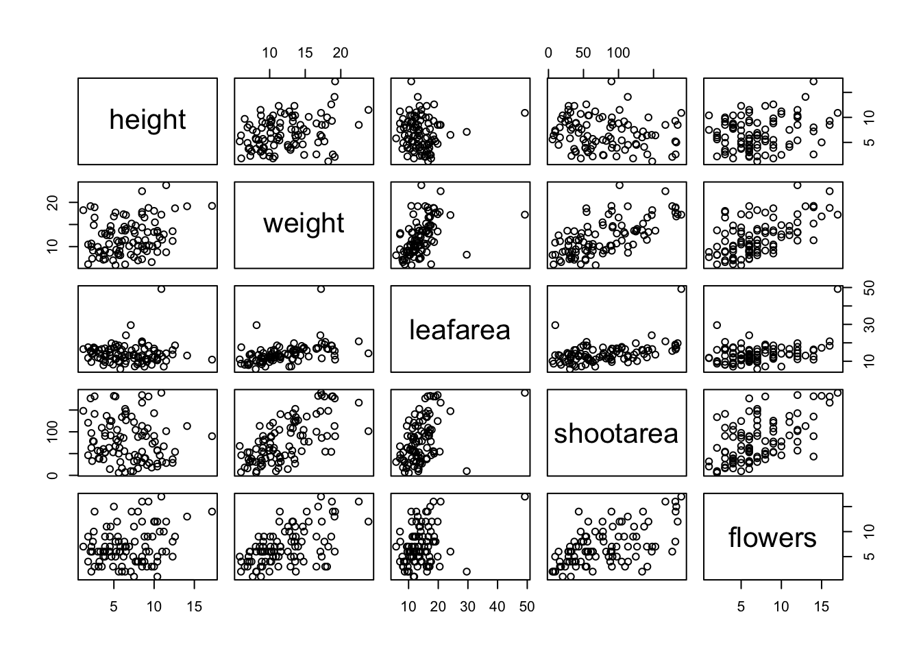
# or we could use the equivalent
# pairs(flowers[, 4:8])
Interpretation of the pairs plot takes a bit of getting used to. The panels on the diagonal give the variable names. The first row of plots displays the height variable on the y axis and the variables weight, leafarea, shootarea and flowers on the x axis for each of the four plots respectively. The next row of plots have weight on the y axis and height, leafarea, shootarea and flowers on the x axis. We interpret the rest of the rows in the same way with the last row displaying the flowers variable on the y axis and the other variables on the x axis. Hopefully you’ll notice that the plots below the diagonal are the same plots as those above the diagonal just with the axis reversed.
We can also add additional information to each of our plots by including a panel function when we use the pairs() function. For example, to add a [LOWESS][lowess] (locally weighted scatterplot smoothing) smoother to each of the panels we just need to add the argument panel = panel.smooth.
pairs(flowers[, c("height", "weight", "leafarea",
                "shootarea", "flowers")],
                 panel = panel.smooth)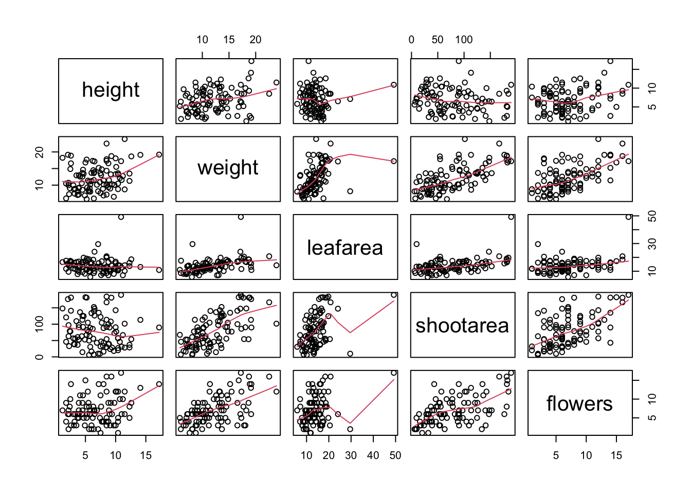
If you take a look at the help file for the pairs() function (?pairs) you’ll find a few more useful panel functions in the ‘Examples’ section. To use these functions you’ll first need to copy the code and paste it into the Console in RStudio (we go into more detail about defining functions in Programming chapter. For example, the panel.cor() function calculates the absolute correlation coefficient between two variables and adjusts the size of the displayed coefficient depending on the value (higher coefficient values are bigger). Don’t worry if you don’t understand this code just yet, for the moment we just need to know how to use it (it might be fun to try and figure it out though!).
panel.cor <- function(x, y, digits = 2, prefix = "", cex.cor, ...)
{
    usr <- par("usr")
    par(usr = c(0, 1, 0, 1))
    r <- abs(cor(x, y))
    txt <- format(c(r, 0.123456789), digits = digits)[1]
    txt <- paste0(prefix, txt)
    if(missing(cex.cor)) cex.cor <- 0.8/strwidth(txt)
    text(0.5, 0.5, txt, cex = cex.cor * r)
}
Once we’ve copied and pasted this code into the Console we can use the panel.cor() function to replace the plots below the diagonal with the correlation coefficient using the lower.panel = argument.
pairs(flowers[, c("height", "weight", "leafarea",
                "shootarea", "flowers")],
                 lower.panel = panel.cor)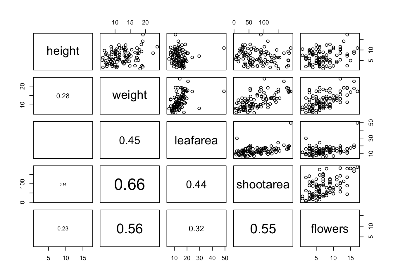
Another useful function in the ‘Examples’ section is the panel.hist() function. This function generates a histogram of each of the variables in the plot. To use it, we must again copy the code and paste it into the Console in RStudio.
panel.hist <- function(x, ...)
{
    usr <- par("usr")
    par(usr = c(usr[1:2], 0, 1.5) )
    h <- hist(x, plot = FALSE)
    breaks <- h$breaks; nB <- length(breaks)
    y <- h$counts; y <- y/max(y)
    rect(breaks[-nB], 0, breaks[-1], y, col = "cyan", ...)
}
We can then include it in our pairs() function to place the histograms on the diagonal set of panels using the diag.panel = panel.hist argument. Let’s also apply the panel.smooth() function to the plots above the diagonal while we’re at it using the upper.panel = panel.smooth argument.
pairs(flowers[, c("height", "weight", "leafarea",
                "shootarea", "flowers")],
                 lower.panel = panel.cor,
                 diag.panel = panel.hist,
                 upper.panel = panel.smooth)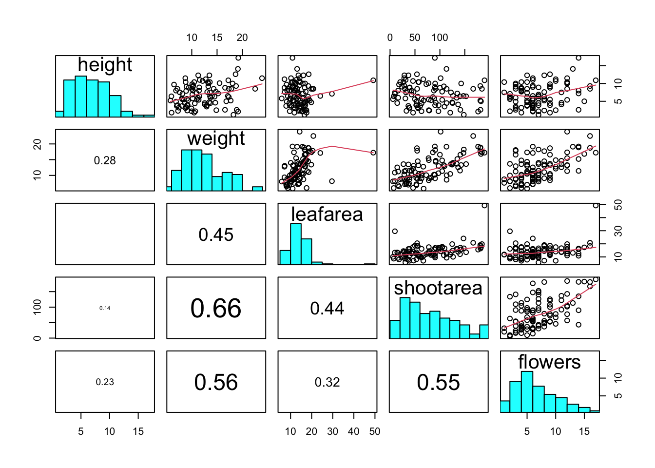
Coplots
When examining the relationship between two numeric variables, it is often useful to be able to determine whether a third variable is obscuring or changing any relationship. A really handy plot to use in these situations is a conditioning plot (also known as conditional scatterplot plot) which we can create in R by using the coplot() function. The coplot() function plots two variables but each plot is conditioned (|) by a third variable. This third variable can be either numeric or a factor. As an example, let’s look at how the relationship between the number of flowers (flowers variable) and the weight of petunia plants changes dependent on leafarea. Note the coplot() function has a data = argument so no need to use the $ notation.
coplot(flowers ~ weight|leafarea, data = flowers)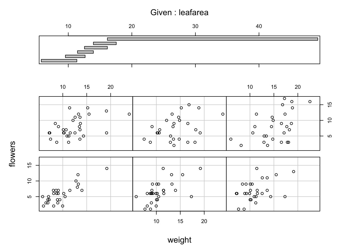
It takes a little practice to interpret coplots. The number of flowers is plotted on the y axis and the weight of plants on the x axis. The six plots show the relationship between these two variables for different ranges of leaf area. The bar plot at the top indicates the range of leaf area values for each of the plots. The panels are read from bottom left to top right along each row. For example, the bottom left panel shows the relationship between number of flowers and weight for plants with the lowest range of leaf area values (approximately 5 - 11 cm2). The top right plot shows the relationship between flowers and weight for plants with a leaf area ranging from approximately 16 - 50 cm2. Notice that the range of values for leaf area differs between panels and that the ranges overlap from panel to panel. The coplot() function does it’s best to split the data up to ensure there are an adequate number of data points in each panel. If you don’t want to produce plots with overlapping data in the panel you can set the overlap = argument to overlap = 0
coplot(flowers ~ weight|leafarea, data = flowers, overlap = 0)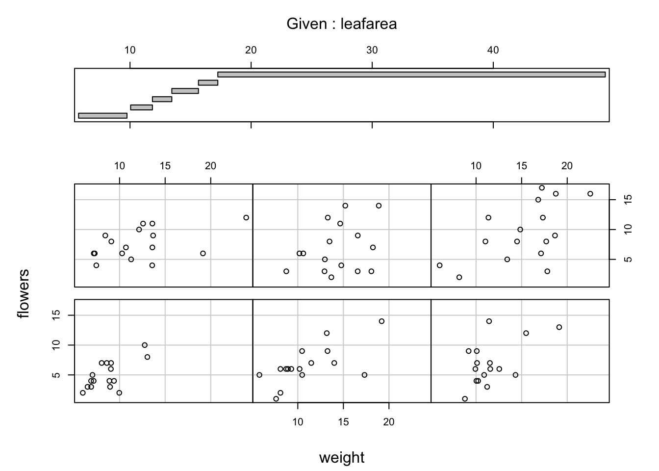
You can also use the coplot() function with factor conditioning variables. For example, we can examine the relationship between flowers and weight variables conditioned on the factor nitrogen. The bottom left plot is the relationship between flowers and weight for those plants in the low nitrogen treatment. The top left plot shows the same relationship but for plants in the high nitrogen treatment.
coplot(flowers ~ weight|nitrogen, data = flowers)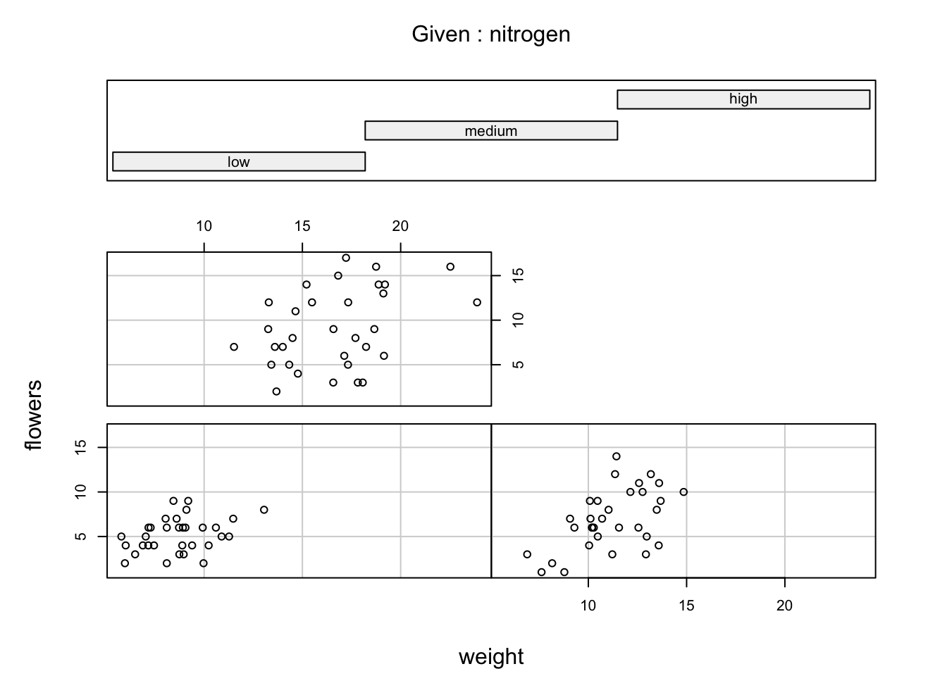
We can even use two conditioning variables (either numeric or factors). Let’s look at the relationship between flowers and height but this time condition on both nitrogen and treat.
coplot(flowers ~ weight|nitrogen * treat, data = flowers)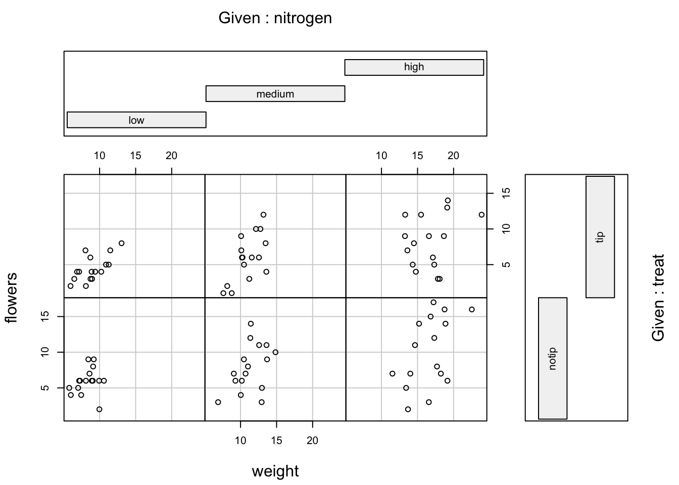
The bottom row of plots are for plants in the notip treatment and the top row for plants in the tip treatment. So the bottom left plot shows the relationship between flowers and weight for plants grown in low nitrogen with the notip treatment. The top right plot are those plants grown in high nitrogen with the tip treatment.
Similar to the pairs() function we can also apply functions to each of the panels using the panel = argument. For example, let’s add a separate line of best fit from a linear model to each of the panels. Don’t worry about the complicated looking code for now, this example is just included to give you an idea about some of the useful things you can do with base R plotting functions.
coplot(flowers ~ weight|nitrogen * treat, data = flowers,
        panel = function(x, y, ...) {
        points(x, y, ...)
        abline(lm(y ~ x), col = "blue")})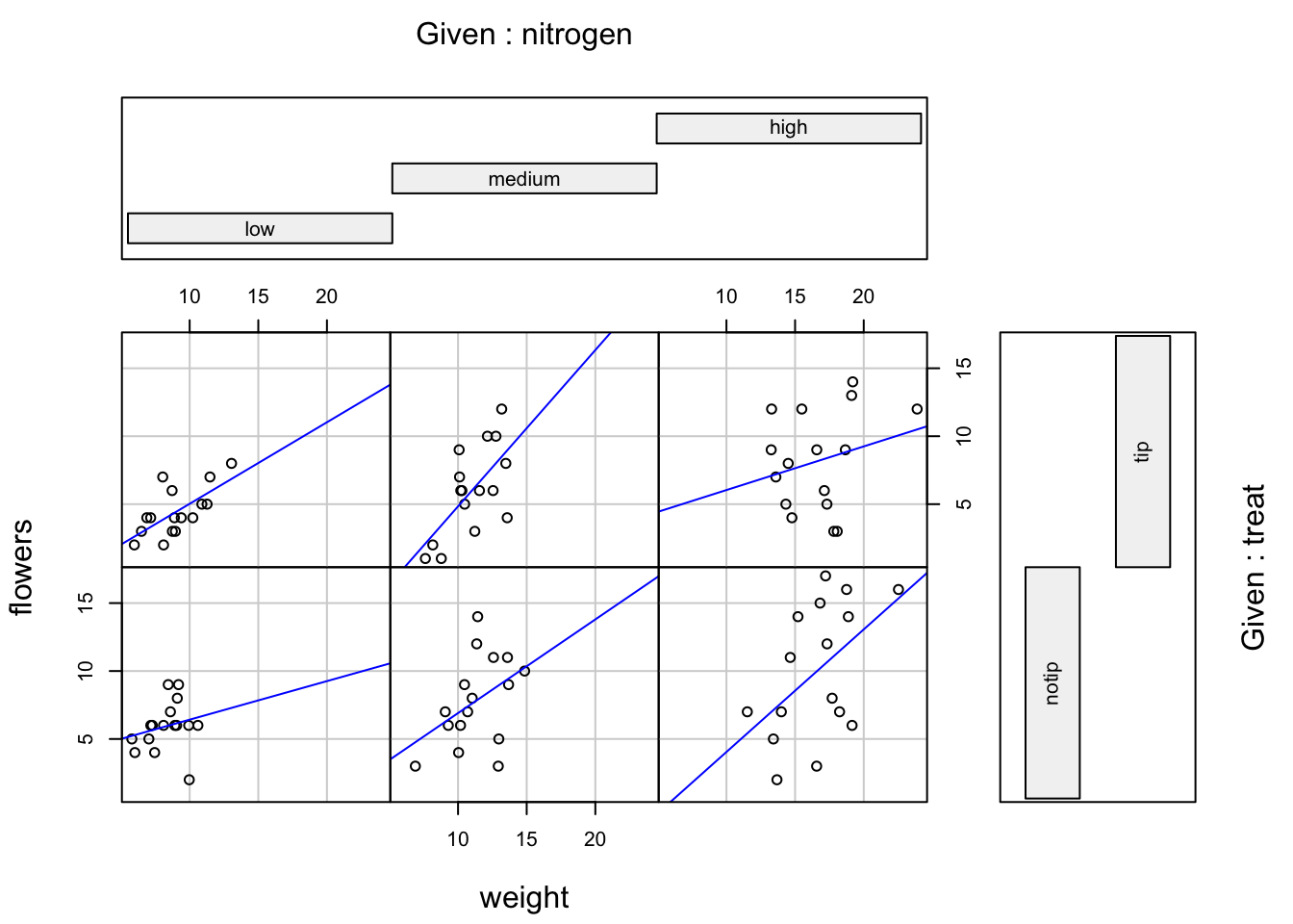
Lattice plots
Many of the plots we’ve previously created using base R graphics can also be created using functions from the lattice package. For example, we can recreate the frequency histogram of the height variable in our flowers data frame using the histogram() function. All of the plotting functions in the lattice package take the formula notation which is why we need to include ~ height as our first argument. We also need to specify that we want a frequency histogram by using the argument type = "count". Don’t forget to first make the package available using library(lattice).
library(lattice)
histogram(~ height, type = "count", data = flowers)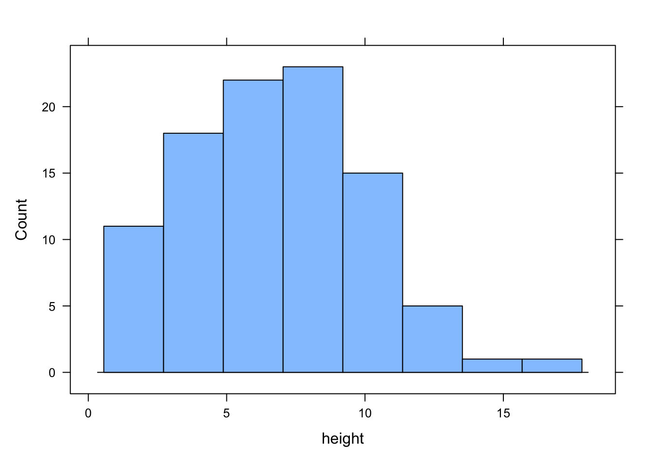
Or perhaps we would like a boxplot of our weight variable for each level of nitrogen using the bwplot() function.
bwplot(weight ~ nitrogen, data = flowers)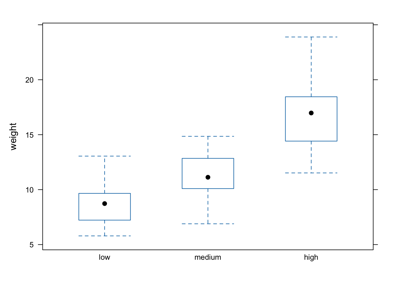
A (non-exhaustive) list of lattice functions and their base R equivalents is given in the table below.
| Graph type | lattice function | Base R function |
|---|---|---|
| scatterplot | xyplot() |
plot() |
| frequency histogram | histogram(type = "count") |
hist() |
| boxplot | bwplot() |
boxplot() |
| Cleveland dotplot | dotplot() |
dotchart() |
| scatterplot matrix | splom() |
pairs() |
| conditioning plot | xyplot(y ~ x | z) |
coplot() |
Where lattice plots really come into their own is when we want to plot graphs in multiple panels. For example, let’s plot a histogram of our height variable again but this time create a separate histogram for each nitrogen level. We do this by including the | (pipe) symbol which we read as ‘height conditional on nitrogen level’. Also notice that the axis scales are the same for each of the panels to aid comparison which is the default for lattice plots.
histogram(~ height | nitrogen, type = "count", data = flowers)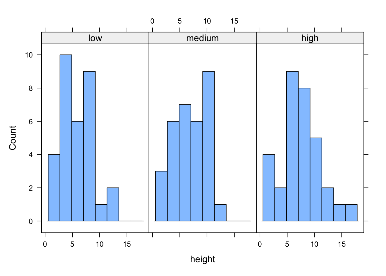
If we want to change the layout of our plots we can use the layout = argument. Perhaps we prefer all of the graphs to be stacked one on top of the other in which case we would use layout = c(1, 3) to specify 1 column and 3 rows of plots.
histogram(~ height | nitrogen, type = "count",
           layout = c(1, 3), data = flowers)
We can also easily create conditional boxplots using the same logic.
bwplot(weight ~ nitrogen | block, data = flowers)
Notice in the plot above that the block names don’t seem to be displayed (actually they are, the’re just represented as orange vertical bars in the panel name). The reason for this is that our block variable is an integer variable (you can check this with class(flowers$block)) as the blocks were coded as either a 1 or a 2 in the original dataset that we imported into R. We can change this by creating a new variable in our data frame and use the factor() function to convert block to a factor (flowers$Fblock <- factor(flowers$block)) and then use the Fblock variable as the conditioning variable. Or we can just change block to be a factor ‘on-the-fly’ when we use it in the bwplot() function. Note, this doesn’t change the block variable in the flowers data frame, just temporarily when we use the bwplot() function.
bwplot(weight ~ nitrogen | factor(block), data = flowers)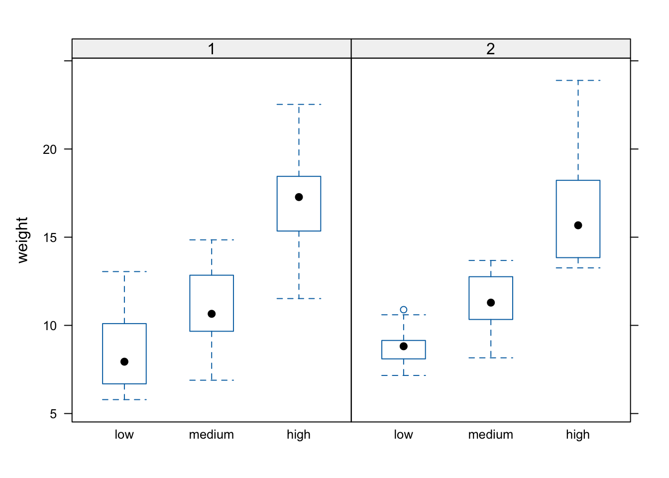
We can also include more than one conditioning variable. For example, let’s create a scatter plot of height against weight for each level of nitrogen and treat. To do this we’ll use the lattice xyplot() function.
xyplot(height ~ weight | nitrogen * treat, data = flowers)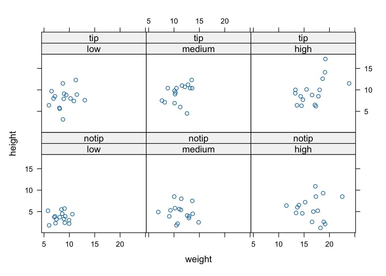
If we want to highlight which data points come from block 1 and which from block 2 by automatically changing the plotting symbols we can use the groups = argument. We’ll also include the argument auto.key = TRUE to automatically generate a legend.
xyplot(flowers ~ shootarea | nitrogen * treat,
        groups = block, auto.key = TRUE, data = flowers)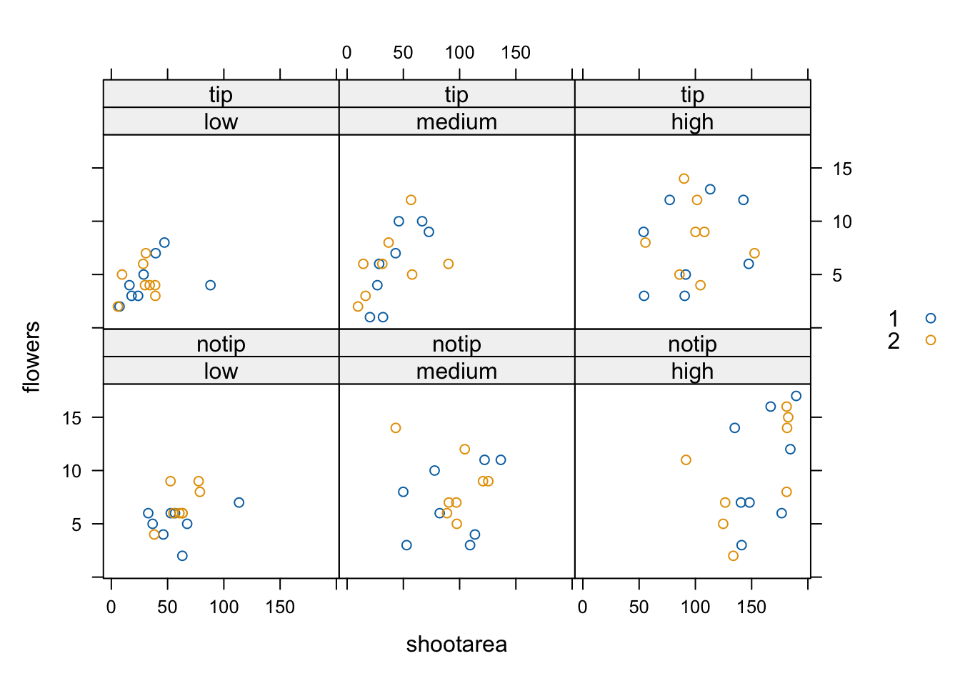
Hopefully, you’re getting the idea that we can create really informative exploratory plots quite easily using either base R or lattice graphics. Which one you use is entirely up to you (that’s the beauty of using R, you get to choose) and we happily mix and match to suit our needs. In the next section we cover how to customise your base R plots to get them to look exactly how you want.
Customising plots
All of the plots we’ve created so far in this Chapter are more than suitable for exploring your data. If however, you’d like to make them a little prettier (for your thesis, publication or even your own amusement) you’ll need to invest some time learning how to customise your plots. The good news is that the base R graphics system allows you to change almost any aspect of your plot. There are however a couple of things to bear in mind. Firstly, although many of the approaches we introduce in this section will work with most base R plotting functions, there’s no true consistency between functions. What works with the plot() function isn’t guaranteed to necessarily work with the boxplot() function. This can be a little frustrating to begin with but gets easier the more experience you gain. Secondly, when you start customising plots you’re confronted with a huge number of options and arguments to try and remember. This isn’t necessarily a bad thing as this is what makes base R graphics so flexible but it’s a lot to take in. Often a quick Google or peek at the relevant help pages will jog your memory. Thirdly, learning how to customise plots in base R isn’t just about what code you need to use, it’s also about learning the process of building a plot. We often start with a basic layout of our plot and then add layers of complexity until we achieve the desired results. This requires a little experience (and trial and error), but again becomes easier with practice. Lastly, this section covers the basics of how to customise base R graphics and most (if not all) of these approaches will not work for plots created with the lattice graphics system.
Customising with arguments
Let’s return to the basic plot we made previously in this Chapter. This was a simple scatterplot to examine the relationship between the shootarea and weight variables in the flowers data frame.
plot(flowers$weight, flowers$shootarea)
Whilst this plot is adequate for data exploration it’s not going to cut the mustard if we want to share it with others. At the very least it could do with a better set of axes labels, more informative axes scales and some nicer plotting symbols.
Let’s start with the axis labels. To add labels to the x and y axes we use the corresponding ylab = and xlab = arguments in the plot() function. Both of these arguments need character strings as values.
plot(flowers$weight, flowers$shootarea,
       xlab = "weight (g)",
       ylab = "shoot area (cm2)")
OK, that looks a little better but the units (cm2) looks a little ugly as we should format the 2 as a superscript. To convert to a superscript we need to use a combination of the expression() and paste() functions. The expression() function allows us to format the superscript (and other mathematical expressions - see ?plotmath for more details) with the ^ symbol and the paste() function pastes together the elements "shoot area (cm"^"2" and ) to create our axis label.
plot(flowers$weight, flowers$shootarea,
       xlab = "weight (g)",
       ylab = expression(paste("shoot area (cm"^"2",")")))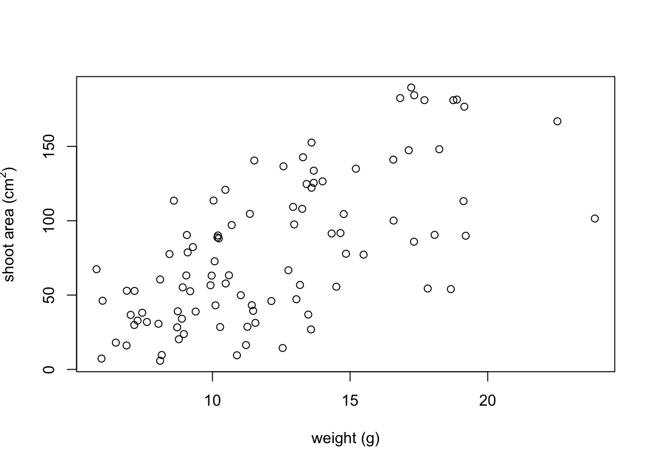
But now we have a new problem, the very top of the y axis label gets cut off. To remedy this we need to adjust the plot margins using the par() function and the mar = argument before we plot the graph. The par() function is the main function for setting graphical parameters in base R and the mar = argument sets the size of the margins that surround the plot. You can adjust the size of the margins using the notation par(mar = c(bottom, left, top, right)) where the arguments bottom, left, top and right are the size of the corresponding margins. By default R sets these margins as mar = c(5.1, 4.1, 4.1, 2.1) with these numbers specifying the number of lines in each margin. Let’s increase the size of the left margin a little bit and decrease the size of the right margin by a smidge.
par(mar = c(4.1, 4.4, 4.1, 1.9))
plot(flowers$weight, flowers$shootarea,
       xlab = "weight (g)",
       ylab = expression(paste("shoot area (cm"^"2",")")))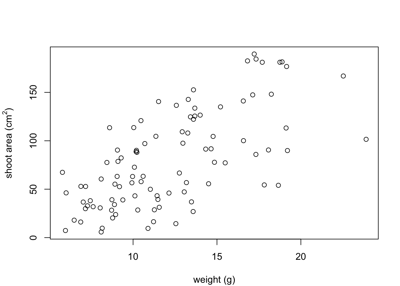
That looks better. Now let’s increase the range of our axes scales so we have a bit of space above and to the right of the data points. To do this we need to supply a minimum and maximum value using the c() function to the xlim = and ylim = arguments. We’ll set the x axis scale to run from 0 to 30 and the range of the y axis scale from 0 to 200.
par(mar = c(4.1, 4.4, 4.1, 1.9))
plot(flowers$weight, flowers$shootarea,
       xlab = "weight (g)",
       ylab = expression(paste("shoot area (cm"^"2",")")),
       xlim = c(0, 30), ylim = c(0, 200))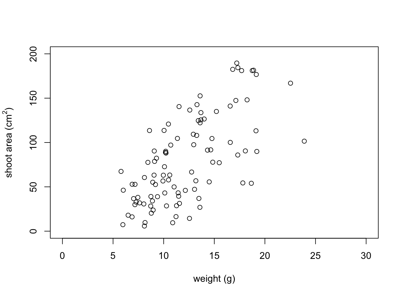
And while we’re at it let’s remove the annoying box all the way around the plot to just leave the y and x axes using the bty = "l" argument.
par(mar = c(4.1, 4.4, 4.1, 1.9))
plot(flowers$weight, flowers$shootarea,
       xlab = "weight (g)",
       ylab = expression(paste("shoot area (cm"^"2",")")),
       xlim = c(0, 30), ylim = c(0, 200), bty = "l")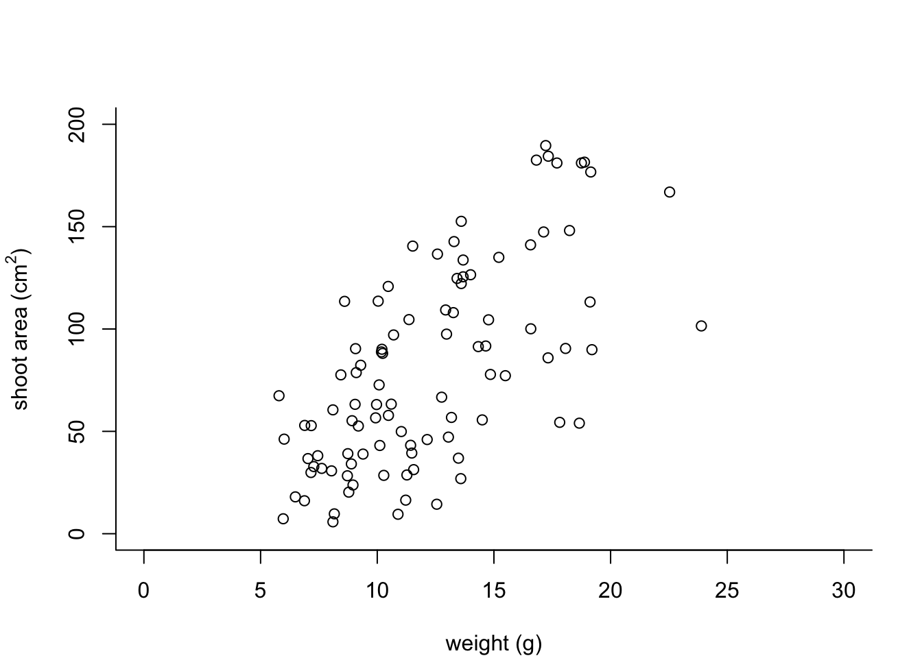
OK, that’s looking a lot better already after only a few adjustments. One of the things that we still don’t like is that by default the x and y axes do not intersect at the origin (0, 0) and both axes extend beyond the maximum value of the scale by a little bit. We can change this by setting the xaxs = "i" and yaxs = "i" arguments when we use the par() function. While we’re about it let’s also rotate the y axis tick mark labels so they read horizontally using by setting the las = 1 argument in the plot() function and make them a tad smaller with the cex.axis = argument. The cex.axis = argument requires a number giving the amount by which the text will be magnified (or shrunk) relative to the default value of 1. We’ll choose 0.8 making our text 20% smaller. We can also make the tick marks just a little shorter by setting tcl = -0.2. This value needs to be negative as we want the tick marks to be outside the plotting region (see what happens if you set it to tcl = 0.2).
par(mar = c(4.1, 4.4, 4.1, 1.9), xaxs = "i", yaxs = "i")
plot(flowers$weight, flowers$shootarea,
       xlab = "weight (g)",
       ylab = expression(paste("shoot area (cm"^"2",")")),
       xlim = c(0, 30), ylim = c(0, 200), bty = "l",
       las = 1, cex.axis = 0.8, tcl  = -0.2)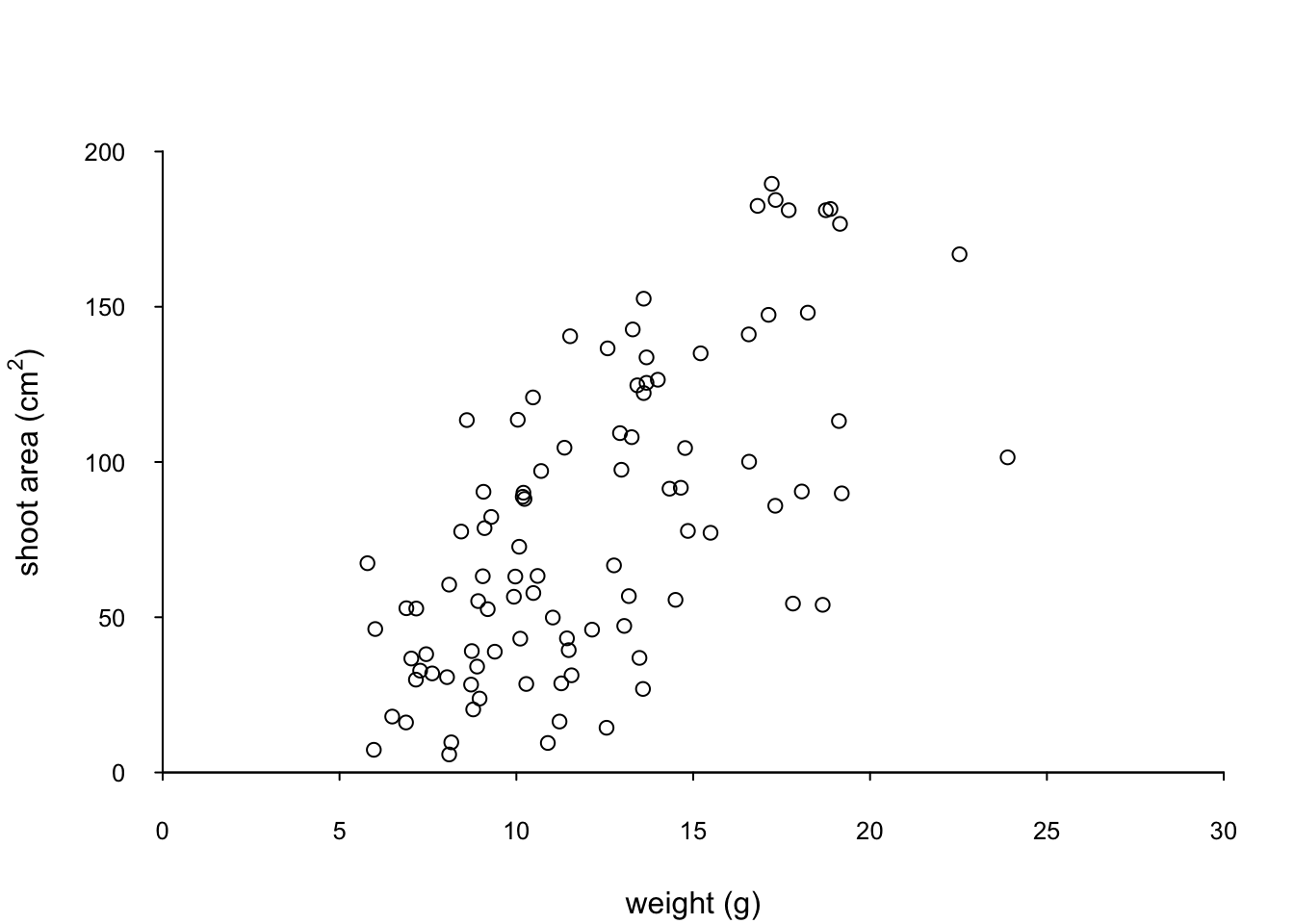
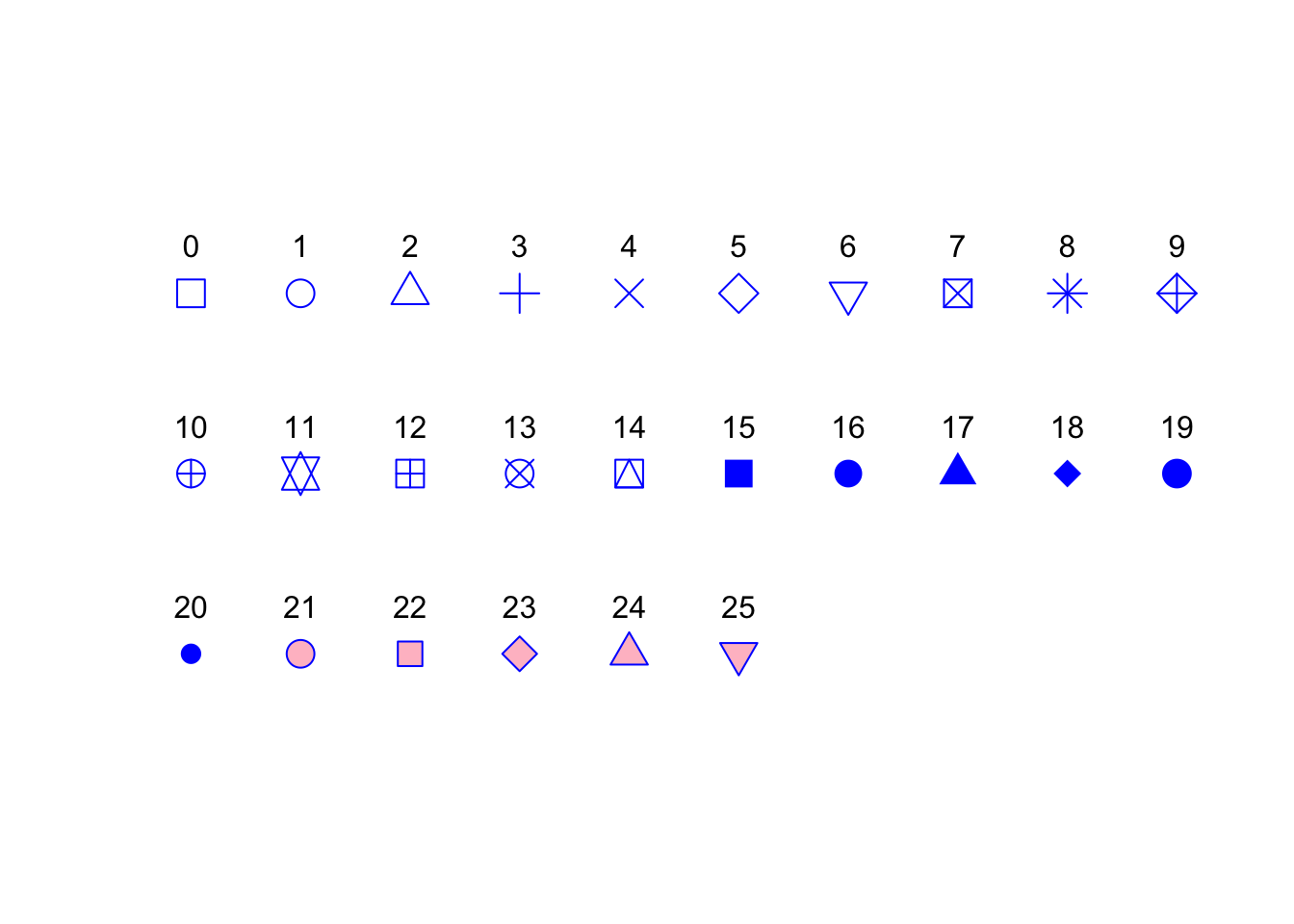
We can also change the type of plotting symbol, the colour of the symbol and the size of the symbol using the pch =, col = and cex = arguments respectively. The pch = argument takes an integer value between 0 and 25 to define the type of plotting symbol. Symbols 0 to 14 are open symbols, 15 to 20 are filled symbols and 21 to 25 are symbols where you can specify a different fill colour and outside line colour. Here’s a summary table displaying the value and corresponding symbol type.
The col = argument changes the colour of the plotting symbols. This argument can either take an integer value to specify the colour or a character string giving the colour name. For example, col = "red" changes the plotting symbol to red. To see a list of all 657 preset colours available in base R use the colours() function (you can also use colors()) or perhaps even easier see this [link][colours]. More colour options are available with other packages (see the excellent RColorBrewer package) or you can even ‘mix’ your own colours using the colorRamp() function (see ?colorRamp for more details).
The cex = argument allow you to change the size of the plotting symbol. This argument works in the same way as the other cex arguments we’ ve already seen (i.e. cex.axis) and requires a numeric value to indicate the proportional increase or decrease in size relative to the default value of 1.
Let’s change the plotting symbol to a filled circle (16), the colour of the symbol to “dodgerblue1” and decrease the size of the symbol by 10%.
par(mar = c(4.1, 4.4, 4.1, 1.9), xaxs = "i", yaxs = "i")
plot(flowers$weight, flowers$shootarea,
       xlab = "weight (g)",
       ylab = expression(paste("shoot area (cm"^"2",")")),
       xlim = c(0, 30), ylim = c(0, 200), bty = "l",
       las = 1, cex.axis = 0.8, tcl = -0.2,
       pch = 16, col = "dodgerblue1", cex = 0.9)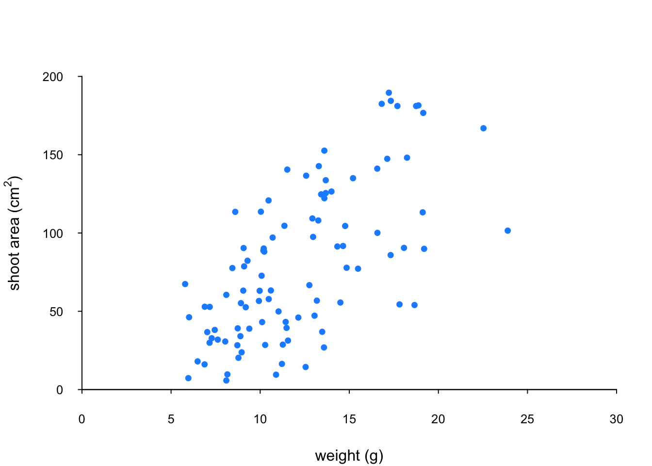
The last thing we’ll do is add a text label to the plot so we can identify it. Perhaps this plot will be one of a series of plots we want to include in the same figure (see the section on plotting multiple graphs to see how to do this) so it would be nice to be able to refer to it in our figure title. To do this we’ll use the text() function to add a capital ‘A’ to the top right of the plot. The text() function needs an x = and a y = coordinate to position the text, a label = for the text and we can use the cex = argument again to change the size of the text.
par(mar = c(4.1, 4.4, 4.1, 1.9), xaxs = "i", yaxs = "i")
plot(flowers$weight, flowers$shootarea,
       xlab = "weight (g)",
       ylab = expression(paste("shoot area (cm"^"2",")")),
       xlim = c(0, 30), ylim = c(0, 200), bty = "l",
       las = 1, cex.axis = 0.8, tcl = -0.2,
       pch = 16, col = "dodgerblue1", cex = 0.9)
text(x = 28, y = 190, label = "A", cex = 2)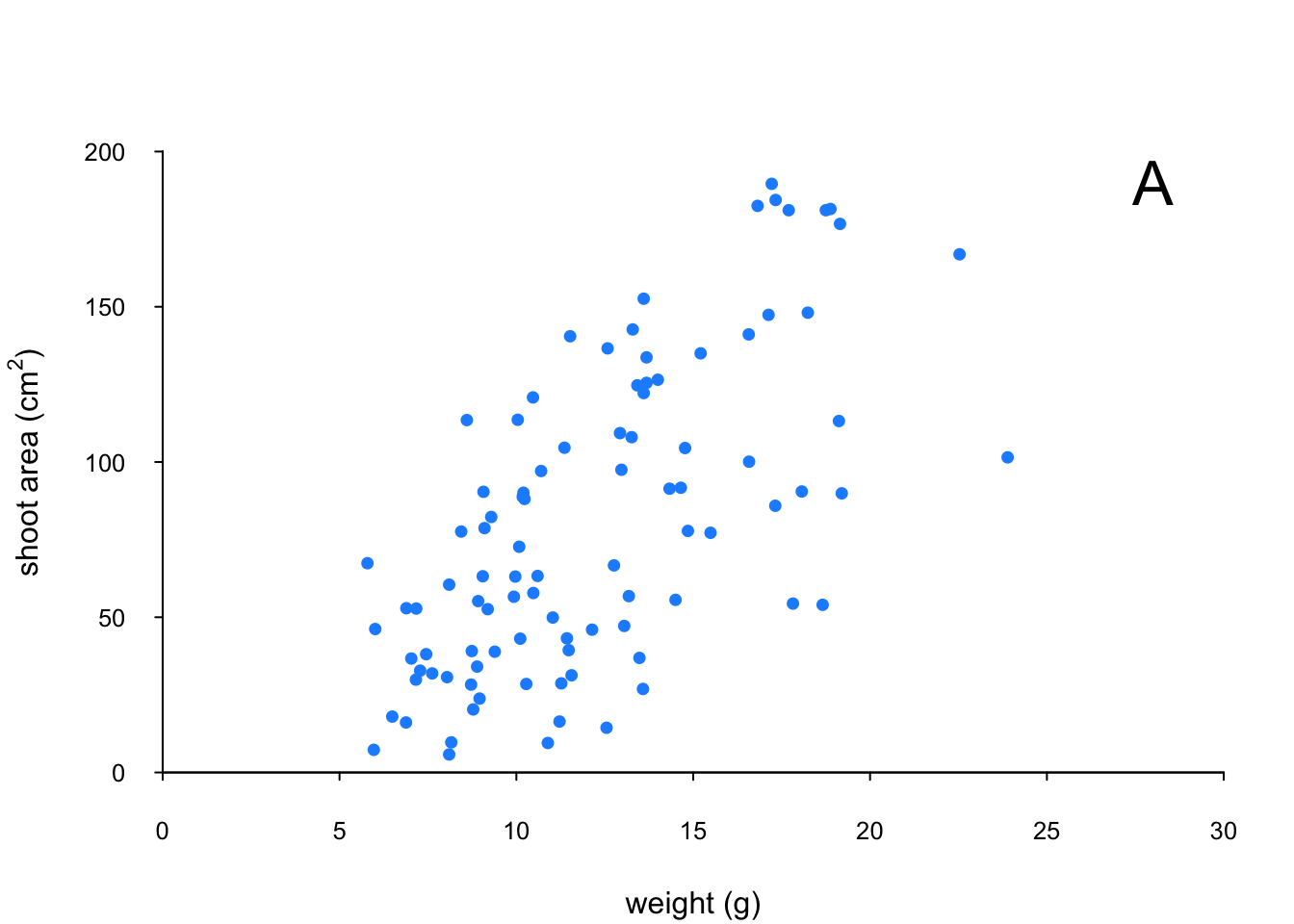
We think our plot now looks pretty good so we’ll stop here! There are, however, a multitude of other arguments which you can play around with to change the look of your plots. The best place to quickly look for more information is the help page associated with the par() function (?par) or just do a quick Google search. Here’s a table of the more commonly used arguments.
| Argument | Description |
|---|---|
adj |
controls justification of the text (0 left justified, 0.5 centered, 1 right justified) |
bg |
specifies the background colour of the plot (i.e. : bg = "red", bg = "blue") |
bty |
controls the type of box drawn around the plot, values include: "o", "l", "7", "c", "u" , "]" (the box looks like the corresponding character); if bty = "n" the box is not drawn |
cex |
controls the size of text and symbols in the plotting area with respect to the default value of 1. Similar commands include: cex.axis controls the numbers on the axes, cex.lab numbers on the axis labels, cex.main the title and cex.sub the sub-title |
col |
controls the colour of symbols; additional argument include: col.axis, col.lab, col.main, col.sub |
font |
an integer controlling the style of text (1: normal, 2: bold, 3: italics, 4: bold italics); other argument include font.axis, font.lab, font.main, font.sub |
las |
an integer which controls the orientation of the axis labels (0: parallel to the axes, 1: horizontal, 2: perpendicular to the axes, 3: vertical) |
lty |
controls the line style, can be an integer (1: solid, 2: dashed, 3: dotted, 4: dotdash, 5: longdash, 6: twodash) |
lwd |
a numeric which controls the width of lines. Works as per cex |
pch |
controls the type of symbol, either an integer between 0 and 25, or any single character within quotes " " |
ps |
an integer which controls the size in points of texts and symbols |
pty |
a character which specifies the type of the plotting region, “s”: square, “m”: maximal |
tck |
a value which specifies the length of tick marks on the axes as a fraction of the width or height of the plot; if tck = 1 a grid is drawn |
tcl |
a value which specifies the length of tick marks on the axes as a fraction of the height of a line of text (by default tcl = -0.5) |
Building plots
For even more control over how your plot looks we can build our plot up in layers, customising each step as we go along. For example, perhaps we want to create a plot of shootarea and weight as we did before but this time we want to change the symbol colours of our data points depending on what level of nitrogen the plants were exposed to. The general approach is to use the high level plotting function plot() to create the general plot (axes, axes labels etc) but without the data points by including the type = "n" argument. We then use the low level function points() to add the plotting symbols for each nitrogen level separately choosing a different colour for each set of points. Let’s go through this approach a step at a time. First we’ll make the plot but suppress plotting the data using the type = "n" argument in the plot() function.
par(mar = c(4.1, 4.4, 4.1, 1.9), xaxs = "i", yaxs = "i")
plot(flowers$weight, flowers$shootarea,
       type = "n",
       xlab = "weight (g)",
       ylab = expression(paste("shoot area (cm"^"2",")")),
       xlim = c(0, 30), ylim = c(0, 200), bty = "l",
       las = 1, cex.axis = 0.8, tcl = -0.2)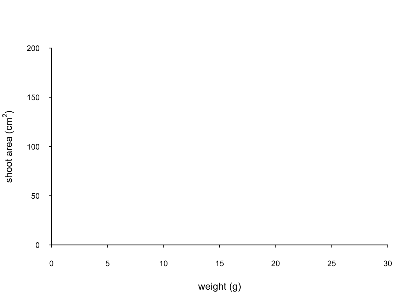
We can now use the points() function in combination with our square bracket [ ] skills to only select those data from the low level of nitrogen. Whilst using the points() function we can also set the symbol type and the symbol colour using the pch = and col = arguments.
par(mar = c(4.1, 4.4, 4.1, 1.9), xaxs = "i", yaxs = "i")
plot(flowers$weight, flowers$shootarea,
       type = "n",
       xlab = "weight (g)",
       ylab = expression(paste("shoot area (cm"^"2",")")),
       xlim = c(0, 30), ylim = c(0, 200), bty = "l",
       las = 1, cex.axis = 0.8, tcl = -0.2)
points(x = flowers$weight[flowers$nitrogen == "low"],
       y = flowers$shootarea[flowers$nitrogen == "low"],
       pch = 16, col = "deepskyblue")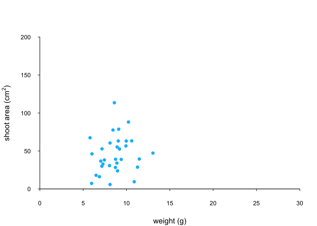
We can now use the points() function again to plot data for the medium level of nitrogen and change the symbol colour to something different. Notice that we do not reuse the plot() function here as we are just using the low level function points() to add data points to the existing plot.
points(x = flowers$weight[flowers$nitrogen == "medium"],
       y = flowers$shootarea[flowers$nitrogen == "medium"],
       pch = 16, col = "yellowgreen")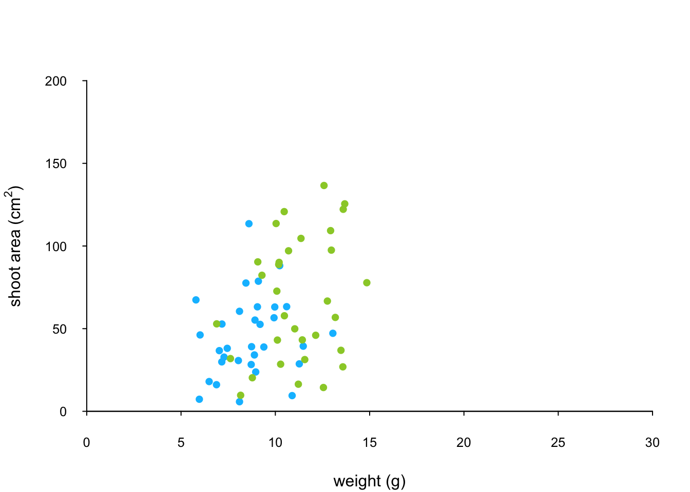
And finally to add the high level of nitrogen data points to the plot and add our text label (‘A’) to the plot as before.
points(x = flowers$weight[flowers$nitrogen == "high"],
       y = flowers$shootarea[flowers$nitrogen == "high"],
       pch = 16, col = "deeppink3")
text(x = 28, y = 190, label = "A", cex = 2)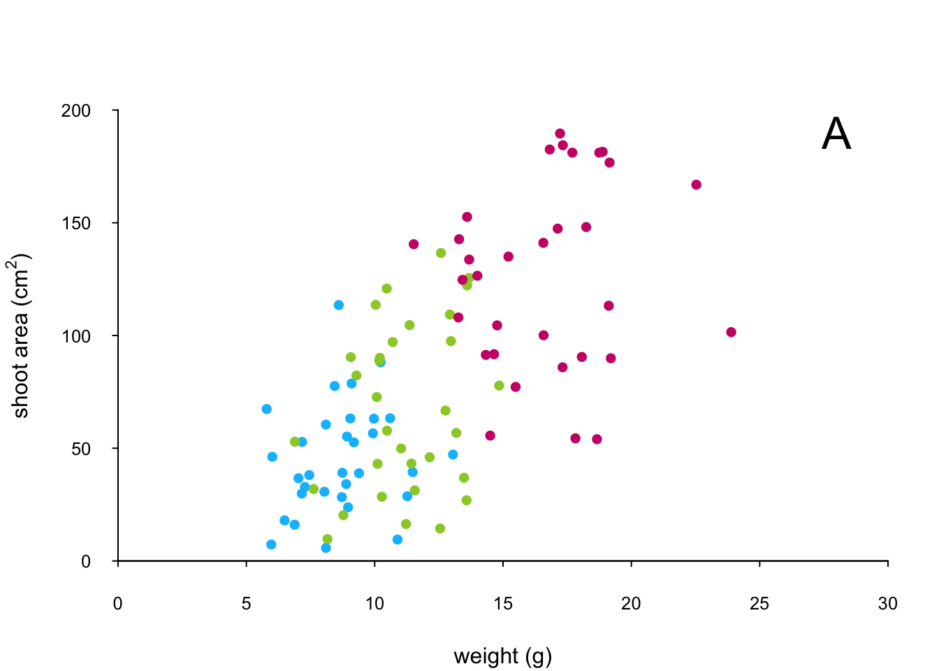
The only thing left to do is to add a legend to the plot to let your reader know what nitrogen level each colour corresponds to. We’ll use another low level function,legend() to do this. The legend() function requires us to provide the x and y coordinates to specify the position of the top left of the legend in the plot, a vector of colours, symbol types and labels to use in the legend. The bty = "n" argument stops a border being drawn around the legend and the title = argument gives the legend a title.
leg_cols <- c("deepskyblue", "yellowgreen", "deeppink3")
leg_sym <- c(16, 16, 16)
leg_lab <- c("low", "medium", "high")

legend(x = 1, y = 200, col = leg_cols, pch = leg_sym,
        legend = leg_lab, bty = "n",
        title = "Nitrogen level")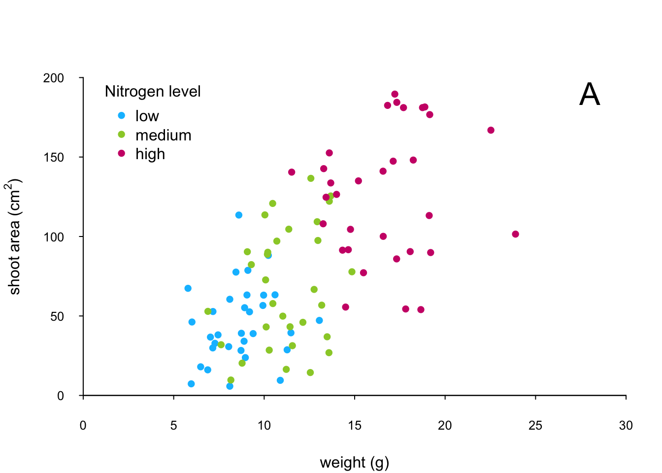
If you want to see all the code together.
par(mar = c(4.1, 4.4, 4.1, 1.9), xaxs="i", yaxs="i")
plot(flowers$weight, flowers$shootarea,
       type = "n",
       xlab = "weight (g)",
       ylab = expression(paste("shoot area (cm"^"2",")")),
       xlim = c(0, 30), ylim = c(0, 200), bty = "l",
       las = 1, cex.axis = 0.8, tcl = -0.2)
points(x = flowers$weight[flowers$nitrogen == "low"],
       y = flowers$shootarea[flowers$nitrogen == "low"],
       pch = 16, col = "deepskyblue")
points(x = flowers$weight[flowers$nitrogen == "medium"],
       y = flowers$shootarea[flowers$nitrogen == "medium"],
       pch = 16, col = "yellowgreen")
points(x = flowers$weight[flowers$nitrogen == "high"],
       y = flowers$shootarea[flowers$nitrogen == "high"],
       pch = 16, col = "deeppink3")
text(x = 28, y = 190, label = "A", cex = 2)
leg_cols <- c("deepskyblue", "yellowgreen", "deeppink3")
leg_sym <- c(16, 16, 16)
leg_lab <- c("low", "medium", "high")

legend(x = 1, y = 200, col = leg_cols, pch = leg_sym,
        legend = leg_lab, bty = "n",
        title = "Nitrogen level")
The table below highlights some of the low level potting functions you might find useful.
| Function | Description |
|---|---|
lines() |
add connected lines to a plot |
curve() |
draws a curve corresponding to a function |
arrows() |
draws arrows between 2 points |
text() |
adds text to a plot |
mtext() |
adds text to one of the 4 plot margins |
axis() |
adds an axis to the current plot |
rect() |
draws a rectangle |
legend() |
adds a legend to the plot |
points() |
adds points to the plot |
abline() |
adds a straight line to a plot |
grid() |
adds a rectangular grid to the current plot |
polygon() |
draws a polygon |
Multiple graphs
There are a number of different methods for plotting multiple graphs within the same graphics device, some of which you’ve already met such as pairs(), coplot(), xyplot() etc. However these functions rely on plotting multiple graphs in different panels within the same plot. If you want to plot separate plots within the same graphics device you’ll need a different approach. One of the most common methods is to use the main graphical function par() to split the plotting device up into a number of defined sections using the mfrow = argument. With this method, you first need to specify the number of rows and columns of plots you would like and then run the code for each plot. For example, to plot two graphs side by side we would use par(mfrow = c(1, 2)) to split the device into 1 row and two columns.
par(mfrow = c(1, 2))
plot(flowers$weight, flowers$shootarea, xlab = "weight",
      ylab = "shoot area")
boxplot(shootarea ~ nitrogen, data = flowers, cex.axis = 0.6)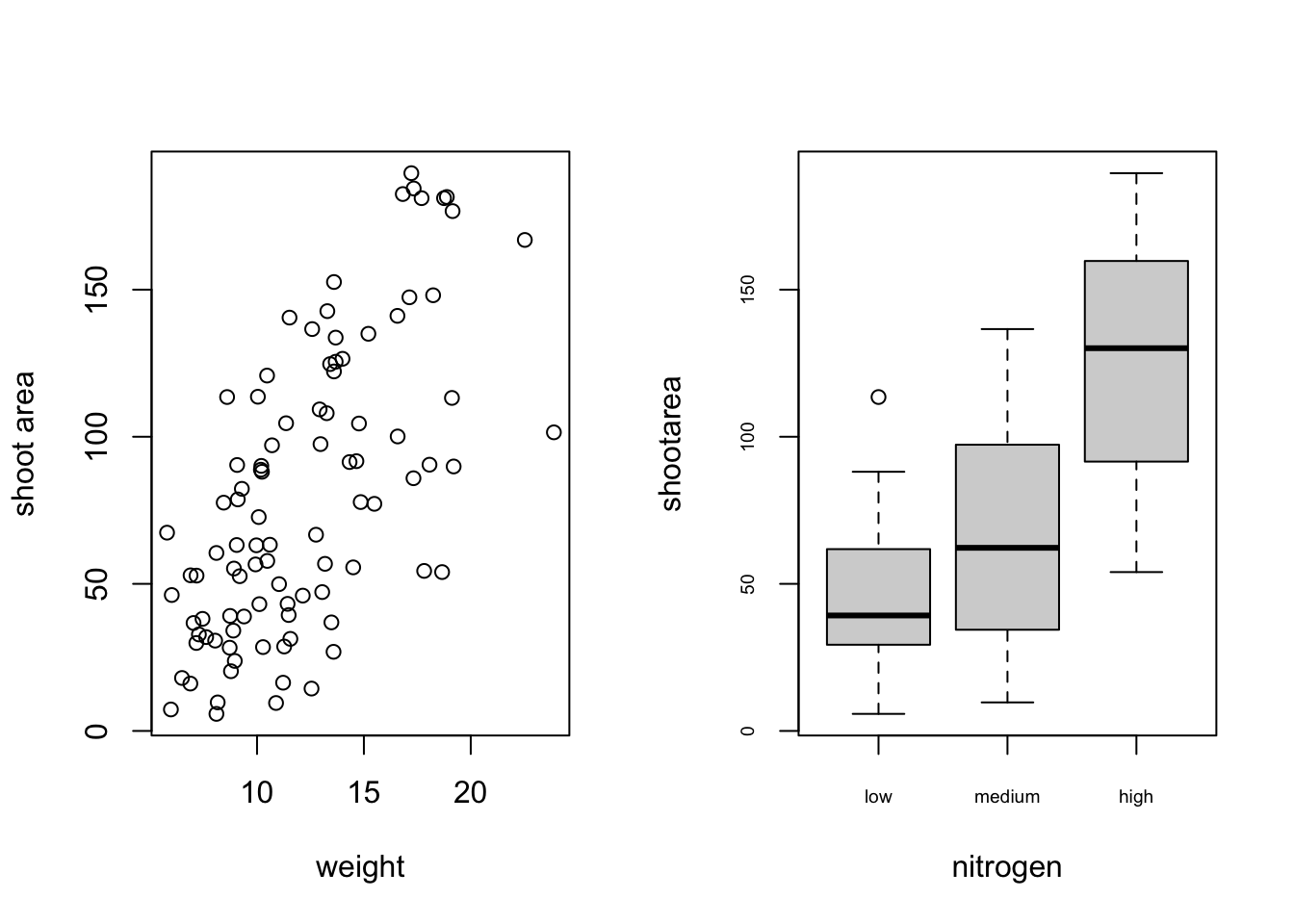
Or if we wanted to plot four plots we can split our plotting device into 2 rows and 2 columns.
par(mfrow = c(2, 2))
plot(flowers$weight, flowers$shootarea, xlab = "weight",
      ylab = "shoot area")
boxplot(shootarea ~ nitrogen, cex.axis = 0.8, data = flowers)
hist(flowers$weight, main ="")
dotchart(flowers$weight)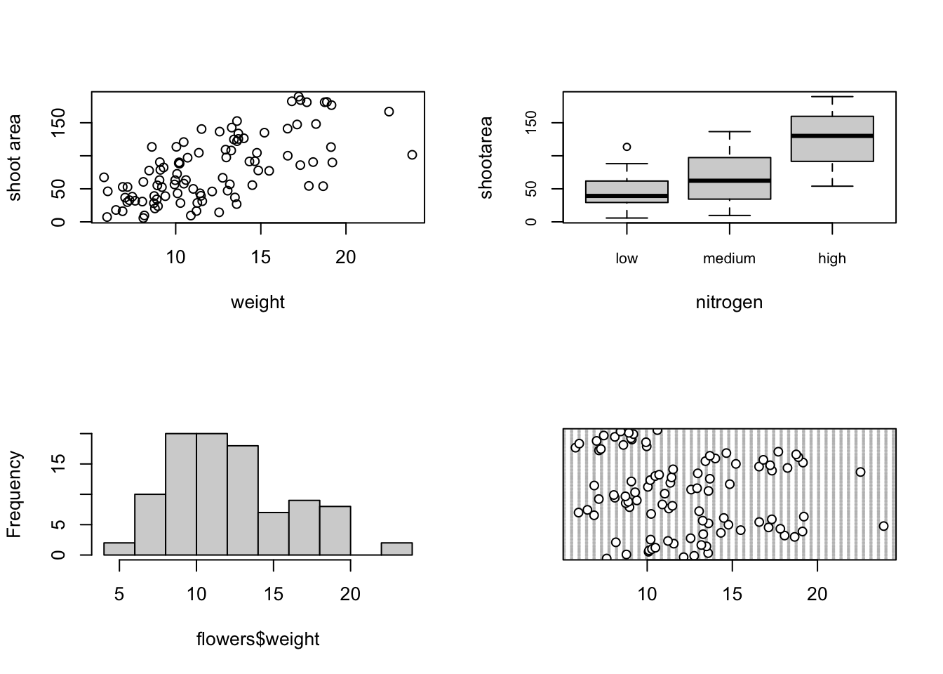
Once you’ve finished making your plots don’t forget to reset your plotting device back to normal with par(mfrow = c(1, 1)).
A more flexible approach is to use the layout() function. The layout() function allows you to split your plotting device up into different sized regions and can be used to build complex figures. Before using the layout() function we first need to specify how we’re going to split our plotting device by creating a matrix using the matrix() function. Let’s create a 2 x 2 matrix.
layout_mat <- matrix(c(2, 0, 1, 3), nrow = 2, ncol = 2,
                      byrow = TRUE)
layout_mat
[,1] [,2]
[1,] 2 0
[2,] 1 3The matrix above represents splitting the plotting device into 2 rows and 2 columns. The first plot will occupy the lower left panel, the second plot the upper left panels and the third plot the lower right panel. The upper right panel will not contain a plot as we have placed a zero here.
We can now use the layout() function to define our layout. As we have two rows and two columns we need to specify the height of each row and the width of each column using the heights = and widths = arguments. The respect = TRUE argument ensures that the units used to define the widths are the same as those to define the heights. We can get a graphical representation of our layout by using the layout.show() function.
my_lay <- layout(mat = layout_mat,
                 heights = c(1, 3),
                 widths = c(3, 1), respect =TRUE)
layout.show(my_lay)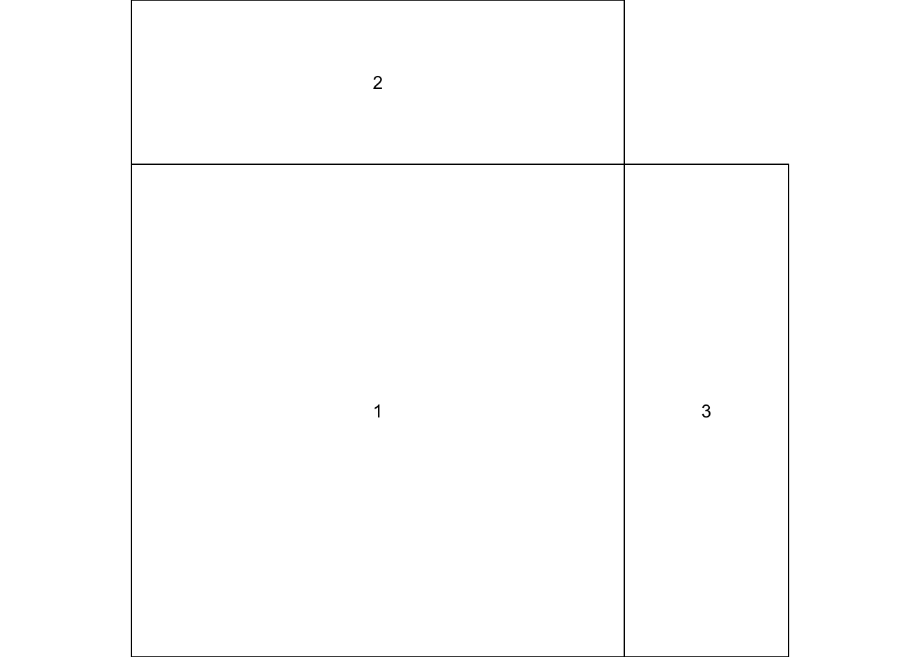
All we need to do now is create our three plots. However, before we do this we also need to change the figure margins for each of the figures using the par(mar = ) command so all of the plots can fit together in the same plotting device. This will probably take a little bit of experimenting to get the plot looking exactly how you want. For our first figure (bottom left) we will reduce the size of the bottom and left margins a little and remove the margins completely from the top and right sides with par(mar = c(4, 4, 0, 0)). For our top plot we will remove the margins from the bottom, top and right sides and set the left side to have the same margin as our first figure (par(mar = c(0, 4, 0, 0))). For the third plot on the right we will set the bottom side to have the same margin as the first plot so they line up and remove the margins from the other sides with par(mar = c(4, 0, 0, 0)).
par(mar = c(4, 4, 0, 0))
plot(flowers$weight, flowers$shootarea,
     xlab = "weight (g)", ylab = "shoot area (cm2)")
par(mar = c(0, 4, 0, 0))
boxplot(flowers$weight, horizontal = TRUE, frame = FALSE,
        axes =FALSE)
par(mar = c(4, 0, 0, 0))
boxplot(flowers$shootarea, frame = FALSE, axes = FALSE)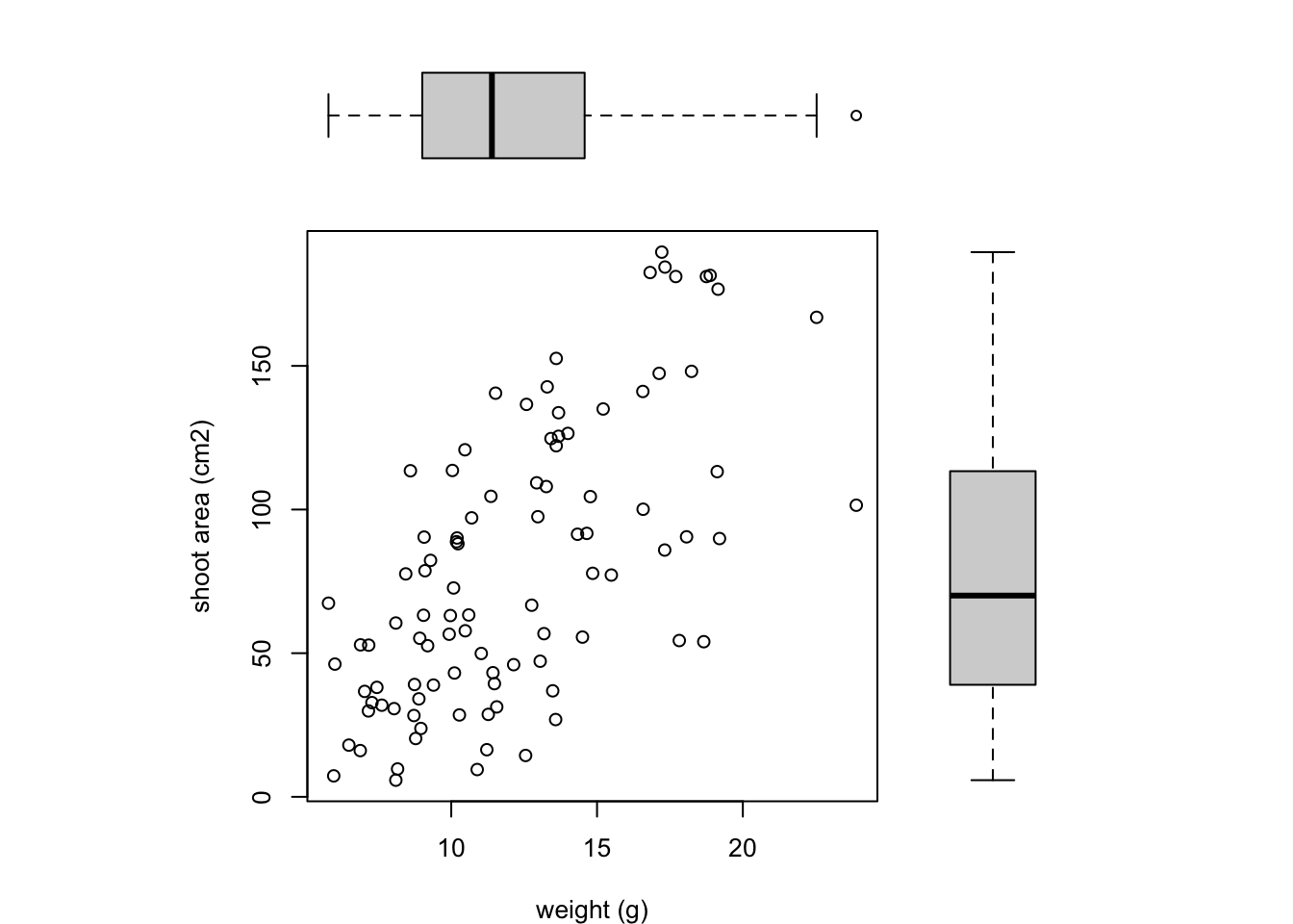
Notice we’ve specified that the boxplot at the top should be plotted horizontally with the horizontal = TRUE argument. The frame = FALSE argument prevents a border being plotted around each boxplot and the axes = FALSE argument suppresses the axes and axes labels from being plotted.
Exporting plots
Creating plots in R is all well and good but what if you want to use these plots in your thesis, report or publication? One option is to click on the ‘Export’ button in the ‘Plots’ tab in RStudio as we described previously. You can also export your plots from R to an external file by writing some code in your R script. The advantage of this approach is that you have a little more control over the output format and it also allows you to generate (or update) plots automatically whenever you run your script. You can export your plots in many different formats but the most common are, pdf, png, jpeg and tiff.
By default, R (and therefore RStudio) will direct any plot you create to the plot window. To save your plot to an external file you first need to redirect your plot to a different graphics device. You do this by using one of the many graphics device functions to start a new graphic device. For example, to save a plot in pdf format we will use the pdf() function. The first argument in the pdf() function is the filepath and filename of the file we want to save (don’t forget to include the .pdf extension). Once we’ve used the pdf() function we can then write all of the code we used to create our plot including any graphical parameters such as setting the margins and splitting up the plotting device. Once the code has run we need to close the pdf plotting device using the dev.off() function.
pdf(file = 'output/my_plot.pdf')
par(mar = c(4.1, 4.4, 4.1, 1.9), xaxs="i", yaxs="i")
plot(flowers$weight, flowers$shootarea,
       xlab = "weight (g)",
       ylab = expression(paste("shoot area (cm"^"2",")")),
       xlim = c(0, 30), ylim = c(0, 200), bty = "l",
       las = 1, cex.axis = 0.8, tcl = -0.2,
       pch = 16, col = "dodgerblue1", cex = 0.9)
text(x = 28, y = 190, label = "A", cex = 2)
dev.off()
If we want to save this plot in png format we simply use the png() function in more or less the same way we used the pdf() function.
png('output/my_plot.png')
par(mar = c(4.1, 4.4, 4.1, 1.9), xaxs="i", yaxs="i")
plot(flowers$weight, flowers$shootarea,
       xlab = "weight (g)",
       ylab = expression(paste("shoot area (cm"^"2",")")),
       xlim = c(0, 30), ylim = c(0, 200), bty = "l",
       las = 1, cex.axis = 0.8, tcl = -0.2,
       pch = 16, col = "dodgerblue1", cex = 0.9)
text(x = 28, y = 190, label = "A", cex = 2)
dev.off()
Other useful functions are; jpeg(), tiff() and bmp(). Additional arguments to these functions allow you to change the size, resolution and background colour of your saved images. See ?png for more details.