Graphics with ggplot
For many people, using R to create informative and pretty figures is one of the more rewarding aspects of using R. These can either take the form of a rough and ready plot to get a feel for what’s going on in your data, or a fancier, more complex figure to use in a publication or a report. This process is often as close as many scientists get to having a professional creative side (at least that’s true for us), and it’s a source of pride for some folk.
As mentioned in the Introduction, one of the many reasons for the rise in the popularity of R is its ability to produce publication quality figures. Not only can R users make figures well suited for publication, but the means in which the figures are produced also offers a wide-range of customisation. This in turn allows users to create their own particular styles and brands of figures which are well beyond the cookie-cutter styles in more traditional point and click software. Because of this inherent flexibility when producing figures, data visualisation in R and supporting packages has grown substantially over the years.
In this Chapter, we will focus on creating figures using a specialised package called ggplot2.
Before we get going with making some plots of the gg variety, how about a quick history of one of the most commonly used packages in R? ggplot2 was based on a book called Grammar of Graphics by Leland Wilkinson (hence the gg in ggplot2), yours for only [£100][leland] or so. But before you spend all that money, see [here][leland-summary] for an interesting summary of Wilkinson’s book.
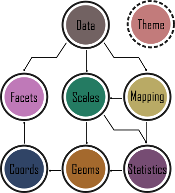
The Grammar of Graphics approach moves away from the idea that to create, for example, a scatterplot, users should click the scatterplot button or use the scatterplot() function. Instead, by breaking figures down into their various components (e.g. the underlying statistics, the geometric arrangement, the theme, see Fig. 5.1), users will be able to manipulate each of these components (i.e. layers) and produce a tailor-made figure fit for their specific needs. Contrast this approach with the one used by, for example, Microsoft Excel. The user specifies the data and then clicks the scatterplot button. This inherently locks the user into many choices made by the software developer and not the user. Think of how easily you can spot an Excel scatterplot because other than a couple of pre-set options, there’s really not much you can do to change the way the plot displays the data - you are at the mercy of the [insert corporation here] Gods.
While Wilkinson would eventually go on to become vice-president of SPSS, his (and his oft forgotten co-author’s) ideas would, never-the-less, make their way into R via ggplot2 as well as other implementations (e.g. tableau).
In 2007 ggplot2 was released by Hadley Wickham. By 2017 the package had reportedly been downloaded 10 million times and over the last few years ggplot2 has become the foundation for numerous other packages which expand its functionality even more. ggplot2 is now part of the [tidyverse][tidyverse] collection of R packages.
It’s important to note that ggplot2 is not required to make “fancy” and informative figures in R. If you prefer using base R graphics then feel free to continue as almost all ggplot2 type figures can be created using base R (we often use either approach depending on what we’re doing). The difference betweenggplot2 and base R is how you get to the end product rather than any substantial differences in the end product itself. This is, never-the-less, a common belief probably due to the fact that making a moderately attractive figure is (in our opinion at least), easier to do with ggplot2 as many aesthetic decisions are made for the user, without you necessarily even knowing that a decision was ever made!
With that in mind, let’s get started making some figures.
Beginning at the end
The approach we’ll use in this Chapter will be to start off by showing you a figure which we suggest is at a standard that you could use in a poster or presentation. Using that as the aim, we will then work towards it step-by-step. You should not view this final figure as any sort of holy grail. For instance, you would be very unlikely to use this in a publication (you’d be much more likely to use some results from your hard earned-analysis). Regardless, this “final figure” is, and will only ever be, a reflection of what our personal preferences are. As with anything subjective, you may well disagree, and to some extent we hope you do. Much better that we all have slightly (or grossly) different views on what a good figure is - otherwise we may as well go back to using cookie-cutter figures.
So what’s the figure we’re going to make together?
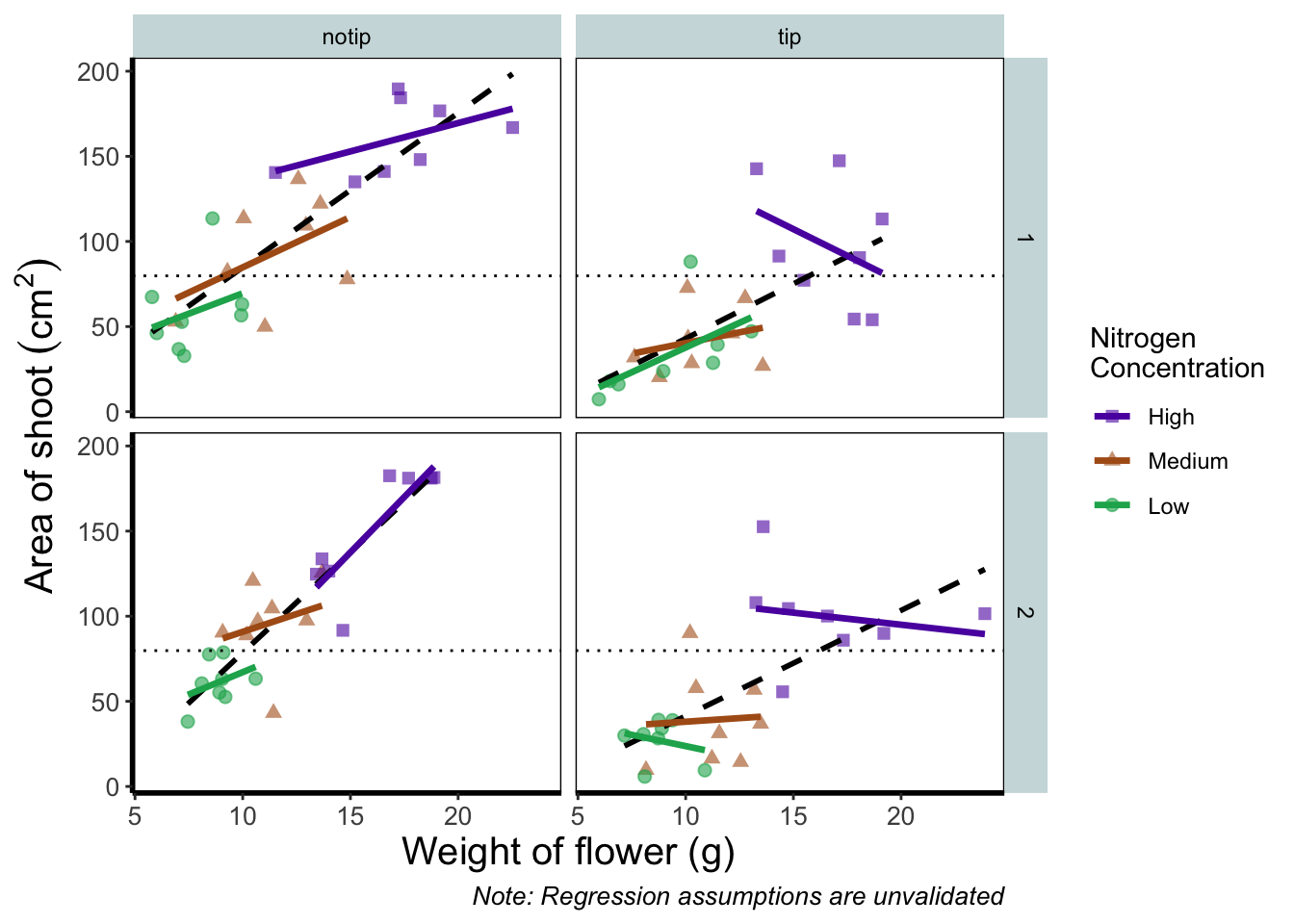
Before we go further, let’s take a second and talk about what this figure is showing. On the y axes of the four plots we have the surface area of flower shoots, and on the x axes we have the weight of the flowers. Each column of plots shows whether the tip of the flower was removed (notip) or retained (tip). Each row of plots identifies which experimental block in the greenhouse the plants were grown in, either ‘block 1’ or ‘block 2’.
The different coloured and shaped points within each plot represents plants grown at three nitrogen concentrations. These colours are used to distinguish which points correspond to a certain nitrogen concentration. For example, data points coloured green were plants grown in low nitrogen concentrations, brown in medium nitrogen and purple in high concentrations.
We have also added four trend lines to each plot (using a linear model, see stats chapter. The three solid coloured lines show the relationship between shoot area and weight of the flower according to which nitrogen treatment and block the plants were grown. The dashed black line in each plot represents the relationship between shoot area and flower weight whilst ignoring any nitrogen affect.
Finally, the thin grey dotted line on each plot represents the overall mean shoot area regardless of the weight of the flowers, the nitrogen concentration or the block.
For the purposes of this Chapter, we won’t worry about the biology here. Do not take this as standard practice, you should absolutely care deeply about the science in your own data. It’s the science that should be the driving force behind the questions you ask, which in turn determines what figures you should make.
The start of the end
The first step in producing a plot with ggplot() is the easiest! We just need to install and then make the package avaialble. Use the skills you learnt in packages to install and load the package. Note that although most people refer to the package as ggplot, it’s proper name is ggplot2.
install.packages("ggplot2")
library(ggplot2)
With that taken care of, let’s make our first ggplot!
The purest of ggplots
When we run our ‘in person’ R courses that accompany this book, we often ask our students to name all of the functions they have either learnt during the course, have heard of previously, or have used before (we call it R bingo!). At this point in the course, the students have not yet learnt about ggplot2, but never-the-less one year a student suggested the function ggplot(). When asked what the ggplot() function does, they joked that it obviously makes a ggplot. This makes intuitive sense, so let’s make a ggplot now:
ggplot()
And here we have it. A fully formed, perfect ggplot. We may have a small issue though. Some puritan data visualisers/plotists/figurines make the claim that figures should include some form of information beyond a light grey background. As loathe as we are to agree with purists, we’ll do so here. We really should include some information, but to do so, we need data.
We’ll keep using the flower dataset that you’ve used in data chapter. Let’s have a quick reminder of what the structure of the data looks like.
flower <- read.table("data/flower.csv", stringsAsFactors = TRUE,
                                         header = TRUE, sep = ",")
str(flower)
## 'data.frame':    96 obs. of  8 variables:
##  $ treat    : Factor w/ 2 levels "notip","tip": 2 2 2 2 2 2 2 2 2 2 ...
##  $ nitrogen : Factor w/ 3 levels "high","low","medium": 3 3 3 3 3 3 3 3 3 3 ...
##  $ block    : int  1 1 1 1 1 1 1 1 2 2 ...
##  $ height   : num  7.5 10.7 11.2 10.4 10.4 9.8 6.9 9.4 10.4 12.3 ...
##  $ weight   : num  7.62 12.14 12.76 8.78 13.58 ...
##  $ leafarea : num  11.7 14.1 7.1 11.9 14.5 12.2 13.2 14 10.5 16.1 ...
##  $ shootarea: num  31.9 46 66.7 20.3 26.9 72.7 43.1 28.5 57.8 36.9 ...
##  $ flowers  : int  1 10 10 1 4 9 7 6 5 8 ...
We know from the “final figure” that we want the variable shootarea on the y axis (response/dependent variable) and weight on the x axis (explanatory/independent variable). To do this in ggplot2 we need to make use of the aes() function and also add a data = argument. aes is short for aesthetics, and it’s the function we use to specify what we want displayed in the figure.
If we did not include the aes() function, then the x = and y = arguments would produce an error saying that the object was not found. A good rule to keep in mind when using ggplot2 is that the variables which we want displayed on the figure must be included in aes() function via the mapping = argument (corresponding to the mapping layer from Figure. 4.1).
All features in the figure which alter the displayed information, not based on a variable in our dataset (e.g. increasing the size of points to an arbitrary value), is included outside of the aes() function. Don’t worry if that doesn’t make sense for now, we’ll come back to this later.
Let’s update our code to include the ‘data’ and ‘mapping’ layers (indicated by the grey Data and mustard Mapping layer bubbles which will precede relevant code chunks):

# Including aesthetics for x and y axes as well as specifying the dataset
ggplot(mapping = aes(x = weight, y = shootarea), data = flower)
That’s already much better. At least it’s no longer a blank grey canvas. We’ve now told ggplot2 what we want as our x and y axes as well as where to find that data. But what’s missing here is where we tell ggplot2 how to display that data. This is now the time to introduce you to ‘geoms’ or geometry layers.
Geometries are the way that ggplot2 displays information. For instance geom_point() tells ggplot2 that you want the information to be displayed as points (making scatterplots possible for example). Given that the “final figure” uses points, this is clearly the appropriate geom to use here.
Before we can do that, we need to talk about the coding structure used by ggplot2. The analogy that we and many others use is to say that making a figure in ggplot2 is much like painting. What we’ve did in the above code was to make our “canvas”. Now we are going to add sequential layers to that painting, increasing the complexity and detail over time. Each time we want to include a new layer we need to end a preceding layer with a + at the end to tell ggplot2 that there are additional layers coming.
Let’s add (+) a new geometry layer now:

ggplot(aes(x = weight, y = shootarea), data = flower) +
        geom_point()     # Adding a geom to display data as point data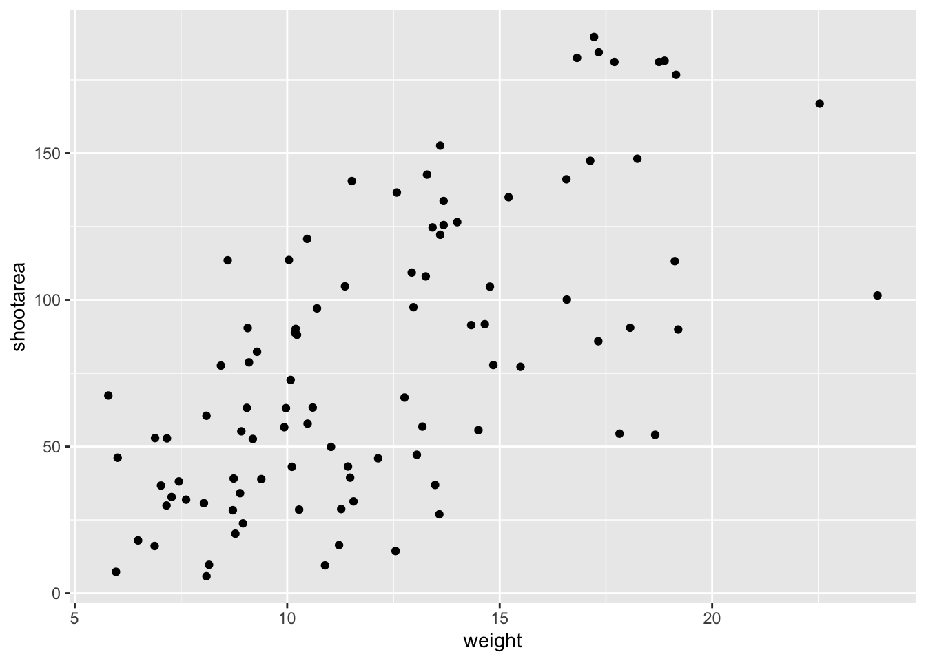
When you first start using ggplot2 there are three crucial layers that require your input. You can safely ignore the other layers initially as they all receive sensible (if sometimes ugly) defaults. The three crucial layers are:


Given that ‘data’ only requires us to specify the dataset we want to use, it is trivially easy to complete. ‘Mapping’ only requires you to specify what variables in the data to use, often just the x- and y-axes (specified using aes()). Lastly, ‘geometry’ is where we choose how we want the data to be visualised.
With just these three fundamentals, you will be able to produce a large variety of plots (see later in this Chapter for a bestiary of plots).
If what we wanted was a quick and dirty figure to get a grasp of the trend in the data we can stop here. From the scatterplot that we’ve produced, we can see that shootarea looks like it’s increasing with weight in a linear fashion. So long as this answers the question we were asking from these data, we have a figure that is fit for purpose. However, for showing to other people we might want something a bit more developed. If we glance back to our “final figure” we can see that we have lines representing the different nitrogen concentrations. We can include lines using a geom. If you have a quick look through the available geoms [here][geom], you might think that geom_line() would be appropriate. Let’s try it.
ggplot(aes(x = weight, y = shootarea), data = flower) +
  geom_point() +
    geom_line()     # Adding geom_line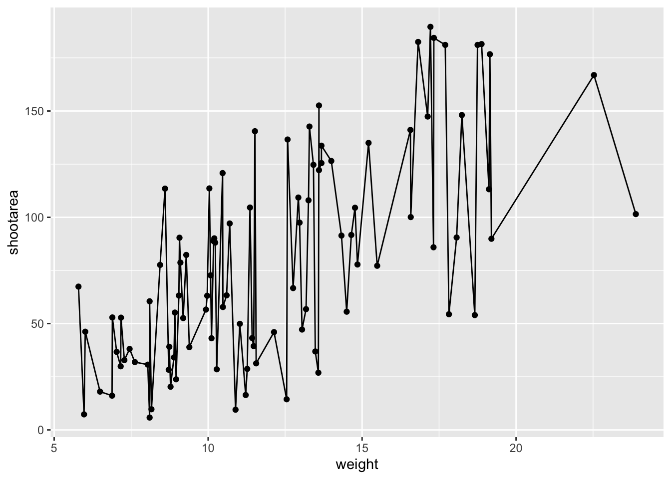
Not quite what we were going for. The problem that we have is that geom_line() is actually just playing join-the-dots in the order they appear in the data (an alternative to geom_path()). The geom we actually want to use is called geom_smooth(). We can fix that very easily just by changing “line” to “smooth”.

ggplot(aes(x = weight, y = shootarea), data = flower) +
  geom_point() +
    geom_smooth()    # Changing to geom_smooth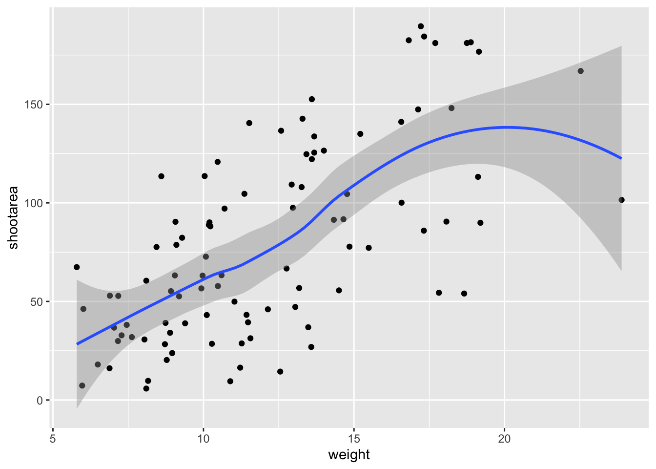
Better, but still not what we wanted. The challenge here is that drawing a line is actually somewhat complicated. The way our line above was drawn was by using a method called “LOESS” (locally estimated scatterplot smoothing) which gives something very close to a moving average; useful in some cases, less so in others. ggplot2 will use LOESS as default when you have < 1000 observations, so we’ll need to manually specify the method. Instead of a wiggly line, we want a nice simple ‘line of best fit’ to be drawn using a method called “lm” (short for linear model - see stats chapter for more details). Try looking at the help file, using ?geom_smooth, to see what other options are available for the method = argument.
While we’re at it, let’s get rid of the confidence interval ribbon around the line. We prefer to do this as we think it’s clearer to the audience that this isn’t a properly analysed line and to treat it as a visual aid only. We can do this at the same time as changing the method by setting the se = argument (short for standard error) to FALSE.
Let’s update the code to use a linear model without confidence intervals.

ggplot(aes(x = weight, y = shootarea), data = flower) +
  geom_point() +
geom_smooth(method = "lm", se = FALSE) # method and se 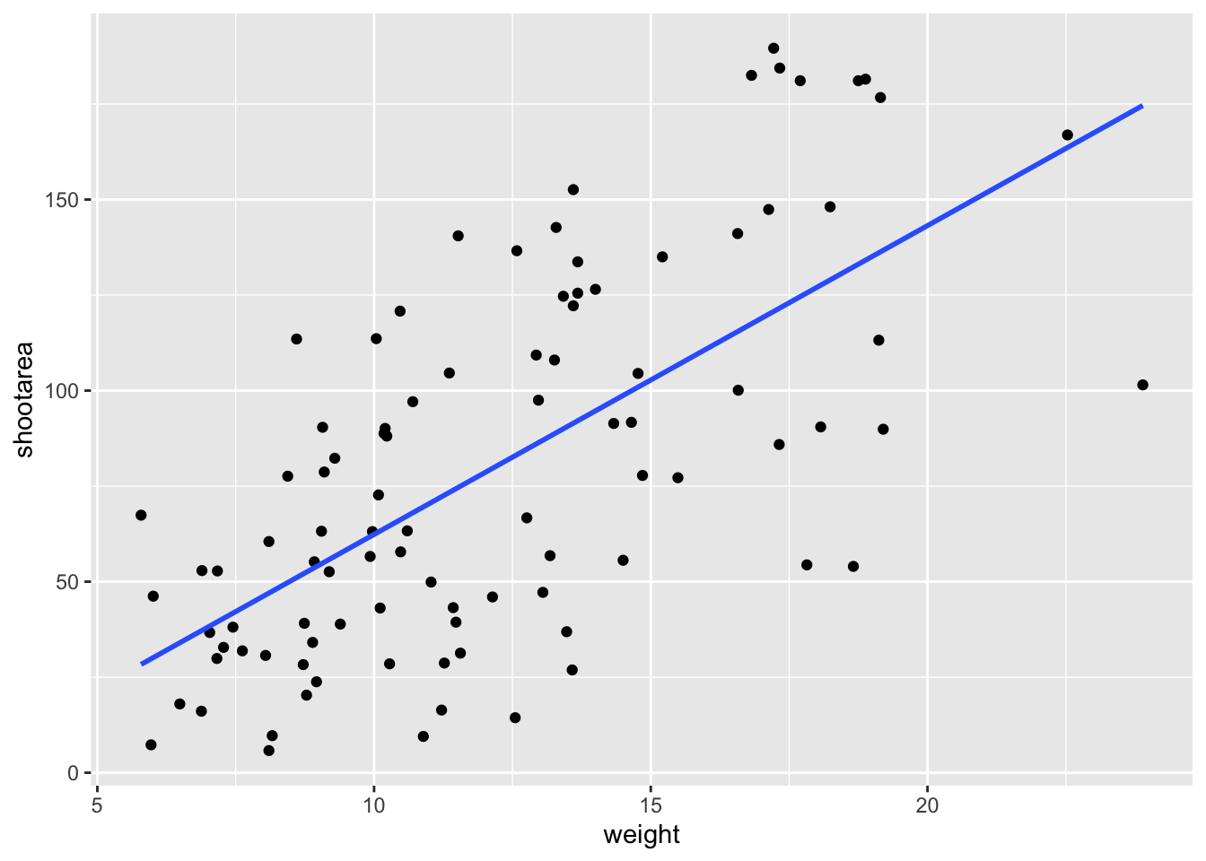
We get the straight line that we wanted, though it’s still not matching the “final figure”. We need to alter geom_smooth() so that it draws lines for each level of nitrogen concentration. Getting ggplot2 to do that is pretty straightforward. We can use the colour = argument within aes() (remember whatever we include in aes() will be something displayed in the figure) to tell ggplot2 to draw a different coloured lines depending on the nitrogen variable. Keep in mind that we have no variable in our dataset called “nitrogen_colour”, so ggplot2 is taking care of that for us here and assigning a colour to each unique nitrogen level.
An aside: ggplot2 was written with both UK English and American English in mind, so both colour and color spellings work in ggplot2.

ggplot(aes(x = weight, y = shootarea), data = flower) +
  geom_point() +
  # Including colour argument in aes()
  geom_smooth(aes(colour = nitrogen), method = "lm", se = FALSE)
We’re getting closer, especially since ggplot2 has automatically created a legend for us. At this point it’s a good time to talk about where to include information - whether to include it within a geom or in the main call to ggplot(). When we include information such as data = and aes() in ggplot() we are setting those as the default, universal values which all subsequent geoms use. Whereas if we were to include that information within a geom, only that geom would use that specific information. In this case, we can easily move the information around and get exactly the same figure.
ggplot() +
    # Moved aes() and data into geoms
  geom_point(aes(x = weight, y = shootarea), data = flower) +
  geom_smooth(aes(x = weight, y = shootarea, colour = nitrogen),
                        data = flower, method = "lm", se = FALSE)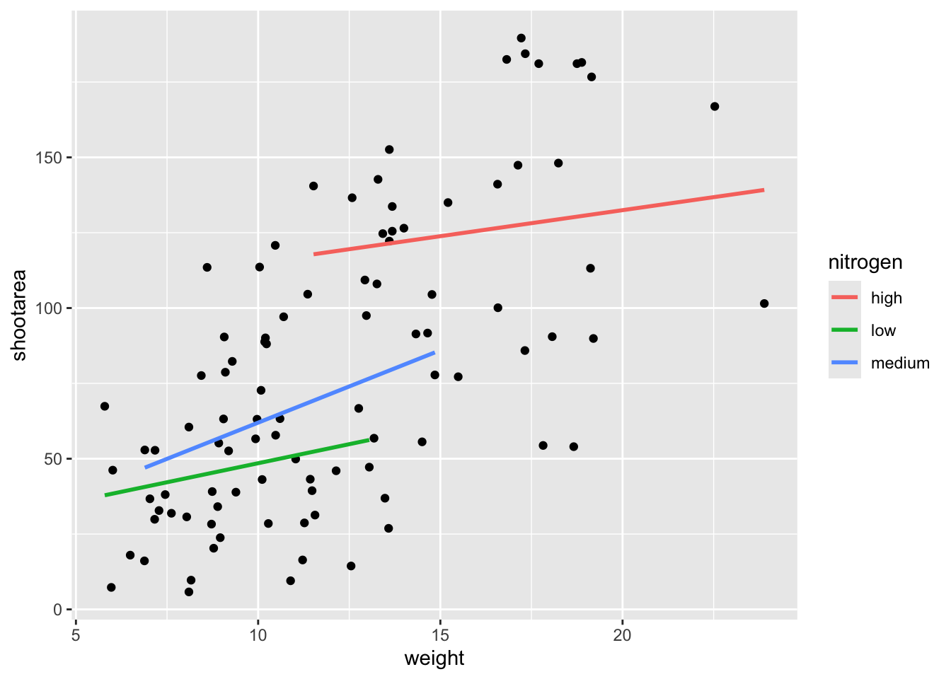
Doing so we get exactly the same figure. This ability to move information between the main ggplot() call or in specific geoms is surprisingly powerful (although sometime confusing!). It can allow different geoms to display different (albeit similar) information (see more on this later).
For this worked example, we’ll move the same information back to the universal ggplot(), but we’ll also move colour = nitrogen into ggplot() so that we can have the points coloured according to nitrogen concentration as well.
# Moved colour = nitrogen into the universal ggplot()
ggplot(aes(x = weight, y = shootarea, colour = nitrogen), data = flower) +
  geom_point() +
  geom_smooth(method = "lm", se = FALSE)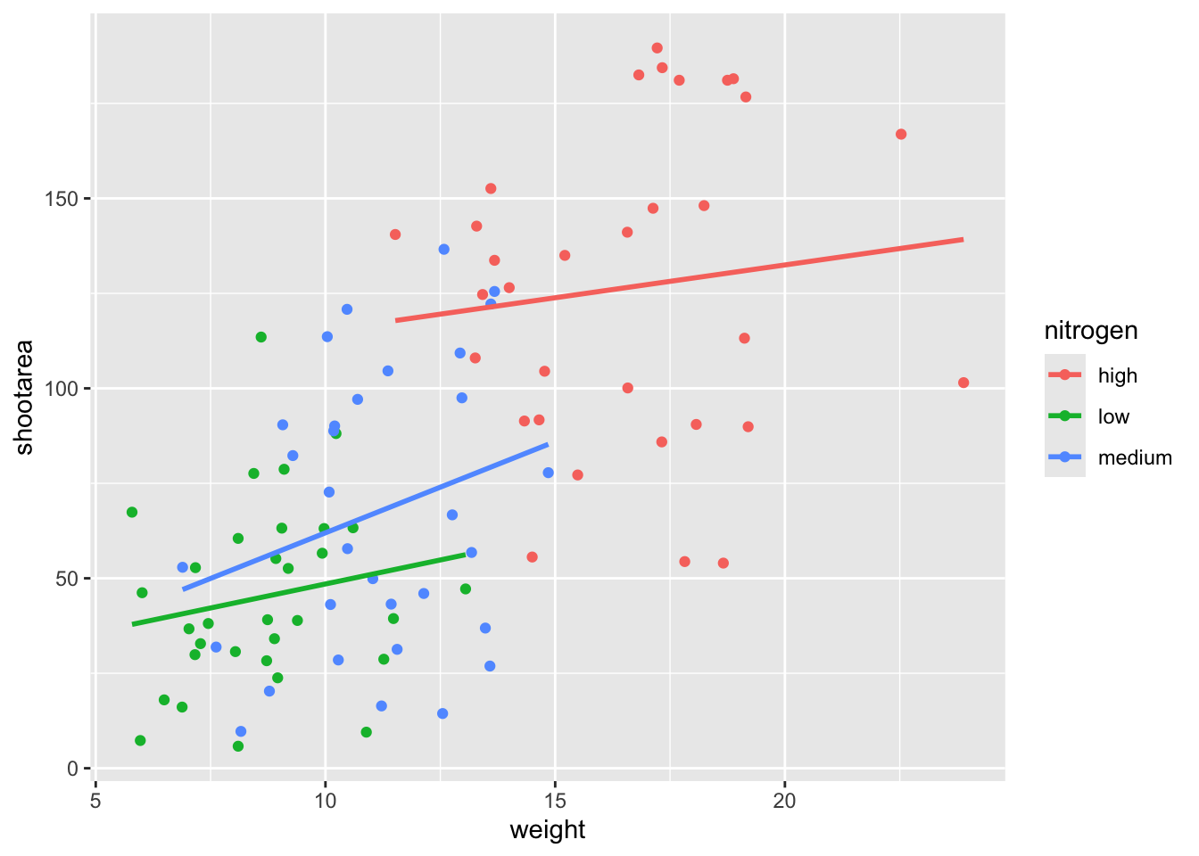
This figure is now what we would consider to be the typical ggplot2 figure (once you know to look for it, you’ll see it everywhere). We have specified some information, with only a few lines of code, yet we have something that looks quite attractive. While it’s not yet the “final figure” it’s perfectly suited for displaying the information we need from these data. You have now created your first “pure” ggplot using only the ‘data’, ‘mapping’ and ‘geom’ layers (as well as others indirectly).
Let’s keep going as we’re aiming for something a bit more “sophisticated”.
Wrapping grids
Having made our “pure” ggplot, the next big obstacle we’re going to tackle is the grid like layout of the “final figure” where our main figure has been split according to the treat and block variables, with new trends shown for each combination.
Each of these panels (technically “multiples”) are a great way to help other people understand what’s going on in the data. This is especially true with large datasets which can obscure subtle trends simply because so much data is overlaid on top of each other. When we split a single figure into multiples, the same axes are used for all multiples which serve to highlight shifts in the data (data in some multiples may have inherently higher or lower values for instance).
ggplot2 includes options for specifying the layout of plots using the ‘facets’ layer. We’ll start off by using facet_wrap() to show what this does. For facet_wrap() to work we need to specify a formula for how the facets will be defined (see ?facet_wrap for more details and also how to define facets without using a formula). In our example we want to use the factor treat to determine the layout so our formula would look like ~ treat. You can read ~ treat as saying “according to treatment”. Let’s see how it works:

ggplot(aes(x = weight, y = shootarea, colour = nitrogen), data = flower) +
  geom_point() +
  geom_smooth(method = "lm", se = FALSE) +
    # Splitting the single figure into multiple depending on treatment
  facet_wrap(~ treat)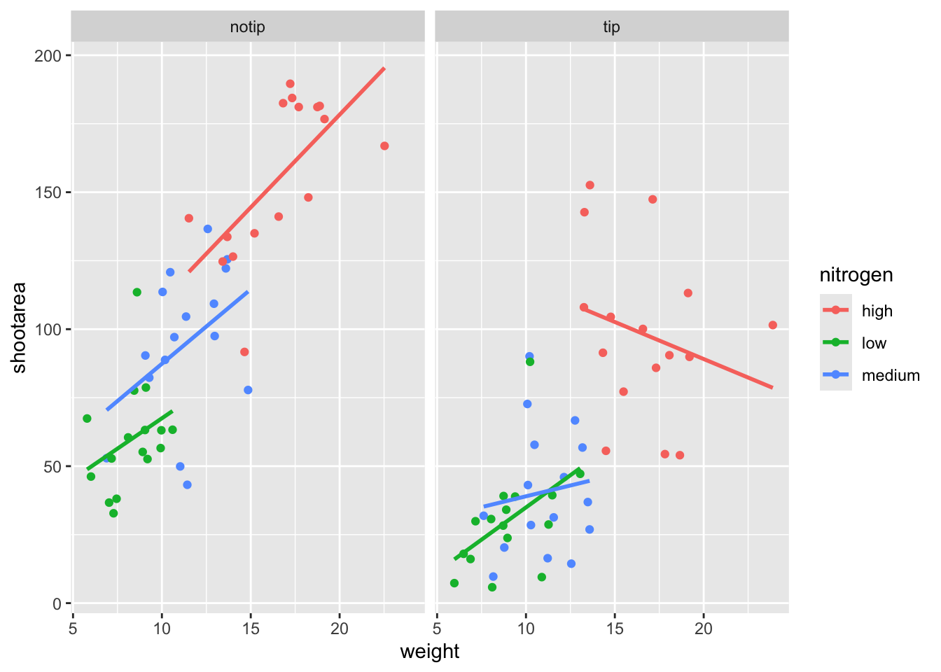
That’s pretty good. Notice how we can see the impact that the tip treatment has on shoot area now (generally lowering shoot area), where in the previous figure this was much more difficult to see?
While this looks pretty good, we are still missing information showing any potential effect of the different blocks. Given that facet_wrap() can use a formula, maybe we could simply include block in the formula? Remember that the block variable refers to the region in the greenhouse where the plants were grown. Let’s try it and see what happens.
ggplot(aes(x = weight, y = shootarea, colour = nitrogen), data = flower) +
  geom_point() +
  geom_smooth(method = "lm", se = FALSE) +
    # Adding "block" to formula
  facet_wrap(~ treat + block)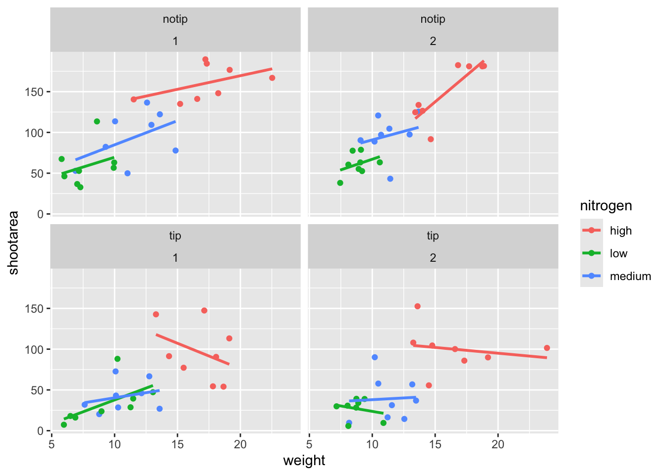
This facet layout is almost exactly what we want. Close but no cigar. In this case we actually want to be using facet_grid(), an alternative to facet_wrap(), which should put us back on track to make the “final figure”.
Play around: Try changing the formula to see what happens. Something like ~ treat + flowers or even ~ treat + block + flowers. The important thing to remember here is that facet_wrap() will create a new figure for each value in a variable. So when you wrap using a continuous variable like flowers, it makes a plot for every unique number of flowers counted. Be aware of what it is that you are doing, but never be scared to experiment. Mistakes are easily fixed in R - it’s not like a point and click programme where you’d have to go back through all those clicks to get the same figure produced.
Let’s try using facet_grid instead of facet_wrap to produce the following plot.
ggplot(aes(x = weight, y = shootarea, colour = nitrogen), data = flower) +
  geom_point() +
  geom_smooth(method = "lm", se = FALSE) +
    # Changing to facet_grid
  facet_grid(~ treat + block)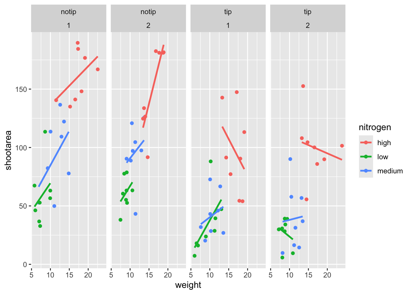
That’s disappointing. It’s pretty much the same as what we had before and is no closer to the “final figure”. To fix this we need to do to rearrange our formula so that we say that it is block in relation to treatment (not in combination with).
ggplot(aes(x = weight, y = shootarea, colour = nitrogen), data = flower) +
  geom_point() +
  geom_smooth(method = "lm", se = FALSE) +
    # Rearranging formula, block in relation to treatment
  facet_grid(block ~ treat)
And we’re there. Although the styling is not the same as the “final figure” this is showing the same core fundamental information.
Plotting multiple ggplots
While we’ve made multiples of the same figure, what if we wanted to take two completely different figures and plot them together in the same frame? As a demonstration, let’s plot the last figure we made and the “final figure” shown at the start of this chapter one on top of the other to see how they compare. To do this we are going to use a package called patchwork. First you will need to install and make the patchwork package available.
install.packages("patchwork")
library(patchwork)
An important note: For those who have used base R to produce their figures and are familiar with using par(mfrow = c(2,2)) (which allows plotting of four figures in two rows and two columns) be aware that this does not work for ggplot2 objects. Instead you will need to use either the patchwork package or alternative packages such as gridArrange or cowplot or covert the ggplot2 objects to grobs.
To plot both of the plots together we need to go back to our previous code and do something clever. We need to assign each figure to a separate object and then use these objects when we use patchwork. For instance, we can assigned our “final figure” plot to an object called final_figure (we’re not very imaginative!), you haven’t see the code yet so you’ll just have to take our word for it! You may see this method used a lot in other textbooks or online, especially when adding addition layers. Something like this:
p <- ggplot(df, mapping = aes(x = x, y = y))And later to add additional layers:
p + geom_point()We prefer not to use this approach here, as we like to always have the code visible to you while you’re reading this book. Anyway, let’s remind ourselves of the final figure.

We’ll now assign the code we wrote when creating our previous plot to an object called rbook_figure:
# Naming our figure object
rbook_figure <- ggplot(aes(x = weight, y = shootarea, colour = nitrogen), data = flower) +
  geom_point() +
  geom_smooth(method = "lm", se = FALSE) +
  facet_grid(block ~ treat)
Now when the code is run, the figure won’t be shown immediately. To show the figure we need to type the name of the object. We’ll do this at the same time as showing you how patchwork works.
An old headache when using ggplot2 was that it could be difficult to create a nested figure (different plots, or “multiples”, all part of the same dataset). patchwork resolves this problem very elegantly and simply. We have two immediate and simple options with patchwork; arrange figures on top of each other (specified with a /) or arrange figures side-by-side (specified with either a + or a |). Let’s try to plot both figures, one on top of the other.
rbook_figure / final_figure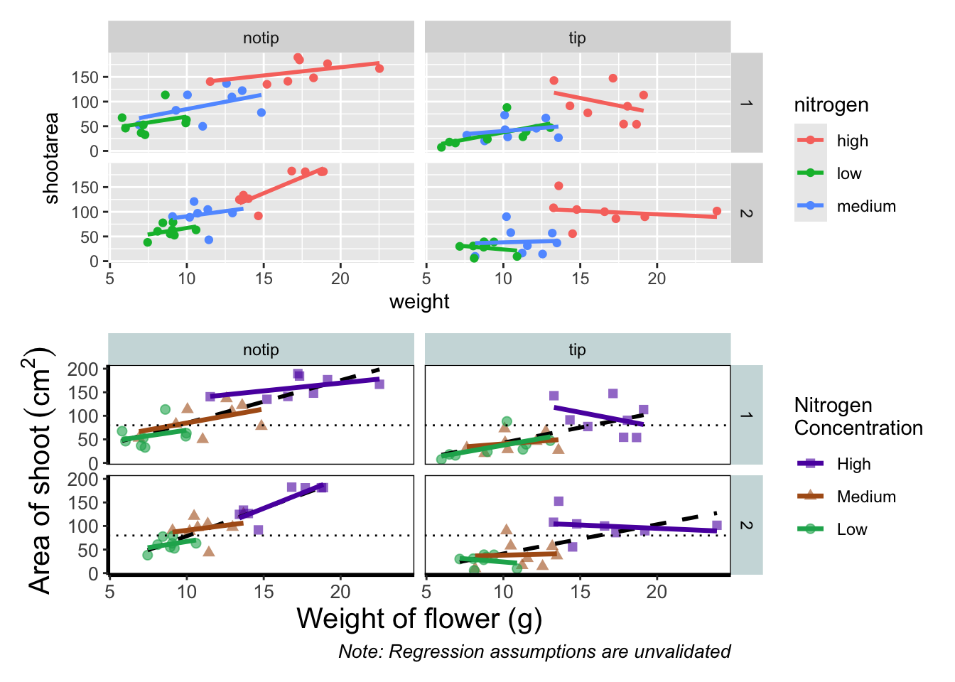
Play around: Try to create a side-by-side version of the above figure (hint: try the other operators [+, /, |]).
We can take this one step further and assign nested patchwork figures to an object and use this in turn to create labels for individual figures.
nested_compare <- rbook_figure / final_figure

nested_compare +
  plot_annotation(tag_levels = "A", tag_suffix = ")")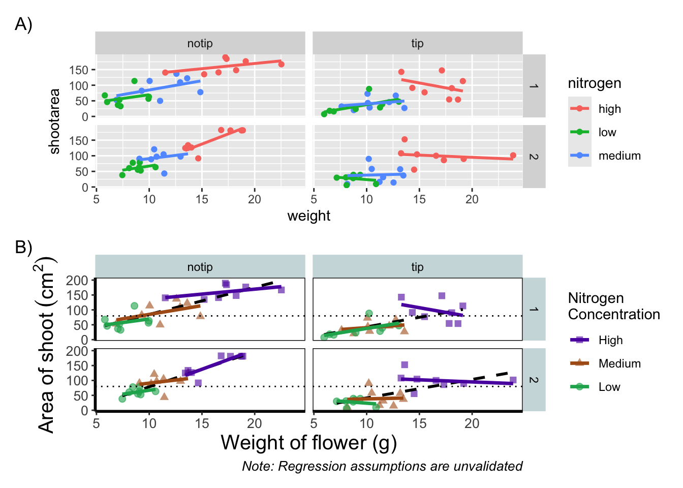
This is only the basics of what the patchwork package can do but there are many other uses. We won’t go into them in any great detail here, but later in the tips and tricks section we’ll show you some more cool features.
Make it your own
While we already have a great figure showing the main aspects of our data, it uses many default layer options. Whilst the default options are fine we may want to change them to get our plot looking exactly how we want it. Maybe we’re going to use this figure in a presentation and we want to make sure someone in the very back of the room can easily read the figure. Maybe we want to use our own colour scheme. Maybe we want to change the grey background to a nice bright neon pink. In essence, maybe we want to decide things for ourselves. This next section will go through how to customise the appearance of our figure.
Let’s start with the easier stuff, namely changing the size of the plotting symbols using the size = argument. Before we do, have a think about where we’d include this argument? Should it be in main call to ggplot() or in the geom_point() geom? Does size depend on a variable in our dataset and is therefore something we want displayed on the figure (meaning we should include it within aes())? Or is it merely changing the appearance of information?
Let’s include it in the geom_point geom
ggplot(aes(x = weight, y = shootarea, colour = nitrogen), data = flower) +
    # Including size argument to change the size of the points
    geom_point(size = 2) +
    geom_smooth(method = "lm", se = FALSE) +
    facet_grid(block ~ treat)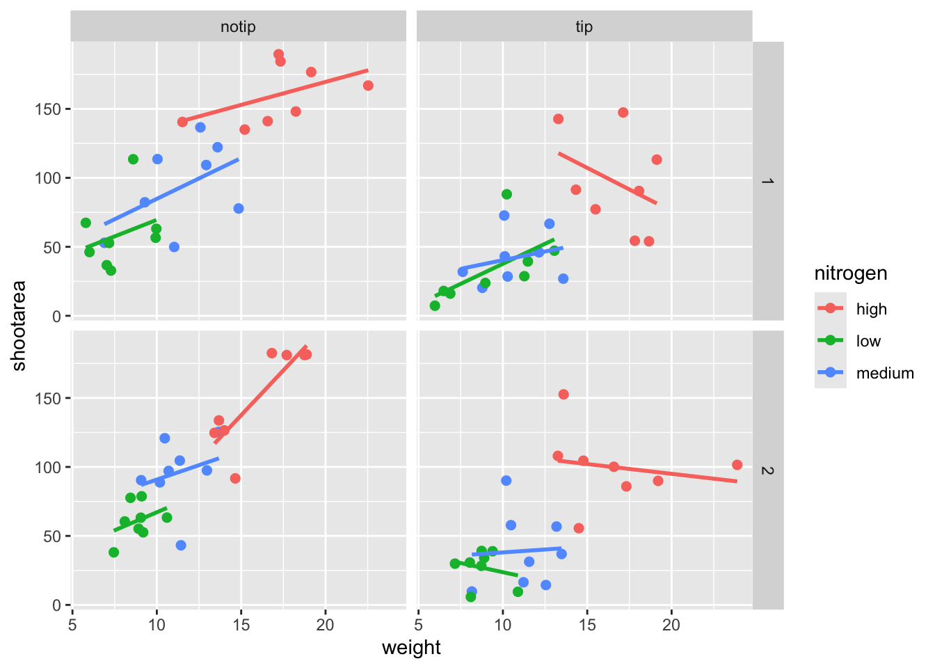
Pretty straight forward, we changed the size from the default of size = 1 to a value that we decide for ourselves. What happens if you included size in ggplot() or within the aes() of geom_point()?
If we wanted to change the shape of the plotting symbols to reflect the different nitrogen concentrations (low, high, medium), how do you think we’d do that? We’d use the shape = argument, but this time we need to include an aes() within geom_point() because we want to include specific information to be displayed on the figure.

ggplot(aes(x = weight, y = shootarea, colour = nitrogen), data = flower) +
    # Including shape argument to change the shape of the points
    geom_point(aes(shape = nitrogen), size = 2) +
    geom_smooth(method = "lm", se = FALSE) +
    facet_grid(block ~ treat)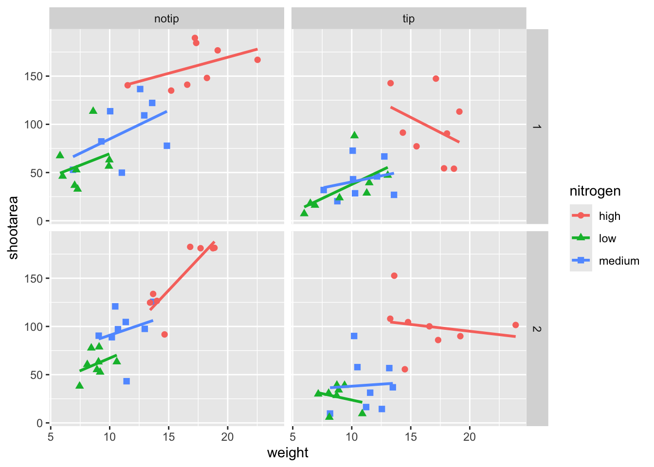
Try including shape = nitrogen without also including aes() and see what happens.
We’re edging our way closer to our “final figure”. Another thing we may want to be able to do is change the transparency of the points. While it’s not actually that useful here, changing the transparency of points is really valuable when you have lots of data resulting in clusters of points obscuring information. Doing this is easily accomplished using the alpha = argument. Again, ask yourself where you think the alpha = argument should be included (hint: you should put it in the geom_point geom!).
ggplot(aes(x = weight, y = shootarea, colour = nitrogen), data = flower) +
    # Including alpha argument to change the transparency of the points
    geom_point(aes(shape = nitrogen), size = 2, alpha = 0.6) +
    geom_smooth(method = "lm", se = FALSE) +
    facet_grid(block ~ treat)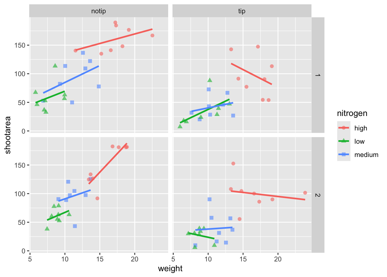
We can also include user defined labels for the x and y axis. There are a couple of ways to do this, but a more familiar way may be to use the same syntax as used in base R figures; using xlab() and ylab(). We’ll specify that these belong to the ggplot by using the + symbol.
ggplot(aes(x = weight, y = shootarea, colour = nitrogen), data = flower) +
    geom_point(aes(shape = nitrogen), size = 2, alpha = 0.6) +
    geom_smooth(method = "lm", se = FALSE) +
    facet_grid(block ~ treat) +
    # Adding layers for x and y labels
    xlab("Weight of flower (g)") +
    ylab("Area of shoot (cm^2)")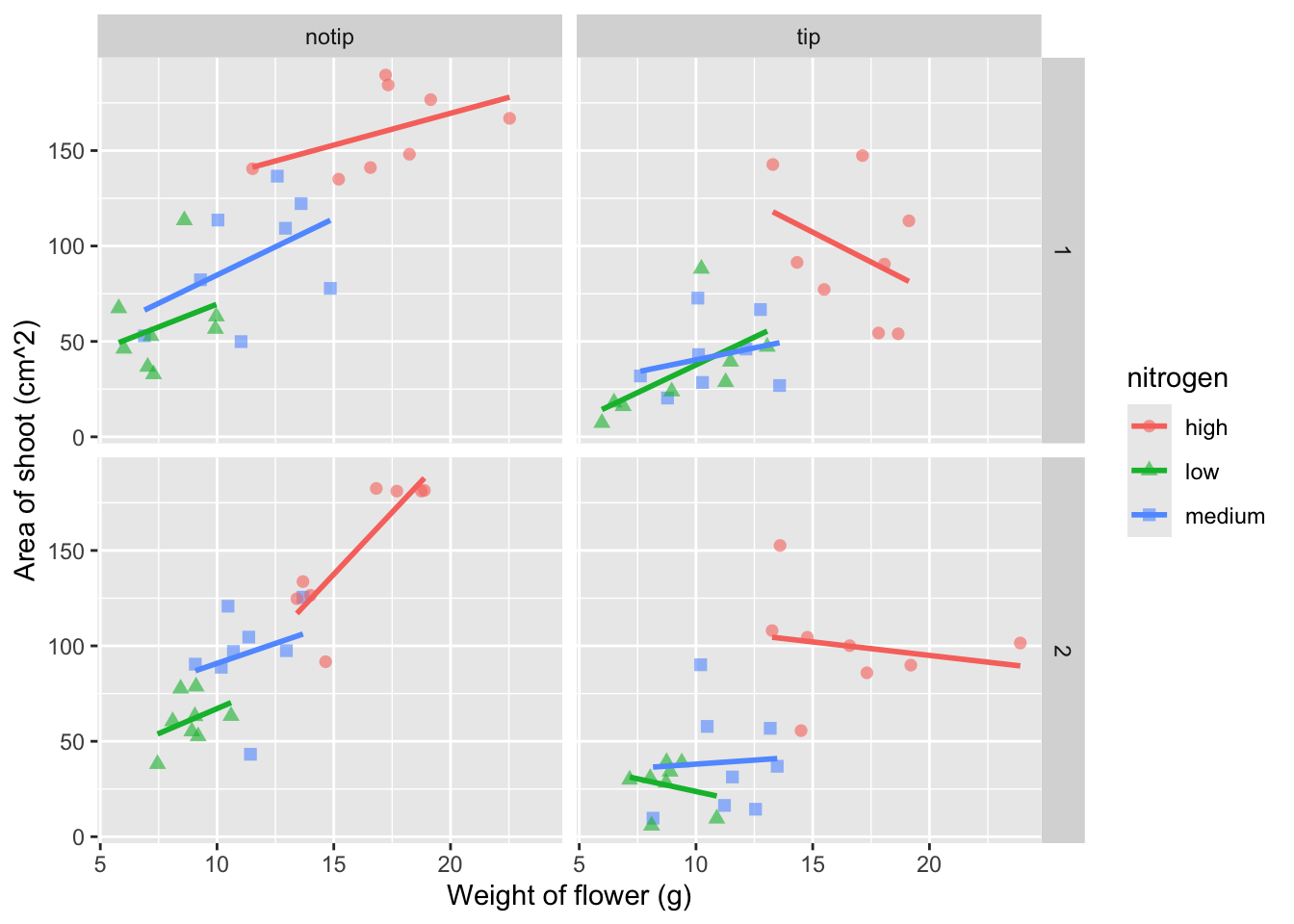
Great. Just as we wanted, though getting the “(cm^2)” to show the square as a superscript would be ideal. Here, we’re going to accomplish that using a function which is part of base R called bquote() which allows for special characters to be shown.
ggplot(aes(x = weight, y = shootarea, colour = nitrogen), data = flower) +
    geom_point(aes(shape = nitrogen), size = 2, alpha = 0.6) +
    geom_smooth(method = "lm", se = FALSE) +
    facet_grid(block ~ treat) +
    xlab("Weight of flower (g)") +
    # Using bquote to get mathematically correct formatting
    ylab(bquote("Area of shoot"~(cm^2)))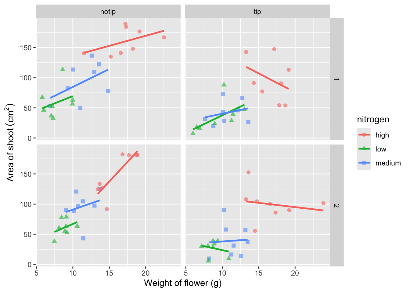
Let’s now work on the legend title while also including a caption to warn people looking at the figure to treat the trend lines with caution. We’ll use a new layer called labs(), short for labels, which we could have also used for specifying the x and y axes labels (we didn’t only for demonstration purposes, but give it a shot). labs() is a fairly straightforward function. Have a look at the help file (using ?labs) to see which arguments are available. We’ll be using caption = argument for our caption, but notice that there isn’t a single simple argument for legend =? That’s because the legend actually contains multiple pieces of information; such as the colour and shape of the symbols. So instead of legend = we’ll use colour = and shape =. Here’s how we do it:
ggplot(aes(x = weight, y = shootarea, colour = nitrogen), data = flower) +
    geom_point(aes(shape = nitrogen), size = 2, alpha = 0.6) +
    geom_smooth(method = "lm", se = FALSE) +
    facet_grid(block ~ treat) +
    xlab("Weight of flower (g)") +
    ylab(bquote("Area of shoot"~(cm^2))) +
    # Adding labels for shape, colour and a caption
    labs(shape = "Nitrogen Concentration", colour = "Nitrogen Concentration",
             caption = "Regression assumptions are unvalidated")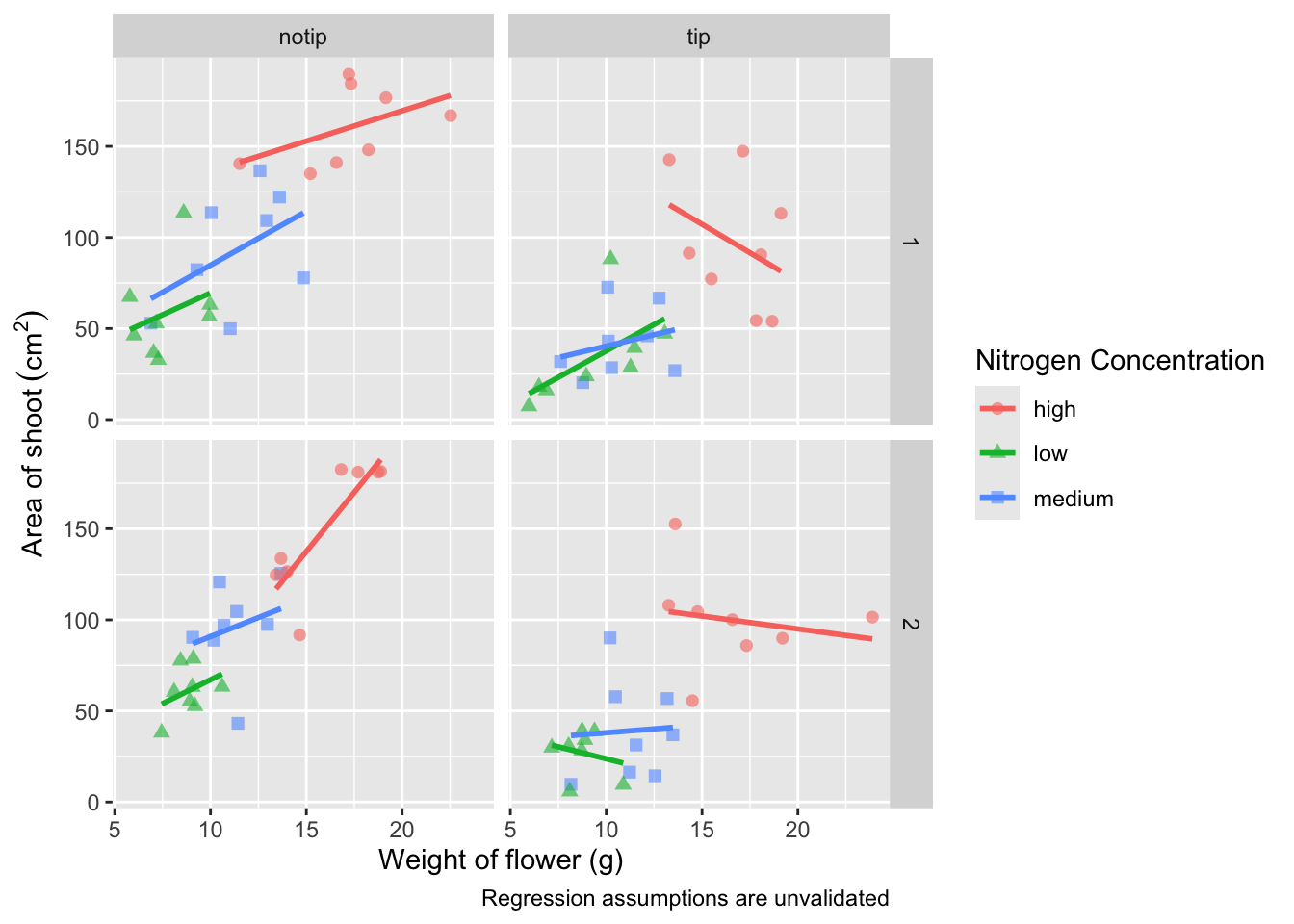
Play around: Try removing colour = or shape = from labs() to see what happens. The resulting legends are why we need to specify both colour and shape (and call it the same thing).
Now’s a good time to introduce the \n. This is a base R feature that tells R that a string should be continued on a new line. We can use that with “Nitrogen Concentration” so that the legend title becomes more compact.
ggplot(aes(x = weight, y = shootarea, colour = nitrogen), data = flower) +
    geom_point(aes(shape = nitrogen), size = 2, alpha = 0.6) +
    geom_smooth(method = "lm", se = FALSE) +
    facet_grid(block ~ treat) +
    xlab("Weight of flower (g)") +
    ylab(bquote("Area of shoot"~(cm^2))) +
    # Including \n to split legend title over two lines
    labs(shape = "Nitrogen\nConcentration", colour = "Nitrogen\nConcentration",
             caption = "Regression assumptions are unvalidated")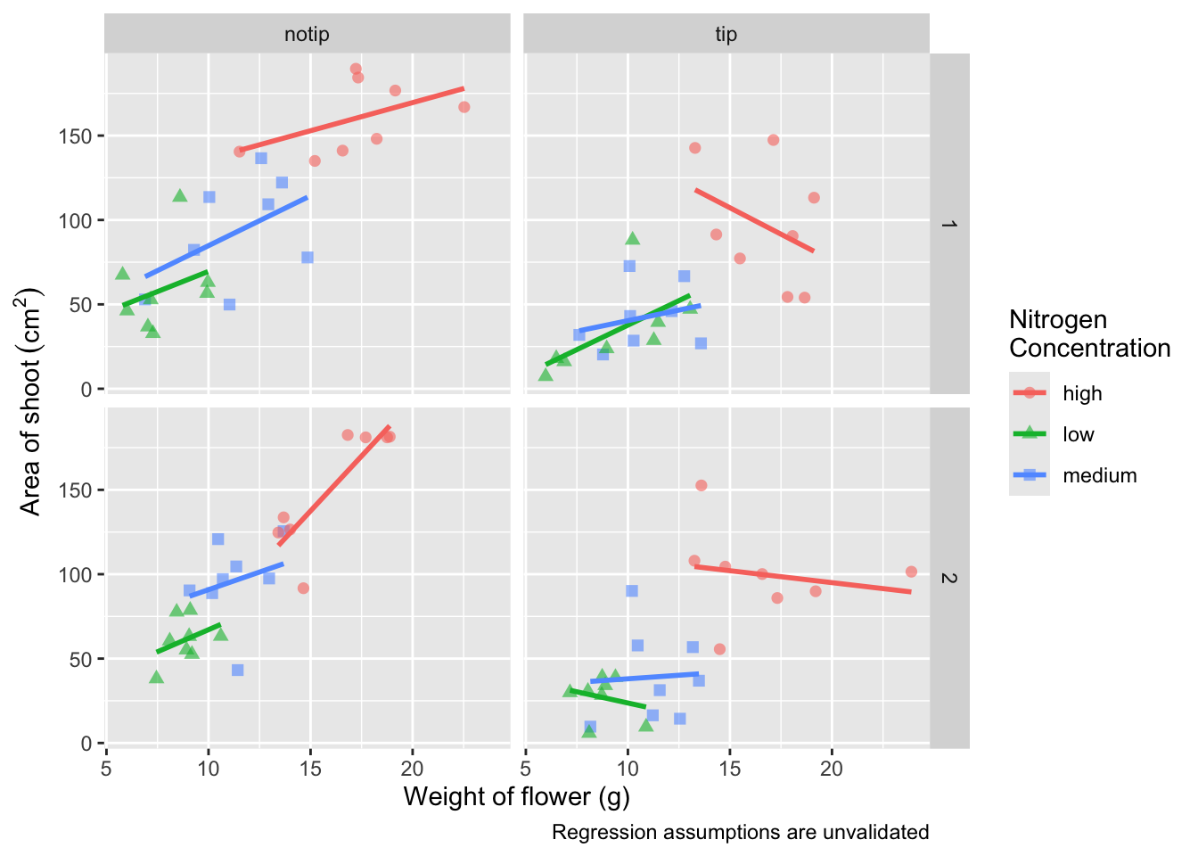
We can now move onto some more wholesale-stylistic choices using the themes layer.
Setting the theme
Themes control the general style of a ggplot (things like the background colour, size of text etc.) and comes with a whole bunch of predefined themes. Let’s play around with themes using some skills we’ve already learnt; assigning plots to an object and plotting multiple ggplots in a single figure using patchwork. We assign themes by creating a new layer with the general notation - theme_NameOfTheme(). For example, to use the theme_classic, theme_bw, theme_minimal and theme_light themes

classic <- ggplot(aes(x = weight, y = shootarea, colour = nitrogen), data = flower) +
    geom_point(aes(shape = nitrogen), size = 2, alpha = 0.6) +
    geom_smooth(method = "lm", se = FALSE) +
    facet_grid(block ~ treat) +
    xlab("Weight of flower (g)") +
    ylab(bquote("Area of shoot"~(cm^2))) +
    labs(shape = "Nitrogen\nConcentration", colour = "Nitrogen\nConcentration",
             caption = "Regression assumptions are unvalidated") +
    # Classic theme
    theme_classic()

bw <- ggplot(aes(x = weight, y = shootarea, colour = nitrogen), data = flower) +
    geom_point(aes(shape = nitrogen), size = 2, alpha = 0.6) +
    geom_smooth(method = "lm", se = FALSE) +
    facet_grid(block ~ treat) +
    xlab("Weight of flower (g)") +
    ylab(bquote("Area of shoot"~(cm^2))) +
    labs(shape = "Nitrogen\nConcentration", colour = "Nitrogen\nConcentration",
             caption = "Regression assumptions are unvalidated") +
    # Black and white theme
    theme_bw()

minimal <- ggplot(aes(x = weight, y = shootarea, colour = nitrogen), data = flower) +
    geom_point(aes(shape = nitrogen), size = 2, alpha = 0.6) +
    geom_smooth(method = "lm", se = FALSE) +
    facet_grid(block ~ treat) +
    xlab("Weight of flower (g)") +
    ylab(bquote("Area of shoot"~(cm^2))) +
    labs(shape = "Nitrogen\nConcentration", colour = "Nitrogen\nConcentration",
             caption = "Regression assumptions are unvalidated") +
    # Minimal theme
    theme_minimal()

light <- ggplot(aes(x = weight, y = shootarea, colour = nitrogen), data = flower) +
    geom_point(aes(shape = nitrogen), size = 2, alpha = 0.6) +
    geom_smooth(method = "lm", se = FALSE) +
    facet_grid(block ~ treat) +
    xlab("Weight of flower (g)") +
    ylab(bquote("Area of shoot"~(cm^2))) +
    labs(shape = "Nitrogen\nConcentration", colour = "Nitrogen\nConcentration",
       caption = "Regression assumptions are unvalidated") +
    # Light theme
    theme_light()

(classic | bw) /
    (minimal | light)
In terms of finding a theme that most closely matches our “final figure”, it’s probably going to be theme_classic(). There are additional themes available to you, and even more available online. ggthemes is a package which contains many more themes for you to use. The BBC even have their own ggplot2 theme called “BBplot” which they use when making their own figures (while good, we don’t like it too much for scientific figures). Indeed, you can even make your own theme which is what we’ll work on next. To begin with, we’ll have a look to see how theme_classic() was coded. We can do that easily enough by just writing the function name without the parentheses for a bit more on this).
theme_classic
function (base_size = 11, base_family = "", base_line_size = base_size/22,
    base_rect_size = base_size/22)
{
    theme_bw(base_size = base_size, base_family = base_family,
        base_line_size = base_line_size, base_rect_size = base_rect_size) %+replace%
        theme(panel.border = element_blank(), panel.grid.major = element_blank(),
            panel.grid.minor = element_blank(), axis.line = element_line(colour = "black",
                linewidth = rel(1)), strip.background = element_rect(fill = "white",
                colour = "black", linewidth = rel(2)), complete = TRUE)
}
<bytecode: 0x1507ae400>
<environment: namespace:ggplot2>
Let’s use this code as the basis for our own theme and modify it according to our needs. We’ll call the theme, theme_rbook. Not all of the options will immediately make sense, but don’t worry about this too much for now. Just know that the settings we’re putting in place are:
- Font size for axis titles = 13
- Font size for x axis text = 10
- Font size for y axis text = 10
- Font for caption = 10 and italics
- Background colour = white
- Background border = black
- Axis lines = black
- Strip colour (for facets) = light blue
- Strip text colour (for facets) = black
- Legend box colours = No colour
This is by no means an exhaustive list of features you can specify in your own theme, but this will get you started. Of course, there’s no need to use a personalised theme as the pre-built options are perfectly suitable.
theme_rbook <- function(base_size = 13, base_family = "", base_line_size = base_size/22,
                         base_rect_size = base_size/22) {
  theme(
    axis.title = element_text(size = 13),
    axis.text.x = element_text(size = 10),
    axis.text.y = element_text(size = 10),
    plot.caption = element_text(size = 10, face = "italic"),
    panel.background = element_rect(fill="white"),
    axis.line = element_line(size = 1, colour = "black"),
    strip.background =element_rect(fill = "#cddcdd"),
    panel.border = element_rect(colour = "black", fill=NA, size=0.5),
        strip.text = element_text(colour = "black"),
        legend.key=element_blank()
  )
}
theme_rbook() is now available for us to use just like any other theme. Let’s try remaking our figure using our new theme.
ggplot(aes(x = weight, y = shootarea, colour = nitrogen), data = flower) +
    geom_point(aes(shape = nitrogen), size = 2, alpha = 0.6) +
    geom_smooth(method = "lm", se = FALSE) +
    facet_grid(block ~ treat) +
    xlab("Weight of flower (g)") +
    ylab(bquote("Area of shoot"~(cm^2))) +
    labs(shape = "Nitrogen\nConcentration", colour = "Nitrogen\nConcentration",
             caption = "Regression assumptions are unvalidated") +
    # Updated theme to our theme_rbook
    theme_rbook()   # use our new theme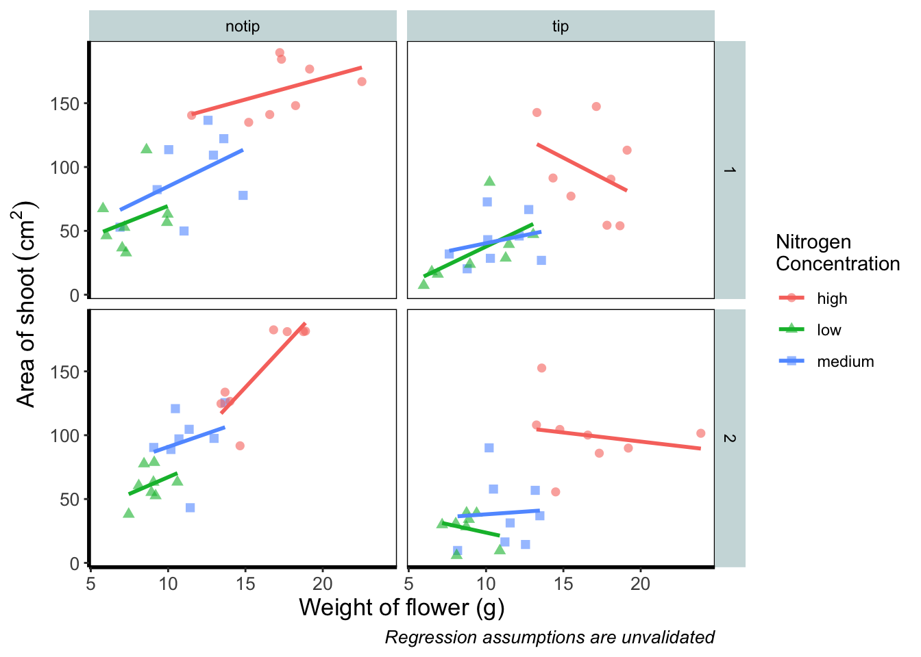
Prettification
We’ve pretty much replicated our “final figure”. We just have a few final adjustments to make, and we’ll do so in order of difficulty.
Let’s remind ourselves of what that “final figure” looked like. Remember, since we’ve previously stored the figure as an object called final_figure we can just type that into the console and pull up the figure.
final_figure +
    labs(title = "Reminder of the final figure")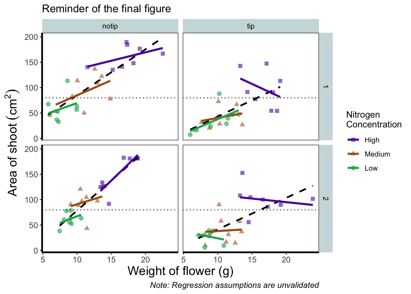
Let’s begin the final push by including that dashed horizontal line at the average shoot area, at about 80, on our y axis. This represents the overall mean area of a shoot, regardless of nitrogen concentration, treatment, or block. To draw a horizontal line we use a geom called geom_hline(), and the most important thing we need to specify is the y intercept value (in this case the mean area of a shoot). We can also change the type of line using the argument linetype = and also the colour (as we did before). Let’s see how it works.

ggplot(aes(x = weight, y = shootarea, colour = nitrogen), data = flower) +
    geom_point(aes(shape = nitrogen), size = 2, alpha = 0.6) +
    geom_smooth(method = "lm", se = FALSE) +
    facet_grid(block ~ treat) +
    xlab("Weight of flower (g)") +
    ylab(bquote("Area of shoot"~(cm^2))) +
    labs(shape = "Nitrogen\nConcentration", colour = "Nitrogen\nConcentration",
             caption = "Regression assumptions are unvalidated") +
    # Added a horizontal line using geom_hline
    geom_hline(aes(yintercept = mean(shootarea)), size = 0.5, colour = "black", linetype = 3) +

    theme_rbook()
Notice how we included the function mean(shootarea) within the geom_hline() function? We could also do that externally to the ggplot2 code and get the same result.
mean(flower$shootarea)
## [1] 79.78333
ggplot(aes(x = weight, y = shootarea, colour = nitrogen), data = flower) +
    geom_point(aes(shape = nitrogen), size = 2, alpha = 0.6) +
    geom_smooth(method = "lm", se = FALSE) +
    facet_grid(block ~ treat) +
    xlab("Weight of flower (g)") +
    ylab(bquote("Area of shoot"~(cm^2))) +
    labs(shape = "Nitrogen\nConcentration", colour = "Nitrogen\nConcentration",
             caption = "Regression assumptions are unvalidated") +
    # Manually entering mean value
    geom_hline(aes(yintercept = 79.8), size = 0.5, colour = "black", linetype = 3) +

    theme_rbook()
Exactly the same figure but produced in a slightly different way (the point being that there are always multiple ways to get what you want).
Now let’s tackle that “overall” nitrogen effect. This overall line is effectively the figure we produced much earlier when we learnt how to include a line of best fit from a linear model. However, we are already using geom_smooth(), surely we can’t use it again? This may shock and/or surprise you so please ensure you are seated. You can use geom_smooth() again. In fact you can use it as many times as you want. You can use any layer as many times as you want! Isn’t the world full of wonderful miracles? … Anyway, here’s the code…
ggplot(aes(x = weight, y = shootarea, colour = nitrogen), data = flower) +
    geom_point(aes(shape = nitrogen), size = 2, alpha = 0.6) +
    geom_smooth(method = "lm", se = FALSE) +
    # Adding a SECOND geom_smooth :O
    geom_smooth(method = "lm", se = FALSE, linetype = 2, alpha = 0.6, colour = "black") +
    facet_grid(block ~ treat) +
    xlab("Weight of flower (g)") +
    ylab(bquote("Area of shoot"~(cm^2))) +
    labs(shape = "Nitrogen\nConcentration", colour = "Nitrogen\nConcentration",
             caption = "Regression assumptions are unvalidated") +
    geom_hline(aes(yintercept = 79.8), size = 0.5, colour = "black", linetype = 3) +
    theme_rbook()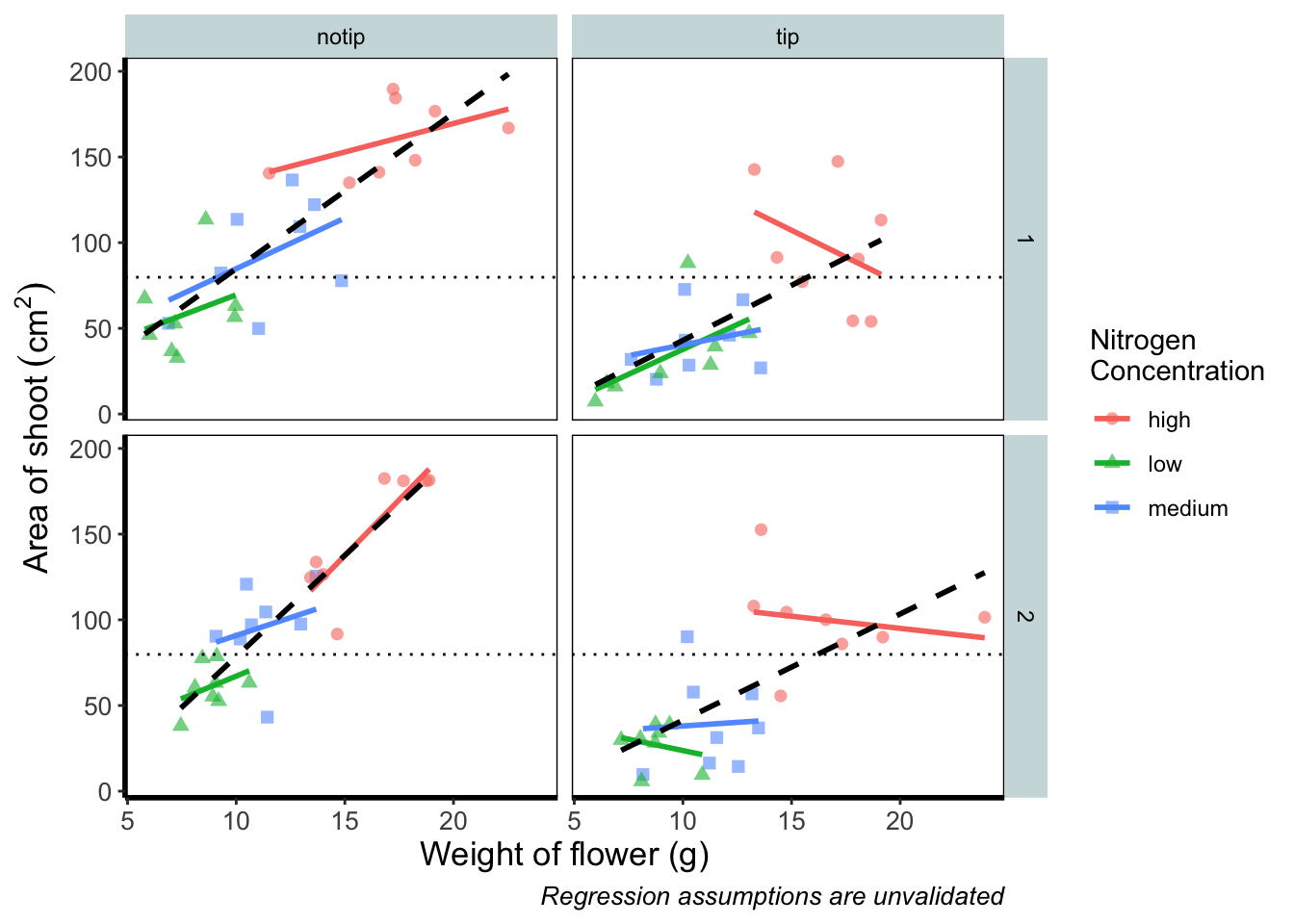
That’s great! But you should be asking yourself why that worked. Why when we specified the first geom_smooth() did it draw 3 lines, whereas the second time we used geom_smooth() it just drew a single line? The secret lies in a “conflict” (it isn’t actually a conflict but that’s what we’ll call it) between the colour specified in the main call to ggplot() and the colour specified in the second geom_smooth(). Notice how in the second we’ve specifically told ggplot2 that the colour will be black, while prior to this it drew lines based on the number of groups (or colours) in nitrogen? In “overriding” the universal ggplot() with a geom specific argument we’re able to get ggplot2 to plot what we want.
The only things left to do are to change the colour and the shape of the points to something of our choosing and include information on the “overall” trend line in the legend. We’ll begin with the former; changing colour and shape to something we specifically want. When we first started using ggplot2 this was the thing which caused us the most difficulty. We think the reason is, that to manually change the colours actually requires an additional layer, where we assumed this would be done in either the main call to ggplot() or in a geom.
Instead of doing this within the specific geom, we’ll use scale_colour_manual() as well as scale_shape_manual(). Doing it this way will allow us to do two things at once; change the shape and colour to our choosing, and assign labels to these (much like what we did with xlab() and ylab()). Doing so is not too complex but will require nesting a function (c()) within our scale_colour_manual and scale_shape_manual functions for a reminder on the concatenate function (c()) if you’ve forgotten).
Choosing colours can be fiddly. We’ve found using a colour wheel helps with this step. You can always use Google to find an interactive colour wheel, or use Google’s Colour picker. Any decent website should give you a HEX code, something like: #5C1AAE which is a “code” representation of a colour. Alternatively, there are colour names which R and ggplot2 will also understand (e.g. “firebrick4”). Having chosen our colours using whichever means, let’s see how we can do it:

ggplot(aes(x = weight, y = shootarea, colour = nitrogen), data = flower) +
    geom_point(aes(shape = nitrogen), size = 2, alpha = 0.6) +
    geom_smooth(method = "lm", se = FALSE) +
    geom_smooth(method = "lm", se = FALSE, linetype = 2, alpha = 0.6, colour = "black") +
    facet_grid(block ~ treat) +
    xlab("Weight of flower (g)") +
    ylab(bquote("Area of shoot"~(cm^2))) +
    labs(shape = "Nitrogen\nConcentration", colour = "Nitrogen\nConcentration",
             caption = "Regression assumptions are unvalidated") +
    geom_hline(aes(yintercept = 79.8), size = 0.5, colour = "black", linetype = 3) +
    # Setting colour and associated labels
    scale_colour_manual(values = c("#5C1AAE", "#AE5C1A", "#1AAE5C"),
       labels = c("High", "Medium", "Low")) +
    # Setting shape and associated labels
    scale_shape_manual(values = c(15,17,19),
       labels = c("High", "Medium", "Low")) +

    theme_rbook()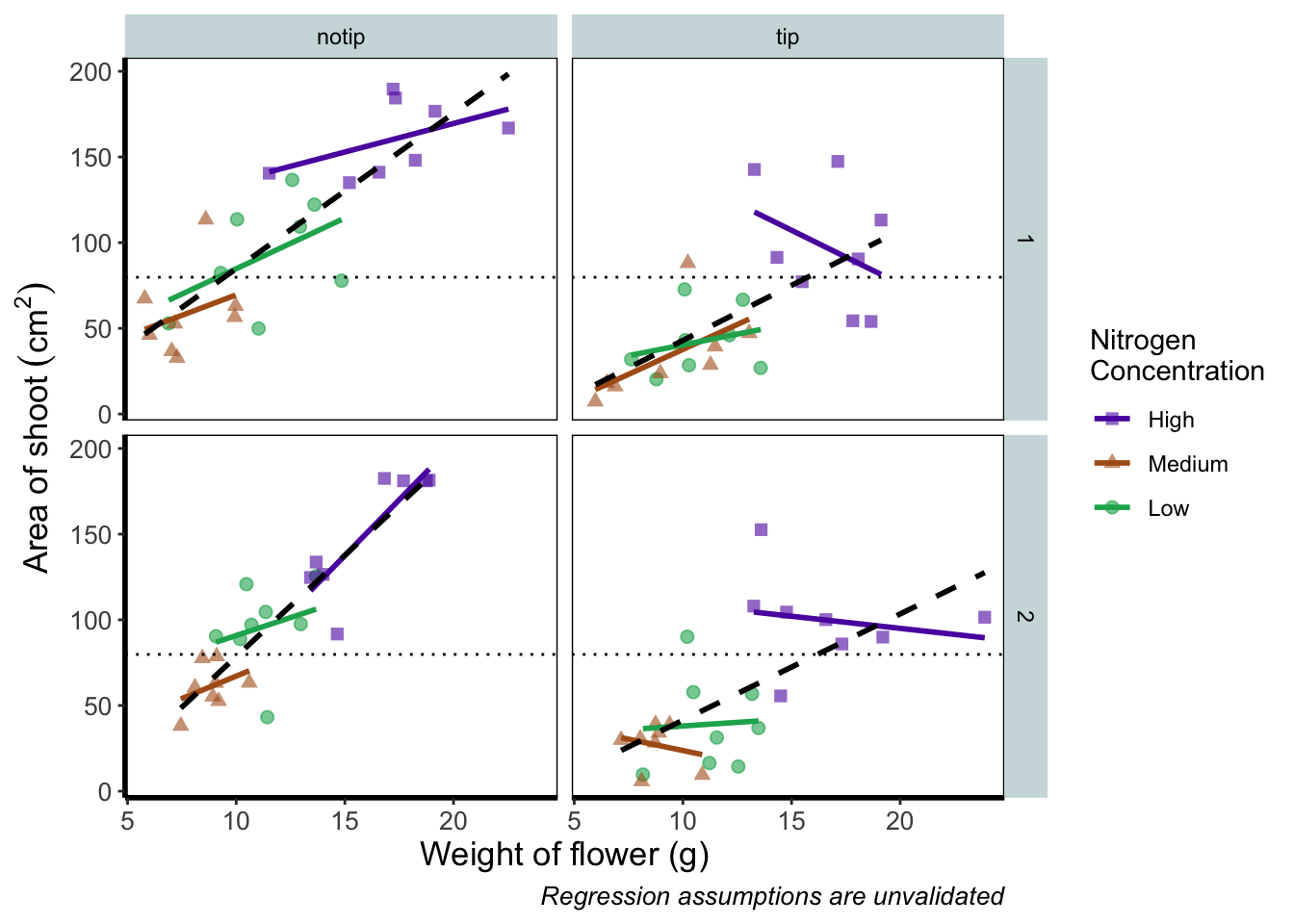
To make sense of that code (or any code for that matter) try running it piece by piece. For instance in the above code, if we run c("#5C1AAE", "#AE5C1A", "#1AAE5C") we’ll get a list of those strings. That list is then passed on to scale_colour_manual() as the colours we wish to use. Since we only have three nitrogen concentrations, it will use these three colours. Try including an additional colour in the list and see what happens (if you place the new colour at the end of the list, nothing will happen since it will use the first three colours of the list - try adding it to the start of the list). The same is true for scale_shape_manual().
But if you’re paying close attention you’ll notice that there’s a mistake with the figure now. What should be labelled “Low” is actually labelled “Medium” (the green points and line are our low nitrogen concentration, but ggplot2 is saying that it’s purple). ggplot2 hasn’t made a mistake here, we have. Remember that code is purely logical. It will do explicitly what it is told to do, and in this case we’ve told it to call the labels High, Medium and Low. We could have just as easily told ggplot2 to call them Pretoria, Tokyo, and Copenhagen. The lesson here is to always be critical of what your outputs are. Double check everything you do.
So how do we fix this? We need to do a little data manipulation to rearrange our factors so that the order goes High, Medium, Low. Let’s do that:
flower$nitrogen <- factor(flower$nitrogen, levels = c("high", "medium", "low"))With that done, we can re-run our above code to get a correct figure and assign it the name “rbook_figure”.
rbook_figure <- ggplot(aes(x = weight, y = shootarea, colour = nitrogen), data = flower) +
    geom_point(aes(shape = nitrogen), size = 2, alpha = 0.6) +
    geom_smooth(method = "lm", se = FALSE) +
    geom_smooth(method = "lm", se = FALSE, linetype = 2, alpha = 0.6, colour = "black") +
    facet_grid(block ~ treat) +
    xlab("Weight of flower (g)") +
    ylab(bquote("Area of shoot"~(cm^2))) +
    labs(shape = "Nitrogen\nConcentration", colour = "Nitrogen\nConcentration",
             caption = "Regression assumptions are unvalidated") +
    geom_hline(aes(yintercept = 79.8), size = 0.5, colour = "black", linetype = 3) +
    scale_colour_manual(values = c("#5C1AAE", "#AE5C1A", "#1AAE5C"),
       labels = c("High", "Medium", "Low")) +
    scale_shape_manual(values = c(15,17,19),
       labels = c("High", "Medium", "Low")) +
    theme_rbook()

rbook_figure
And we’ve done it! Our final figure matches the “final figure” exactly. We can then save the final figure to our computer so that we can include it in a poster etc. The code for this is straightforward, but does require an understanding of file paths. To save ggplot figures to an external file we use the function ggsave.
This is the point when having assigned the code to the object named rbook_figure comes in handy. Doing so allows us to specify which figure to save within ggsave(). If we hadn’t specified which plot to save, ggsave() would instead save the last figure produced.
Other important arguments to take note of are: device = which tells ggplot2 what format we want to save the figure (in this case a pdf) though ggplot2 is often smart enough to guess this based on the extension we give our file name, so it is often redundant; units = which specifies the units used in width = and height =; width = and height = specify the width and height of figure (in this case in mm as specified using units =); dpi = which controls the resolution of the saved figure; and limitsize = which prevents accidentally saving a massive figure of 1 km x 1 km!
ggsave(filename = "areashoot_weight_facet.pdf", plot = rbook_figure, device = "pdf",
             path = "output", width = 250, height = 150, units = "mm",
             dpi = 500, limitsize = TRUE)
This concludes the worked example to reproduce our final figure. While absolutely not an exhaustive list of what you can do with ggplot2, this will hopefully help when you’re making your own from scratch or, perhaps likely when starting, copying ggplots made by other people (in which case hopefully this will help you understand what they’ve done).
Two sections follow this one. The first is simply a collection of tips and tricks that couldn’t quite make their way into this worked example, and the second section is a collection of different geometries to give you a feel for what’s possible. We would recommend only glancing through each section and coming back to them as and when you need to know how to do that particular thing.
Hopefully you’ve enjoyed reading through this Chapter, and more importantly, that it’s increased your confidence in making figures. Here are two final parting words of wisdom!. First, as we’ve said before, don’t fall into the trap of thinking your figures are superior to those who don’t use ggplot2. As we’ve mentioned previously, equivalent figures are possible in both base R and ggplot2. The only difference is how you get to those figures.
Secondly, don’t overcomplicate your figures. With regards to the final figure we produced here, we’ve gone back and forth as to whether we are guilty of this. The figure does contain a lot of information, drawing on information from five different variables, with one of those being presented in three different ways. We would be reluctant, for example, to include this in a presentation as it would likely be too much for an audience to fully appreciate in the 30 seconds to 1 minute that they’ll see it. In the end we decided it was worth the risk as it served as a nice demonstration. Fortunately, or unfortunately depending on your view, there are no hard and fast rules when it comes to making figures. Much of it will be at your discretion, so please ensure you give it some thought.
Tips and tricks
For this section we’ll use various versions of the final figure without including the facet_grid(). We do so only to allow the changes to be more apparent. With this plot, we’ll run through some tips and tricks that we wish we’d learnt when we started using ggplot2.
Statistics layer
The statistics layer is often ignored in favour of working solely with the geometry layer, as we’ve done above. The two are largely interchangeable, though the relative rareness of online help and discussions on the statistics layer seems to have relegated it to almost a state of anonymity. There is real value in at least understanding what the statistics layer is doing, even if you don’t ever need to make direct use of it. It is perhaps most clear what the statistical layer is doing in the early geom_smooth() figure we made.
ggplot(aes(x = weight, y = shootarea), data = flower) +
  geom_point() +
  geom_smooth(method = "lm", se = FALSE)
`geom_smooth()` using formula = 'y ~ x'
Nowhere in our dataset are there columns for either the y-intercept or the gradient needed to draw the straight line, yet we’ve managed to draw one. The statistics layer calculates these based on our data, without us necessarily knowing what we’ve done. It’s also the engine behind converting your data into counts for producing a bar chart, or densities for violin plots, or summary statistics for boxplots and so on.
It’s entirely possible that you’ll be able to use ggplot2 for the vast majority of you plotting without ever consulting the statistics layer in any more detail than we have here (simply by “calling” - unknowingly - to it via the geometry layer), but be aware that it exists.
If we wanted to recreate the above figure using the statistics layer we would do it like this:
ggplot(aes(x = weight, y = shootarea), data = flower) +
  geom_point() +
    # using stat_smooth instead of geom_smooth
  stat_smooth(geom = "smooth", method = "lm", se = FALSE)
While in this example it doesn’t make a difference which we use, in other cases we may want to use the calculated statistics in alternative ways. We won’t get into it, but see ?after_stat if you are interested.
Axis limits and zooms
Fairly often, you may want to limit the range of your axes. Maybe you want to focus a particular part of the data to really tease apart any patterns occurring there. Whatever the reason, it’s a useful skill, and with most things code related, there’s a couple of ways to do this. We’ll show two here; xlim() and ylim(), and coord_cartesian(). Using both of these we’ll set the x axis to only show data between 10 and 15 g and the y axis to only show the area of the shoot between 50 and 150 mm2. We’ll start with limiting the axes:

ggplot(aes(x = weight, y = shootarea), data = flower) +
    geom_point(aes(colour = nitrogen, shape = nitrogen), size = 2, alpha = 0.6) +
    geom_smooth(colour = "black", method = "lm", se = FALSE, linetype = 2, alpha = 0.6) +
    geom_smooth(aes(colour = nitrogen), method = "lm", se = FALSE, size = 1.2) +
    xlab("Weight of flower (g)") +
    ylab(bquote("Area of shoot"~(cm^2))) +
    geom_hline(aes(yintercept = 79.7833), size = 0.5, colour = "black", linetype = 3) +
    labs(shape = "Nitrogen\nConcentration", colour = "Nitrogen\nConcentration",
             caption = "Regression assumptions are unvalidated") +
    scale_colour_manual(values = c("#5C1AAE", "#AE5C1A", "#1AAE5C"),
         labels = c("High", "Medium", "Low")) +
    scale_shape_manual(values = c(15,17,19,21),
         labels = c("High", "Medium", "Low")) +
    theme_rbook() +
    # New x and y limits
    xlim(c(10, 15)) +
    ylim(c(50, 150))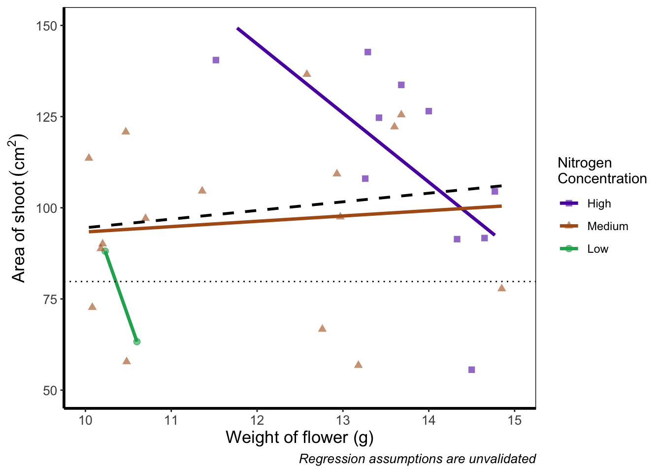
If you run this yourself you’ll see warning messages telling us that n rows contain either missing or non-finite values. That’s because we’ve essentially chopped out a huge part of our data using this method (everything outside of the ranges that we specified is “removed” from the data). As a result of doing this our lines have now completely changed direction. Notice that for low nitrogen concentration, the line is being drawn using only two points? This may, or may not be a problem depending on the aim we have, but we can use an alternative method; coord_cartesian().
coord_cartesian() works in much the same way, but instead of chopping out data, it instead zooms in. Doing so means that the entire dataset is maintained (and any trends are maintained).
ggplot(aes(x = weight, y = shootarea), data = flower) +
    geom_point(aes(colour = nitrogen, shape = nitrogen), size = 2, alpha = 0.6) +
    geom_smooth(colour = "black", method = "lm", se = FALSE, linetype = 2, alpha = 0.6) +
    geom_smooth(aes(colour = nitrogen), method = "lm", se = FALSE, size = 1.2) +
    xlab("Weight of flower (g)") +
    ylab(bquote("Area of shoot"~(cm^2))) +
    geom_hline(aes(yintercept = 79.7833), size = 0.5, colour = "black", linetype = 3) +
    labs(shape = "Nitrogen\nConcentration", colour = "Nitrogen\nConcentration",
             caption = "Regression assumptions are unvalidated") +
    scale_colour_manual(values = c("#5C1AAE", "#AE5C1A", "#1AAE5C"),
       labels = c("High", "Medium", "Low")) +
    scale_shape_manual(values = c(15,17,19,21),
       labels = c("High", "Medium", "Low")) +
    theme_rbook() +
    # Zooming in rather than chopping out
    coord_cartesian(xlim = c(10, 15),   ylim = c(50, 150))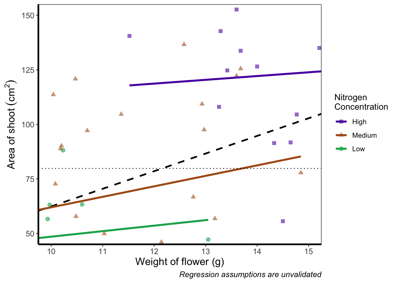
Notice now that the trends are maintained (as the lines are being informed by data which are off-screen). We would generally advise using coord_cartesian() as it protects you against possible misinterpretations.
Layering layers
Remember that ggplot2 works like painting. Let’s imagine we were one of the great renaissance painters. We’ve just finished the focal point of our painting, the half naked Duke of Toulouse looking moody or something. Now that we’ve finished painting the honourable Duke, we proceed to paint the background, a beautiful landscape showing the Pyrenees mountains in the distance. Unfortunately, in doing so we’ve painted over the Duke because the order of our layers was wrong. We get our heads chopped off, but learn a valuable lesson in the process: the order of layers matter.
The exact same is true in ggplot2 (minus the chopping off of heads, though your situation may vary). The layers are read and “painted” in order of their appearance in the code. If geom_point() comes before geom_col(), then your points may well end up being hidden. To fix this is easy, we simply need to move the layers up or down in the code. A useful tip for those using RStudio, is that you can move lines of code especially easily. Simply click on a line of code, hold down Alt and then press either the up or down arrows, and the entire line will move up or down as well. For multiple lines of code, simply highlight all those lines you want to move and press Alt + Up/Down arrow.
We’ll move both the points and the overall black dashed line down in the code so that they are superimposed over the nitrogen lines:
ggplot(aes(x = weight, y = shootarea), data = flower) +
    geom_smooth(aes(colour = nitrogen), method = "lm", se = FALSE, size = 1.2) +
    # Move one line down
    geom_point(aes(colour = nitrogen, shape = nitrogen), size = 2, alpha = 0.6) +
    geom_smooth(colour = "black", method = "lm", se = FALSE, linetype = 2, alpha = 0.6) +
    xlab("Weight of flower (g)") +
    ylab(bquote("Area of shoot"~(cm^2))) +
    geom_hline(aes(yintercept = 79.7833), size = 0.5, colour = "black", linetype = 3) +
    labs(shape = "Nitrogen\nConcentration", colour = "Nitrogen\nConcentration",
             caption = "Regression assumptions are unvalidated") +
    scale_colour_manual(values = c("#5C1AAE", "#AE5C1A", "#1AAE5C"),
       labels = c("High", "Medium", "Low")) +
    scale_shape_manual(values = c(15,17,19,21),
       labels = c("High", "Medium", "Low")) +
    theme_rbook()
It’s not the clearest example, but give it a shot with your own data.
Continuous colours
Instead of categorical colours, such as we’ve used for nitrogen concentration, what if instead we wanted a gradient? To illustrate this, we’ll remove the trend lines to highlight the changes we make. We’ll also be using the flowers variable (i.e. number of flowers) to specify the colour that points should be coloured. We have three options that we’ll use here; the default colour scheme, the scale_colour_gradient() scheme, and an alternative schemescale_colour_gradient2(). Remember that we’ll also need to change our label for the legend.
We’ll start with the default option. Here we only need to change nitrogen (which is a factor) to flowers (which is continuous) in the colour = argument within aes():
ggplot(aes(x = weight, y = shootarea), data = flower) +
    # Deleted geom_smooths for illustrative purposes only
  # (and also removed alpha argument from geom_point)
    geom_point(aes(colour = flowers, shape = nitrogen), size = 2) +
    xlab("Weight of flower (g)") +
    ylab(bquote("Area of shoot"~(cm^2))) +
    geom_hline(aes(yintercept = 79.7833), size = 0.5, colour = "black", linetype = 3) +
    # Changed colour argument label
    labs(shape = "Nitrogen\nConcentration", colour = "Number of\nFlowers",
             caption = "Regression assumptions are unvalidated") +
    scale_shape_manual(values = c(15,17,19,21),
       labels = c("High", "Medium", "Low")) +
    theme_rbook()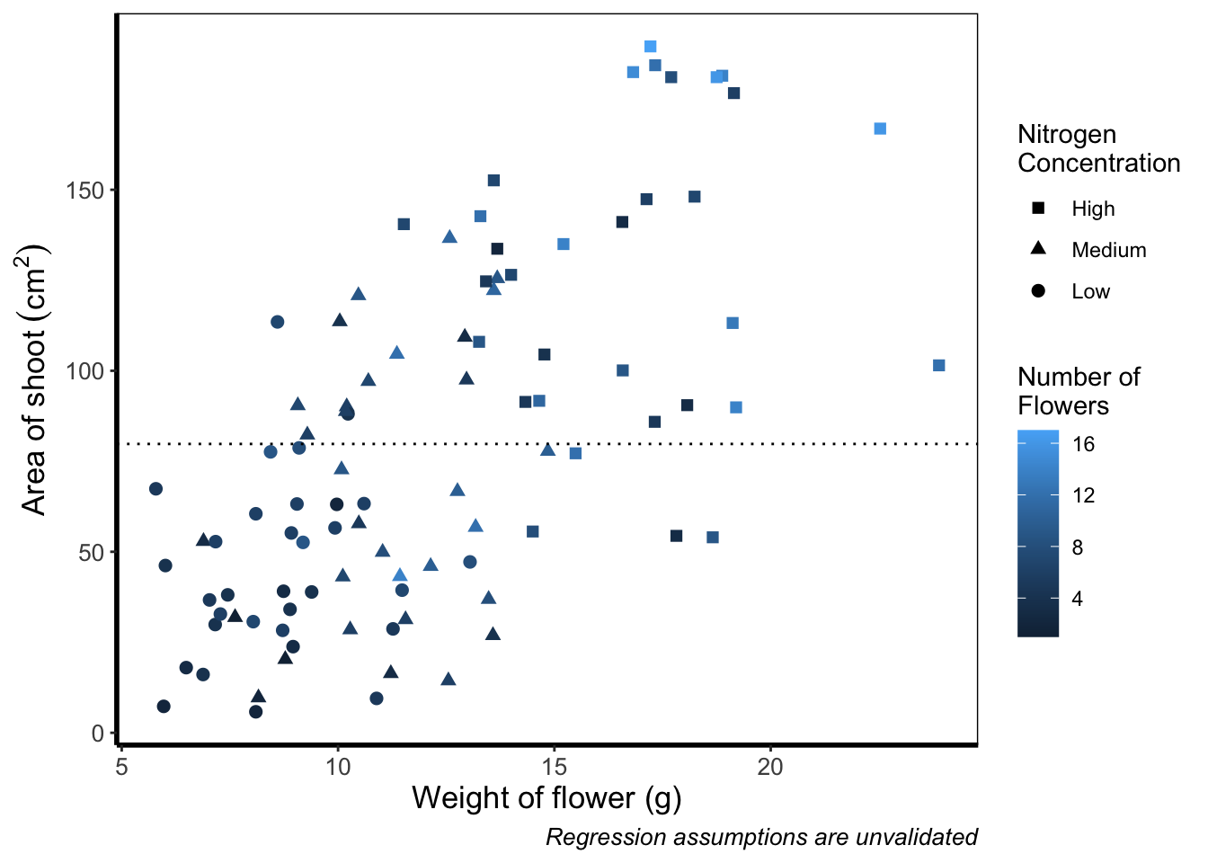
And as easily as that we have a colour gradient to show number of flowers. Dark blue shows low flower numbers and light blue shows higher flower numbers. While the code has worked, we have a hard time distinguishing between the different shades of blue. It would help ourselves (and our audience), if we changed the colours to something more noticeably different, using scale_colour_gradient(). This works much as scale_colour_manual() except that this time we specify the low = and high = values using arguments.
ggplot(aes(x = weight, y = shootarea), data = flower) +
    geom_point(aes(colour = flowers, shape = nitrogen), size = 2) +
    xlab("Weight of flower (g)") +
    ylab(bquote("Area of shoot"~(cm^2))) +
    geom_hline(aes(yintercept = 79.7833), size = 0.5, colour = "black", linetype = 3) +
    # Updated legend name for colour
    labs(shape = "Nitrogen\nConcentration", colour = "Number of\nFlowers",
             caption = "Regression assumptions are unvalidated") +
    scale_shape_manual(values = c(15,17,19,21),
       labels = c("High", "Medium", "Low")) +
    # Adding scale_colour_gradient
    scale_colour_gradient(low = "#9F00FF", high = "#FF9F00") +
    theme_rbook()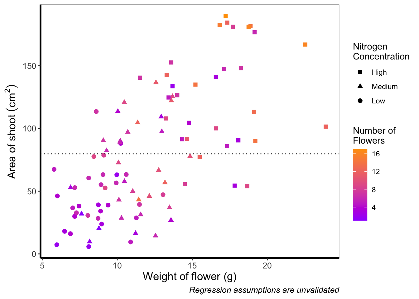
Although arguably better, we still struggle to spot the difference when there are between 5 and 12 flowers. Maybe having an additional colour would help those mid values stand out a bit more. The way we can do that here is to set a midpoint where the colours shift from green to blue to pink. Doing so might help us see the variation even more clearly. This is exactly what scale_colour_gradient2() allows. scale_colour_gradient2() works in much the same way as scale_colour_gradient() except that we have two additional arguments to worry about; midpoint = where we specify a value for the midpoint, and mid = where we state the colour the midpoint should take. We’ll set the midpoint using mean().
ggplot(aes(x = weight, y = shootarea), data = flower) +
    geom_point(aes(colour = flowers, shape = nitrogen), size = 2) +
    xlab("Weight of flower (g)") +
    ylab(bquote("Area of shoot"~(cm^2))) +
    geom_hline(aes(yintercept = 79.7833), size = 0.5, colour = "black", linetype = 3) +
    labs(shape = "Nitrogen\nConcentration", colour = "Number of\nFlowers",
             caption = "Regression assumptions are unvalidated") +
    scale_shape_manual(values = c(15,17,19,21),
       labels = c("High", "Medium", "Low")) +
    # Adding scale_colour_gradient2
    scale_colour_gradient2(midpoint = mean(flower$flowers),
       low = "#9F00FF", mid = "#00FF9F", high = "#FF9F00") +
    theme_rbook()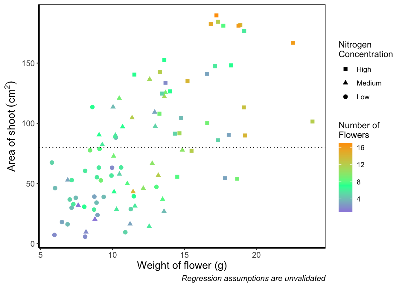
Definitely not our favourite figure. Perhaps if we add more colours, that will help things a bit (probably not but let’s do it anyway). We now move onto using scale_colour_gradientn(), which diverges slightly. Instead of specifying colours for low, mid, and/or high, here we’ll be specifying them using proportions within the values = argument. A common mistake with values =, within scale_colour_gradient(), is to assume (justifiably in our opinion) that we’d specify the actual numbers of flowers as our values. This is wrong. Try doing so and you’ll likely see a grey colour bar and grey points. Instead values = represent the proportional ranges where we want the colour to occupy. In the code below, we use 0, 0.25, 0.5, 0.75 and 1 as our proportions, corresponding to 4 colours (note that we have one fewer colour than proportions given as the colours occupy a range and not a value).
ggplot(aes(x = weight, y = shootarea), data = flower) +
    geom_point(aes(colour = flowers, shape = nitrogen), size = 2) +
    xlab("Weight of flower (g)") +
    ylab(bquote("Area of shoot"~(cm^2))) +
    geom_hline(aes(yintercept = 79.7833), size = 0.5, colour = "black", linetype = 3) +
    labs(shape = "Nitrogen\nConcentration", colour = "Number of\nFlowers",
             caption = "Regression assumptions are unvalidated") +
    scale_shape_manual(values = c(15,17,19,21),
       labels = c("High", "Medium", "Low")) +
    # Adding scale_colour_gradientn
    scale_colour_gradientn(colours = c("#1252ED", "#12ED3F", "#EDAD12", "#ED12C0"),
       values = c(0, 0.25, 0.5, 0.75, 1)) +
    theme_rbook()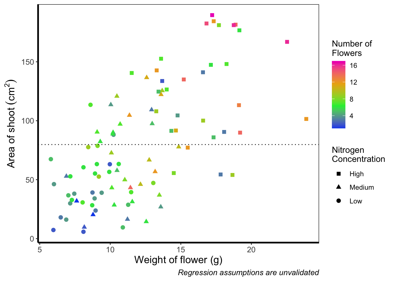
Slightly nauseating but it’s doing what we wanted it to do, so we shouldn’t really complain.
Size of points
Previously, we altered to size of points to be a constant number (e.g. size = 2). What if instead we wanted size to change according to a variable in our dataset? We can do this very easily by including a continuous variable with the size = argument.
ggplot(aes(x = weight, y = shootarea), data = flower) +
    # Moving size into aes and changing to a continuous variable
    geom_point(aes(colour = nitrogen, shape = nitrogen, size = height), alpha = 0.6) +
    geom_smooth(colour = "black", method = "lm", se = FALSE, linetype = 2, alpha = 0.6) +
    geom_smooth(aes(colour = nitrogen), method = "lm", se = FALSE, size = 1.2) +
    xlab("Weight of flower (g)") +
    ylab(bquote("Area of shoot"~(cm^2))) +
    geom_hline(aes(yintercept = 79.7833), size = 0.5, colour = "black", linetype = 3) +
    # Including size label
    labs(shape = "Nitrogen\nConcentration", colour = "Nitrogen\nConcentration",
             caption = "Regression assumptions are unvalidated",
             size = "Plant\nHeight (cm)") +
    scale_colour_manual(values = c("#5C1AAE", "#AE5C1A", "#1AAE5C"),
       labels = c("High", "Medium", "Low")) +
    scale_shape_manual(values = c(15,17,19,21),
       labels = c("High", "Medium", "Low")) +
    theme_rbook()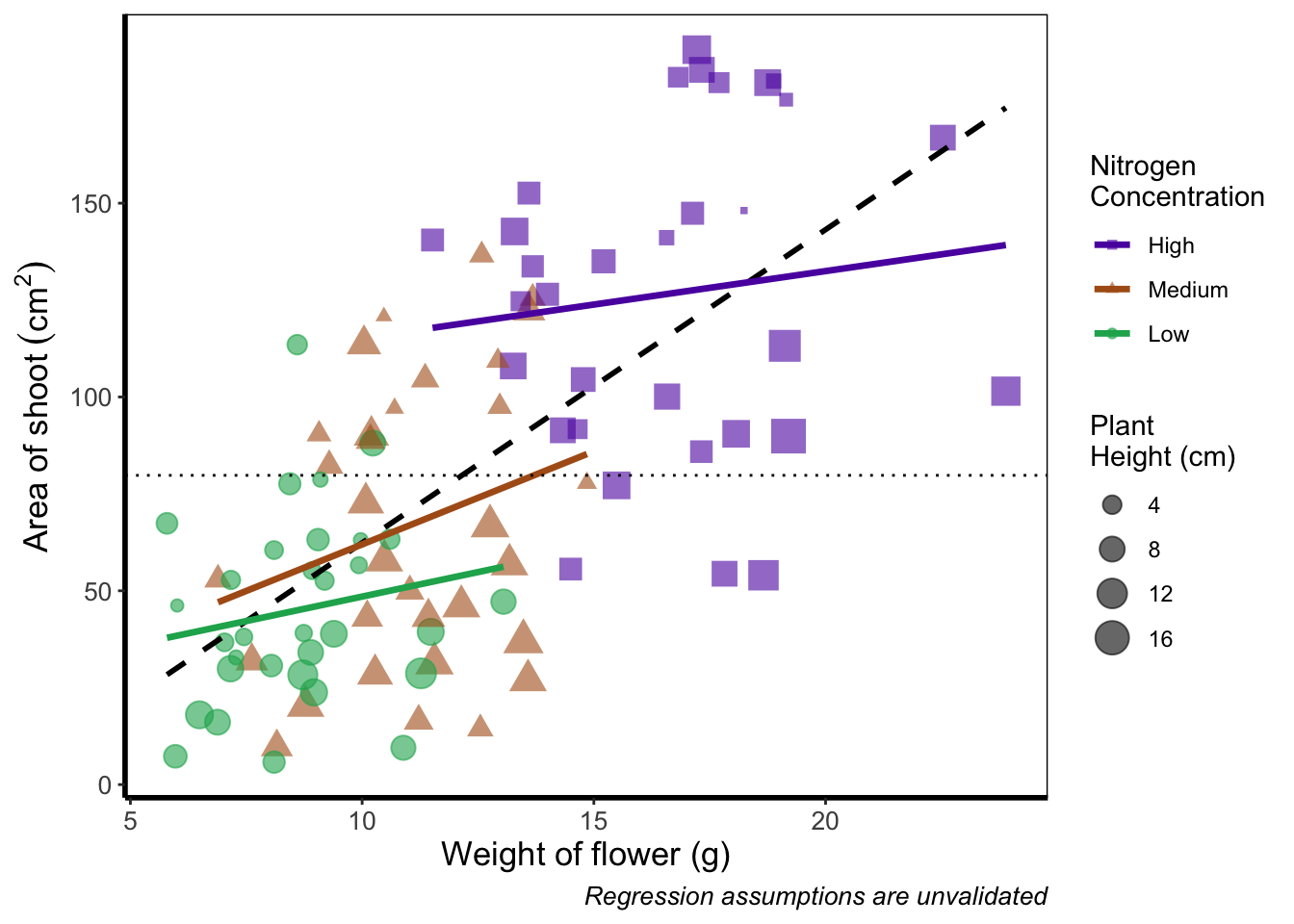
Now the sizes reflect the height of the plants, with bigger points representing taller plants and vice-versa.
Moving the legend
To move the position of the legend requires tweaking the theme, just as we did before with theme_rbook(). But for legends we might not want this to be set in stone whenever we use the theme (i.e. coding this into theme_rbook()). Instead we can change it on the fly depending on the individual figure. To do so, we can use a theme() layer and the argument legend.position =, followed swiftly by another layer specifying that we still want to use theme_rbook().
ggplot(aes(x = weight, y = shootarea, colour = nitrogen), data = flower) +
    geom_point(aes(shape = nitrogen), size = 2, alpha = 0.6) +
    geom_smooth(method = "lm", se = FALSE) +
    geom_smooth(method = "lm", se = FALSE, linetype = 2, alpha = 0.6, colour = "black") +
    xlab("Weight of flower (g)") +
    ylab(bquote("Area of shoot"~(cm^2))) +
    labs(shape = "Nitrogen\nConcentration", colour = "Nitrogen\nConcentration",
             caption = "Regression assumptions are unvalidated") +
    geom_hline(aes(yintercept = 79.8), size = 0.5, colour = "black", linetype = 3) +
    scale_colour_manual(values = c("#5C1AAE", "#AE5C1A", "#1AAE5C"),
       labels = c("High", "Medium", "Low")) +
    scale_shape_manual(values = c(15,17,19),
       labels = c("High", "Medium", "Low")) +
    # Moving the legend
    theme(legend.position = "bottom") +
    theme_rbook()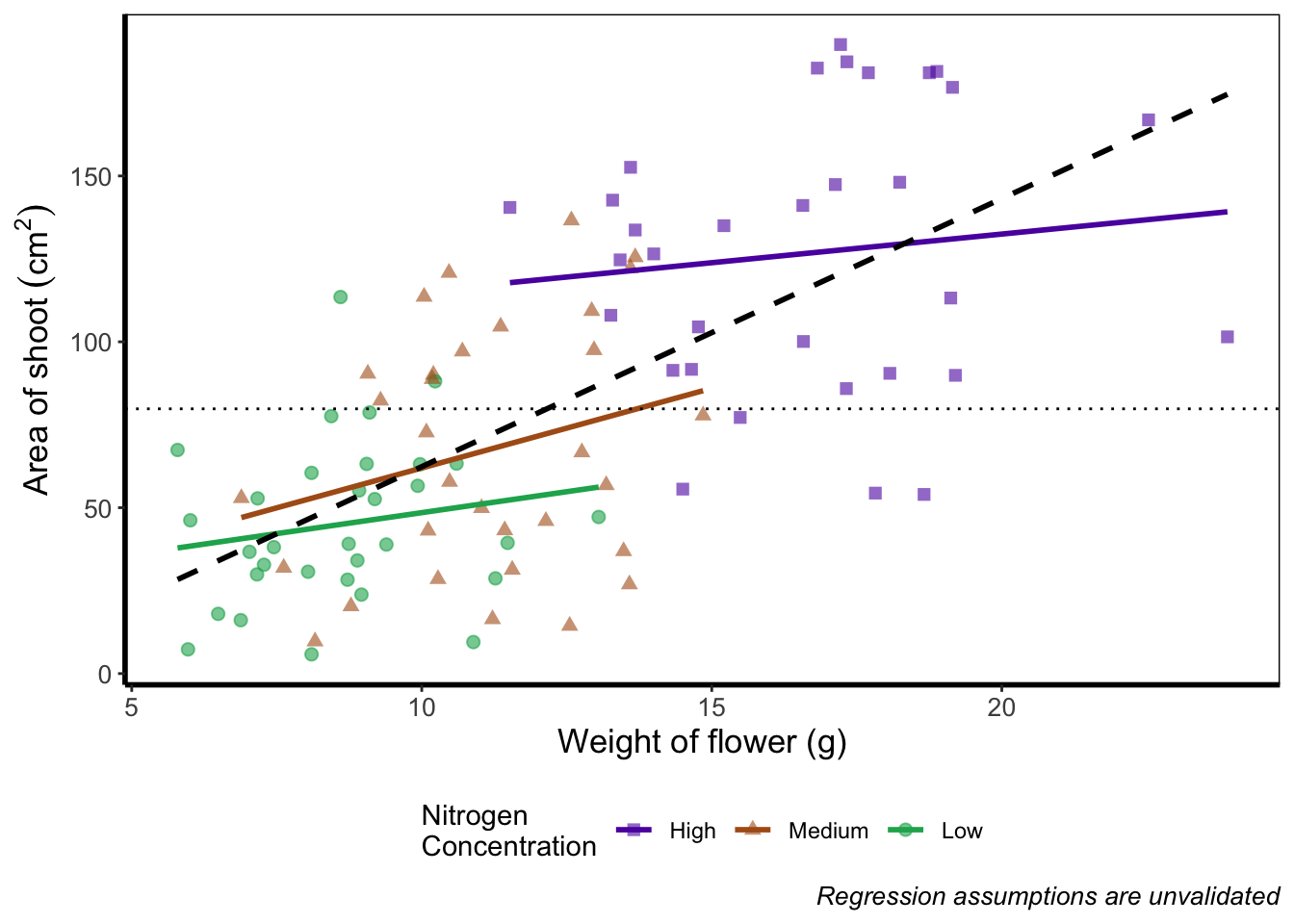
Play around: Try the code above but don’t include theme_rbook() and see what happens? What about if you try theme_rbook(legend.position = "bottom")?
Hiding the legend
Suppose we don’t want a legend at all. How would we go about hiding it?
ggplot(aes(x = weight, y = shootarea, colour = nitrogen), data = flower) +
    geom_point(aes(shape = nitrogen), size = 2, alpha = 0.6) +
    geom_smooth(method = "lm", se = FALSE) +
    geom_smooth(method = "lm", se = FALSE, linetype = 2, alpha = 0.6, colour = "black") +
    xlab("Weight of flower (g)") +
    ylab(bquote("Area of shoot"~(cm^2))) +
    labs(shape = "Nitrogen\nConcentration", colour = "Nitrogen\nConcentration",
             caption = "Regression assumptions are unvalidated") +
    geom_hline(aes(yintercept = 79.8), size = 0.5, colour = "black", linetype = 3) +
    scale_colour_manual(values = c("#5C1AAE", "#AE5C1A", "#1AAE5C"),
       labels = c("High", "Medium", "Low")) +
    scale_shape_manual(values = c(15,17,19),
       labels = c("High", "Medium", "Low")) +
    # Hiding the legend
    theme(legend.position = "none") +
    theme_rbook()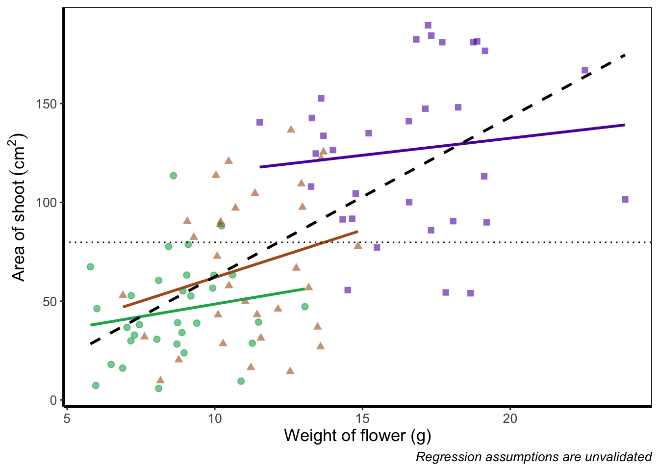
Hiding part of the legend
What if we really don’t want points included in the legend? Instead of stating this using theme(), we’ll include it within geom_point() using show.legend = FALSE.
ggplot(aes(x = weight, y = shootarea, colour = nitrogen), data = flower) +
    # Including show.legend = FALSE to prevent inclusion in legend
    geom_point(aes(shape = nitrogen), size = 2, alpha = 0.6, show.legend = FALSE) +
    geom_smooth(method = "lm", se = FALSE) +
    geom_smooth(method = "lm", se = FALSE, linetype = 2, alpha = 0.6, colour = "black") +
    xlab("Weight of flower (g)") +
    ylab(bquote("Area of shoot"~(cm^2))) +
    labs(shape = "Nitrogen\nConcentration", colour = "Nitrogen\nConcentration",
             caption = "Regression assumptions are unvalidated") +
    geom_hline(aes(yintercept = 79.8), size = 0.5, colour = "black", linetype = 3) +
    scale_colour_manual(values = c("#5C1AAE", "#AE5C1A", "#1AAE5C"),
       labels = c("High", "Medium", "Low")) +
    scale_shape_manual(values = c(15,17,19),
       labels = c("High", "Medium", "Low")) +
    theme_rbook()
Writing on a figure
What if we were so utterly proud of our figure that we wanted to sign it (just like a painter signs their works of art)? We can do this using geom_text(). If we want to change the font, we need to check which ones are available for us to use. We can check this by running windowsFonts(). We’ll use Times New Roman in this example, which is referred to as serif.
Not happy with your font options? Check out the extrafont package which expands your ‘fontage’.
ggplot(aes(x = weight, y = shootarea, colour = nitrogen), data = flower) +
    geom_point(aes(shape = nitrogen), size = 2, alpha = 0.6) +
    geom_smooth(method = "lm", se = FALSE) +
    geom_smooth(method = "lm", se = FALSE, linetype = 2, alpha = 0.6, colour = "black") +
    xlab("Weight of flower (g)") +
    ylab(bquote("Area of shoot"~(cm^2))) +
    labs(shape = "Nitrogen\nConcentration", colour = "Nitrogen\nConcentration",
             caption = "Regression assumptions are unvalidated") +
    geom_hline(aes(yintercept = 79.8), size = 0.5, colour = "black", linetype = 3) +
    scale_colour_manual(values = c("#5C1AAE", "#AE5C1A", "#1AAE5C"),
       labels = c("High", "Medium", "Low")) +
    scale_shape_manual(values = c(15,17,19),
       labels = c("High", "Medium", "Low")) +
    # Including layer to display text
    geom_text(x = 22, y = 5, label = "A. Artist", colour = "grey", family = "serif") +
    theme_rbook()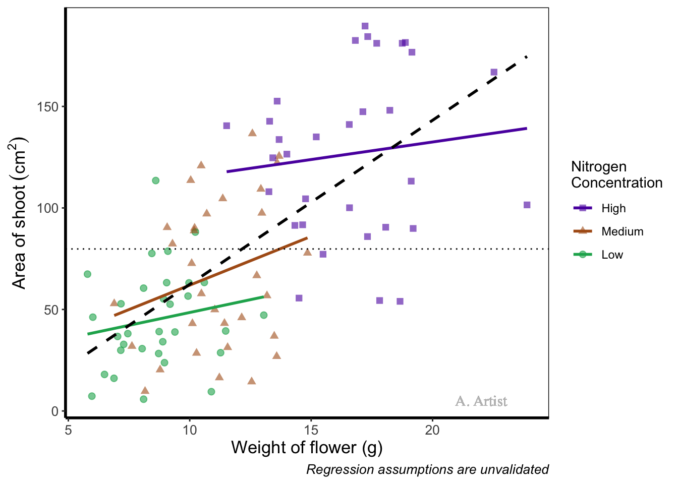
In reality there are more appropriate uses for geom_text() but whatever the reason, the mechanics remain the same. We specify what the x and y position are (on the scale of the axes), what we want written (using label =), the font (using family =). If you want to do more complex tasks with text and labels, check out ggrepel which extends the options available to you.
Similarly, if we want to include a tag for the figure, for instance we may want to refer to this figure as A we can do this using an additional argument in labs(). Let’s see how that works:
ggplot(aes(x = weight, y = shootarea, colour = nitrogen), data = flower) +
    geom_point(aes(shape = nitrogen), size = 2, alpha = 0.6) +
    geom_smooth(method = "lm", se = FALSE) +
    geom_smooth(method = "lm", se = FALSE, linetype = 2, alpha = 0.6, colour = "black") +
    xlab("Weight of flower (g)") +
    ylab(bquote("Area of shoot"~(cm^2))) +
    # Including tag argument
    labs(shape = "Nitrogen\nConcentration", colour = "Nitrogen\nConcentration",
             caption = "Regression assumptions are unvalidated", tag = "A") +
    geom_hline(aes(yintercept = 79.8), size = 0.5, colour = "black", linetype = 3) +
    scale_colour_manual(values = c("#5C1AAE", "#AE5C1A", "#1AAE5C"),
       labels = c("High", "Medium", "Low")) +
    scale_shape_manual(values = c(15,17,19),
       labels = c("High", "Medium", "Low")) +
    theme_rbook()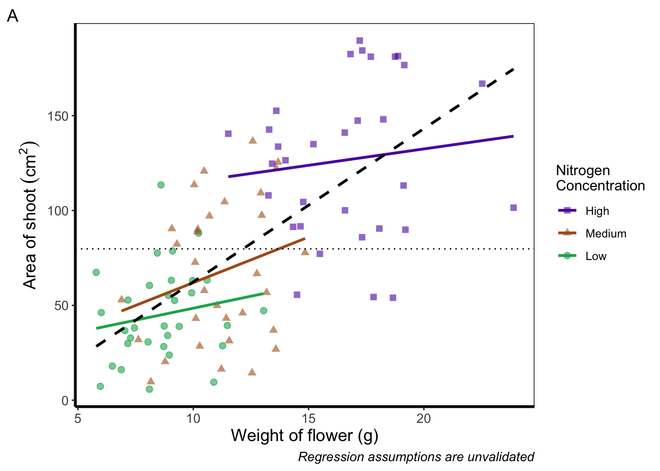
Doing so we get an “A” at the top left of the figure. If we weren’t happy with the position of the “A”, we can always use geom_text() instead and position it ourselves.
Axes tick marks and tick labels
What are we to do if we want more or fewer ticks on an axis? We can do this using the appropriate layers; scale_y_discrete() and scale_x_discrete() for discrete data (e.g. factors); and scale_y_continuous() and scale_x_continuous() for continuous data. Within these layers, the argument we want to use is called breaks =, though we need to use this in combination with seq() for a reminder on how the seq() function works). We’ll alter the x axis ticks in this example, with a tick label every 2.5 units.
ggplot(aes(x = weight, y = shootarea, colour = nitrogen), data = flower) +
    geom_point(aes(shape = nitrogen), size = 2, alpha = 0.6) +
    geom_smooth(method = "lm", se = FALSE) +
    geom_smooth(method = "lm", se = FALSE, linetype = 2, alpha = 0.6, colour = "black") +
    xlab("Weight of flower (g)") +
    ylab(bquote("Area of shoot"~(cm^2))) +
    labs(shape = "Nitrogen\nConcentration", colour = "Nitrogen\nConcentration",
             caption = "Regression assumptions are unvalidated") +
    geom_hline(aes(yintercept = 79.8), size = 0.5, colour = "black", linetype = 3) +
    scale_colour_manual(values = c("#5C1AAE", "#AE5C1A", "#1AAE5C"),
       labels = c("High", "Medium", "Low")) +
    scale_shape_manual(values = c(15,17,19),
       labels = c("High", "Medium", "Low")) +
    # Adjusting breaks on x axis
    scale_x_continuous(breaks = seq(from = 5, to = 25, by = 2.5)) +
    theme_rbook()
Axis tick labels sometimes need to be rotated. If you’ve ever worked with data from multiple species (with those lovely long latin names) for example, you’ll know that it can be a nightmare making figures. The names can end up overlapping to such an extent that your axis tick labels merge into a giant black blob of unreadable abstractionism. In such cases it’s best to rotate the text to make it readable. Doing so isn’t too much of a pain and we’ll be using theme() again to set the text angle to 45 degrees in addition to a little vertical adjustment so that the text doesn’t get too close or run too far away from the axis.
ggplot(aes(x = weight, y = shootarea, colour = nitrogen), data = flower) +
    geom_point(aes(shape = nitrogen), size = 2, alpha = 0.6) +
    geom_smooth(method = "lm", se = FALSE) +
    geom_smooth(method = "lm", se = FALSE, linetype = 2, alpha = 0.6, colour = "black") +
    xlab("Weight of flower (g)") +
    ylab(bquote("Area of shoot"~(cm^2))) +
    labs(shape = "Nitrogen\nConcentration", colour = "Nitrogen\nConcentration",
             caption = "Regression assumptions are unvalidated") +
    geom_hline(aes(yintercept = 79.8), size = 0.5, colour = "black", linetype = 3) +
    scale_colour_manual(values = c("#5C1AAE", "#AE5C1A", "#1AAE5C"),
       labels = c("High", "Medium", "Low")) +
    scale_shape_manual(values = c(15,17,19),
       labels = c("High", "Medium", "Low")) +
    # Changing the angle of the axis text
    theme(axis.text.x=element_text(angle = 45, vjust = 0.5)) +
    theme_rbook()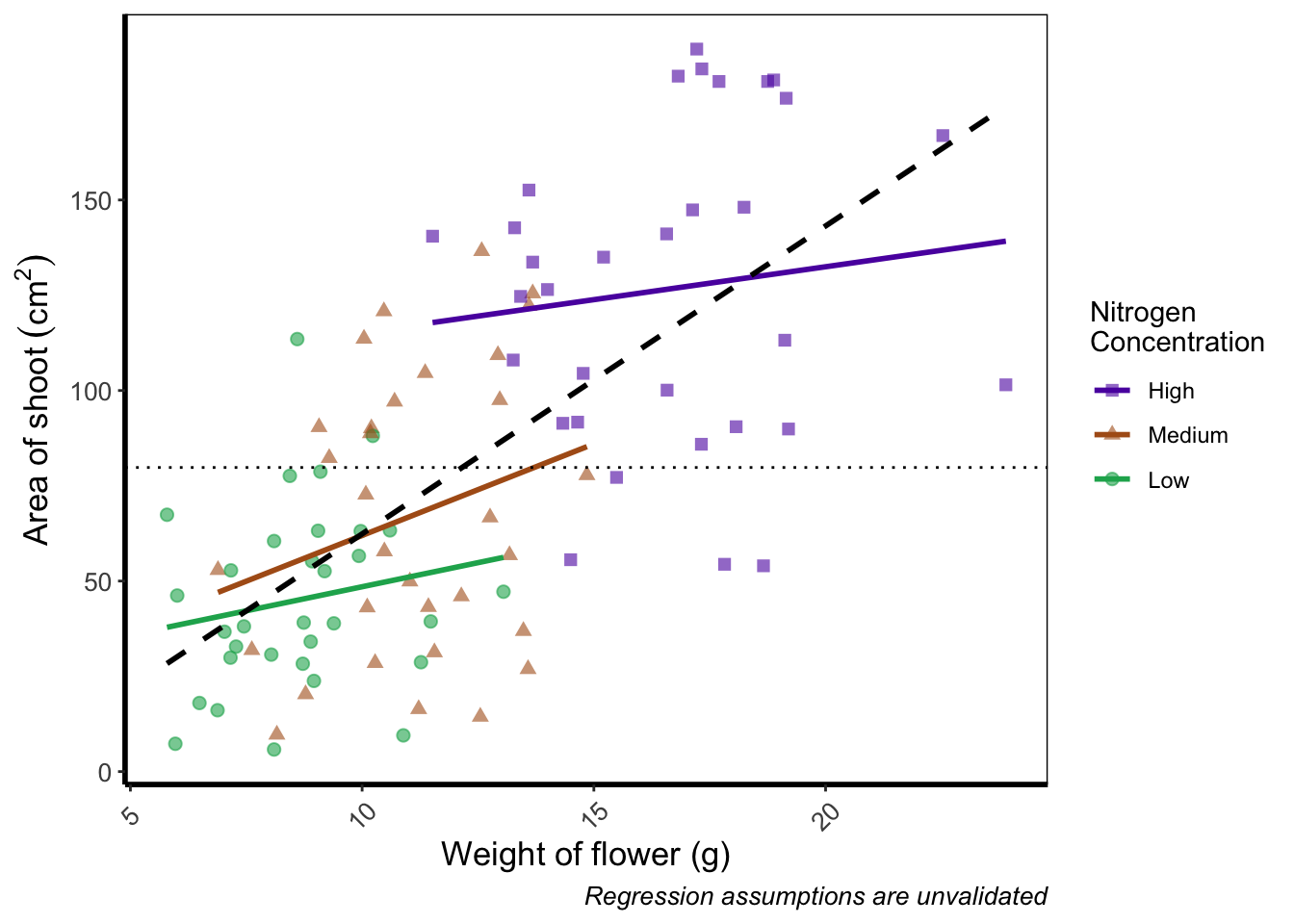
Phew. Now we can really read those numbers. Granted, rotating the axis text here isn’t needed, but keep this trick in mind if you have lots of levels in a factor which leads to illegible blobs.
More advanced patchwork
When we used patchwork previously, we used the basics of the package to create nested figures. There are more advanced features which we’ll quickly go through here.
As a precursor, we’ll generate four simple scatterplots each with one of the four different themes used earlier and assign the nested figure the name nested_1. We’ll use the patchwork operator + to link them all together and see how that looks.
a <- ggplot(aes(x = weight, y = shootarea, colour = nitrogen), data = flower) +
    geom_point(aes(shape = nitrogen), size = 2, alpha = 0.6) +
    theme_classic()

b <- ggplot(aes(x = weight, y = shootarea, colour = nitrogen), data = flower) +
    geom_point(aes(shape = nitrogen), size = 2, alpha = 0.6) +
    theme_bw()

c <- ggplot(aes(x = weight, y = shootarea, colour = nitrogen), data = flower) +
    geom_point(aes(shape = nitrogen), size = 2, alpha = 0.6) +
    theme_minimal()

d <- ggplot(aes(x = weight, y = shootarea, colour = nitrogen), data = flower) +
    geom_point(aes(shape = nitrogen), size = 2, alpha = 0.6) +
    theme_light()

nested_1 <- a + b + c +d

nested_1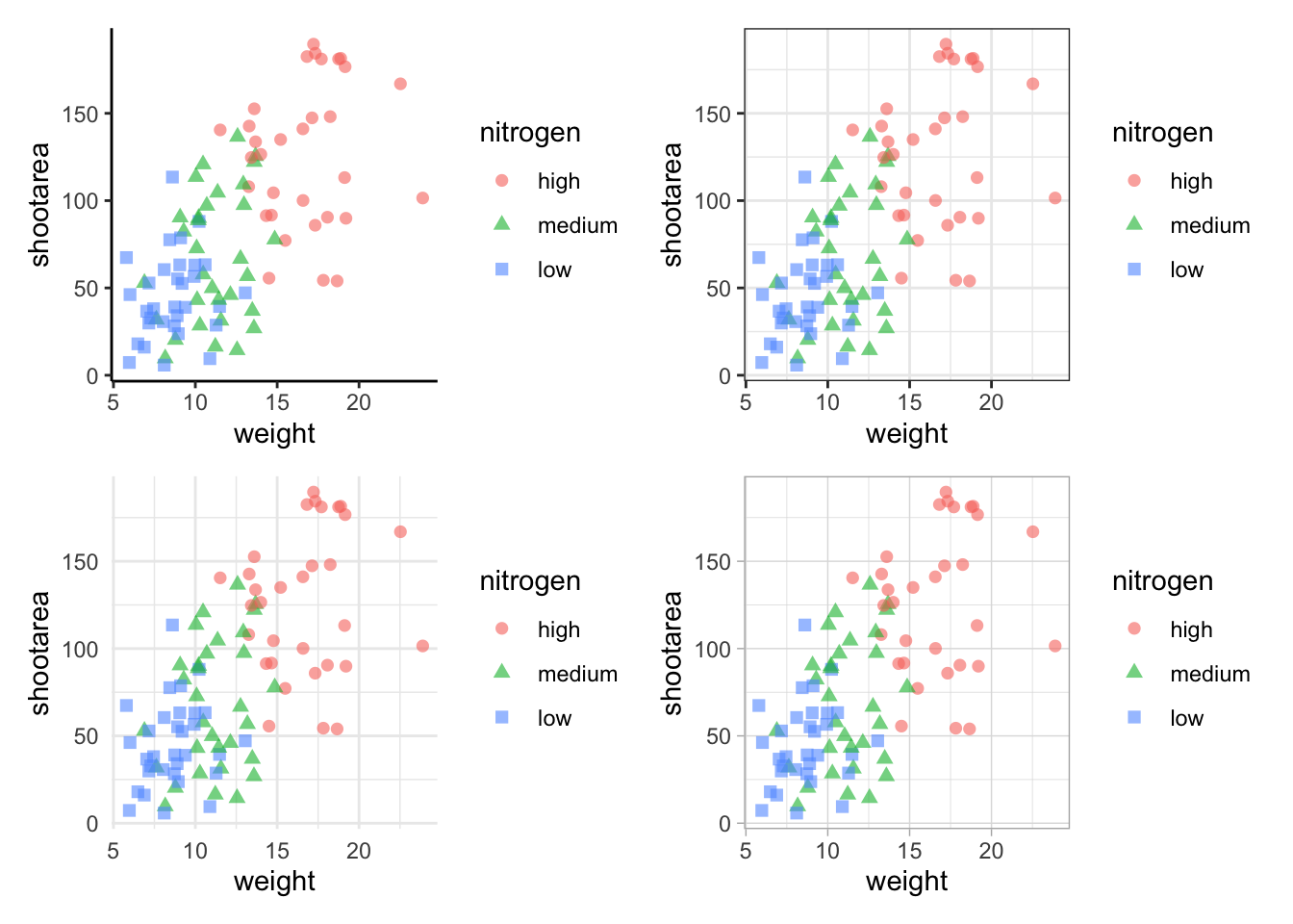
The problem with this figure is that we’re using a lot of space to get legends squeezed into the middle. We can solve that by using the plot_layout() function and collecting the guides together:
nested_1 +
    plot_layout(guides = "collect")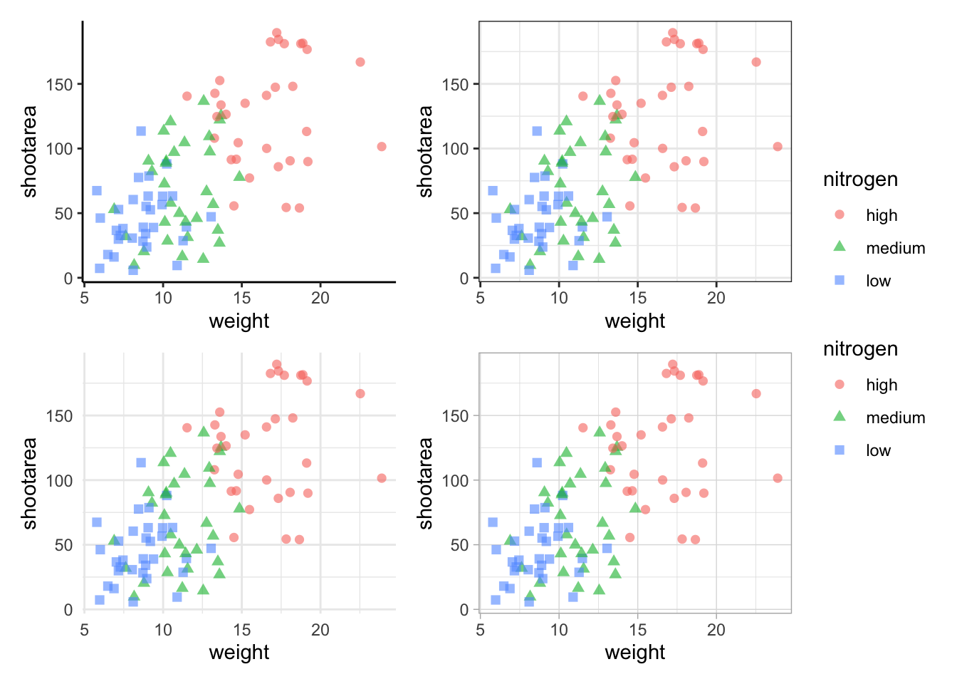
Looks a bit tidier, though in this case say we want to remove the legends entirely. Note that to do this we use a new operator, the ampersand (&). When we use the & operator in patchwork, we add ggplot2 elements to all plots within patchwork. To show how you can use patchwork and ggplot2 together, we’ll also add in an additional geom_path() to all plots, while simultaneously removing the legends.
# note the use of '&' instead of '+'
nested_1 &
    theme(legend.position = 'none') &
    geom_path()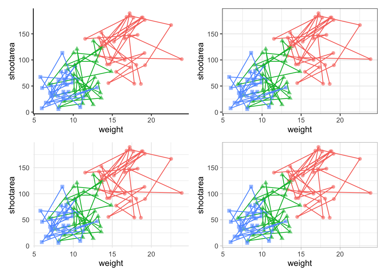
To change the layout of the figure we can use the plot_layout() function to specify a design. We’ll start by creating a layout to use, which we call grid_layout using A, B, C, D to represent plots a, b, c and d (we could have called the plots anything we wanted to). We’ll arrange it so that the four graphs surround an empty white space in the centre of the plotting space. Each plot will either be five units wide or five unites tall.
grid_layout <- "
AAAAA
B###C
B###C
B###C
B###C
B###C
DDDDD
"

nested_1 +
    plot_layout(design = grid_layout) &
    theme(legend.position = 'none')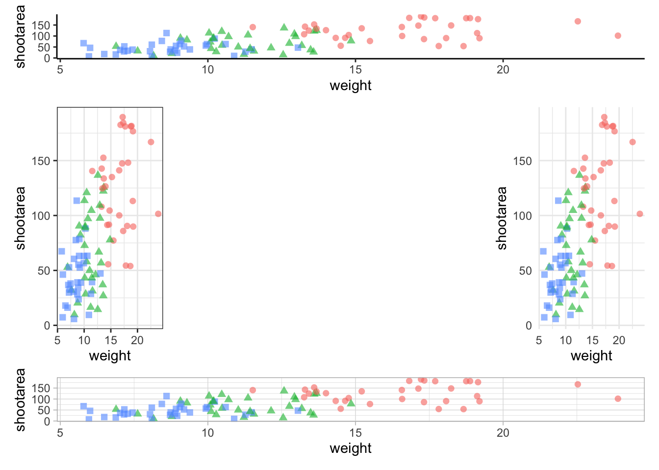
To round off this Chapter, we’ll take you on a whistle-stop tour of some of the common types of plots you can make in the aptly named “ggplot bestiary section”.
A ggplot bestiary
What follows is a quick run through of example ggplots. These will predominantly be created by changing the geoms used, but there will be additional tweaks which we’ll highlight.
Density plot
Below is a density plot which is much like a histogram. The x axis shows observations of given numbers of flowers, while the y axis is the density of observations (roughly equivalent to number of rows with that many flowers, calculated in the background by the statistics layer). Each density is coloured according to nitrogen concentration, though note that we’re using fill = instead of colour =. Try using colour instead to see what happens.
Notice that we haven’t used data = flower here and instead just used flower? When an object is not assigned with an argument, ggplot2 will assume that it is the dataset. We’re using that here, but we actually prefer to explicitly state the argument name in our own work.
ggplot(flower) +
    geom_density(aes(x = flowers, fill = nitrogen), alpha = 0.5) +
    labs(y = "Density", x = "Number of Flowers", fill = "Nitrogen\nConcentration") +
    scale_fill_manual(labels = c("High", "Medium", "Low"),
        values = c("#DB24BC", "#BCDB24", "#24BCDB")) +
    theme_rbook()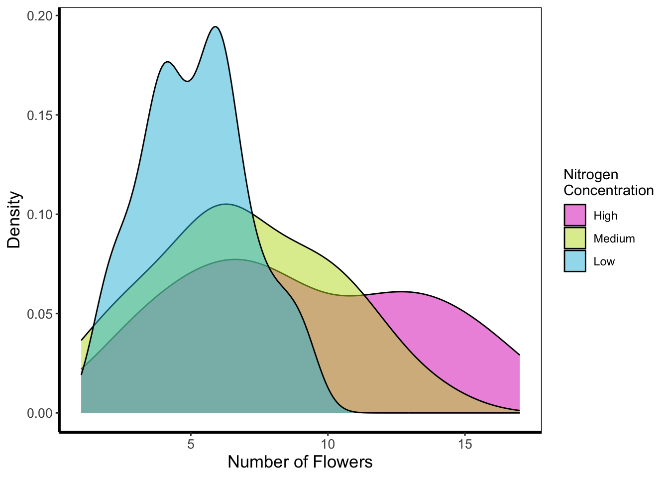
Histogram
Next is a histogram (a much more traditional version of a density plot). There are a couple of things to take note of here. The first is that flower$block is numeric and not a factor. We can correct that here fairly easily using the factor() function to convert it from numeric to factor (though ideally we’d have done this before). The other thing to take note of is that we’ve specified bins = 20. The number of bins control how many times the y-axis is broken up to show the data. Try increasing and decreasing to see the effect. The last is using the position = argument and stating that we do not want the bars to be stacked (the default position), instead we want them side-by-side, a.k.a. dodged.
ggplot(flower) +
    geom_histogram(aes(x = flowers, fill = factor(block)), colour = "black", bins = 20,
                 position = "dodge") +
    labs(y = "Count", x = "Number of Flowers", fill = "Greenhouse\nBlock") +
    scale_fill_manual(labels = c("1", "2"),
          values = c("#8CD926", "#7326D9")) +
    theme_rbook()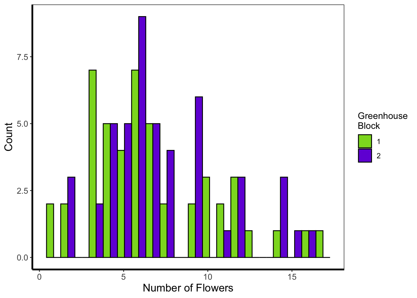
Frequency polygons
A frequency polygon is yet another visualisation of the above two. The only difference here is that we are drawing a line to each value, instead of a density curve or bars.
ggplot(flower) +
    geom_freqpoly(aes(x = flowers, colour = factor(block)), size = 1, bins = 20) +
    labs(y = "Count", x = "Number of Flowers", colour = "Greenhouse\nBlock") +
    scale_colour_manual(labels = c("1", "2"),
         values = c("#8CD926", "#7326D9")) +
    theme_rbook()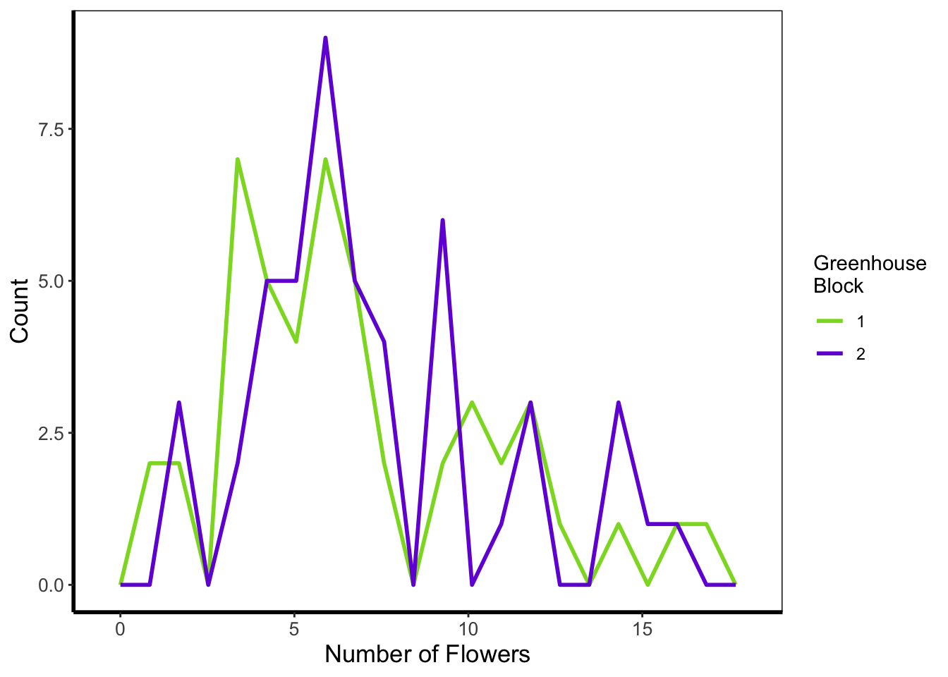
Boxplot
Boxplots are a classic way to show to spread of data, and they’re easy to make in ggplot2. The dark line in the middle of the box shows the median, the boxes show the 25th and 75th percentiles (which is different from the base R boxplot()), and the whiskers show 1.5 times the inter-quartile range (i.e. the distance between between the lower and upper quartiles).
ggplot(flower) +
    geom_boxplot(aes(y = flowers, x = nitrogen)) +
    labs(y = "Number of Flowers", x = "Nitrogen Concentration") +
    theme_rbook()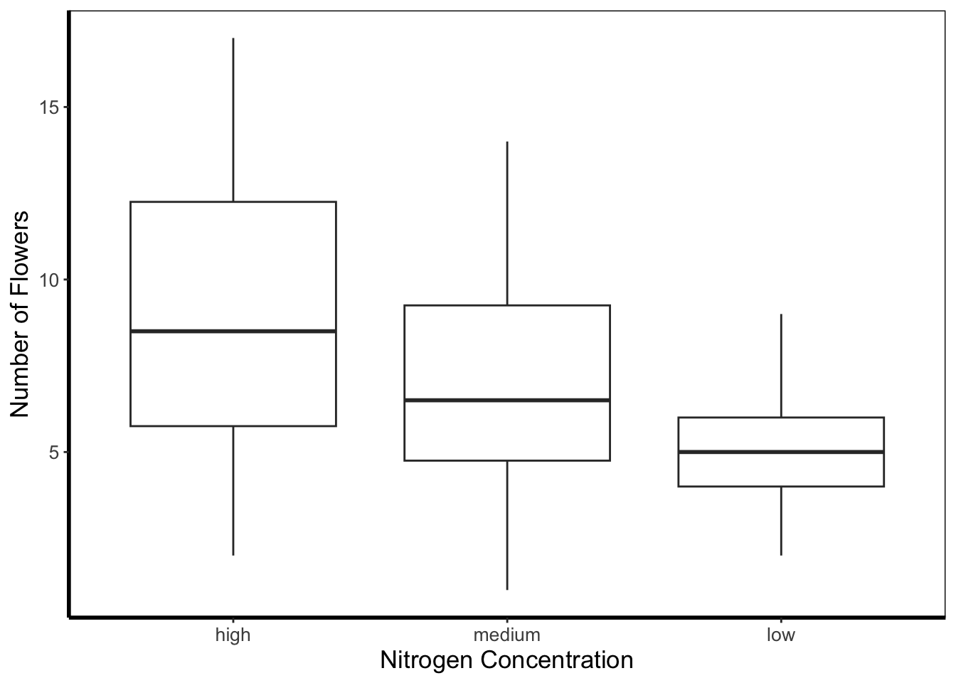
Violin plots
Violin plots are an increasingly popular alternative to boxplots. They display much of the same information, as well as showing a version of the density plot above (imagine each violin plot, cut in half vertically and place on it’s side, thus showing the overall distribution of the data). In the plot below the figure is slightly more complex than those above and so deserves some explanation.
Within geom_violin() we’ve included draw_quantiles = where we’ve specified we want quantile lines drawn at the 25, 50 and 75 quantiles (using the c() function). In combination with geom_violin() we’ve also included geom_jitter(). geom_jitter() is similar to geom_point() but induces a slight random spread of the points, often helpful when those points would otherwise be clustered. Within geom_jitter() we’ve also set height = 0, and width = 0.1 which specifies how much to jitter the points in a given dimension (here essentially telling ggplot2 not to jitter by height, and only to jitter width by a small amount).
Finally, we’re also using this plot to show scale_y_log10. Hopefully this is largely self-explanatory (it converts the y-axis to the \(\text{log}_{10}\) scale). There are additional scaling options for axis (for instance scale_y_sqrt()). Please note that using a log scaled axis in this case is actually doing harm in terms of understanding the data, we’d actually be much better off not doing so in this particular case.
ggplot(flower) +
  geom_violin(aes(y = flowers, x = nitrogen, fill = nitrogen),
              draw_quantiles = c(0.25, 0.5, 0.75)) +
  geom_jitter(aes(y = flowers, x = nitrogen), colour = "black", height = 0,
              width = 0.1, alpha = 0.5) +
    scale_fill_manual(labels = c("High", "Medium", "Low"),
         values = c("#5f7f5c", "#749770", "#9eb69b")) +
    labs(y = "Number of Flowers", x = "Nitrogen Concentration") +
    scale_y_log10() +
    theme_rbook()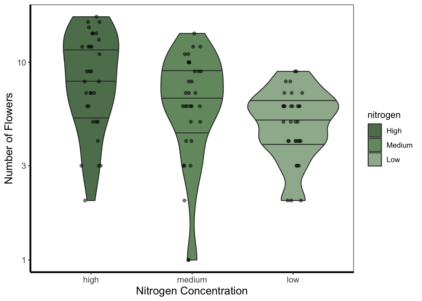
Barchart
Below is an example of barcharts. It is included here for completeness, but be aware that they are viewed with contention (with good reason). Briefly, barcharts can hide information, or imply there is data where there is none; ultimately misleading the reader. There are almost always better alternatives to use that better demonstrate the data.
ggplot(flower) +
  geom_bar(aes(x = factor(block), fill = nitrogen)) +
    scale_fill_manual(labels = c("High", "Medium", "Low"),
         values = c("#2613EC", "#9313EC", "#EC13D9")) +
    labs(y = "Count", x = "Block") +
    theme_rbook()
The barchart shows the numbers of observations in each block, with each bar split according to the number of observations in each nitrogen concentration. In this case they are equal because the dataset (and experimental design) was balanced.
Quantile lines
While we can draw a straight line, perhaps we would also like to include the descriptive nature of a boxplot, except using continuous data. We can use quantile lines in such cases. Note that for quantiles to be calculated ggplot2 requires the installation of the package quantreg.
library(quantreg)

ggplot(aes(x = weight, y = shootarea), data = flower) +
    geom_point(size = 0.5, alpha = 0.6) +
    geom_quantile(colour = "darkgrey", size = 1) +
    labs(y = "Shoot Area", x = "Weight") +
    theme_rbook()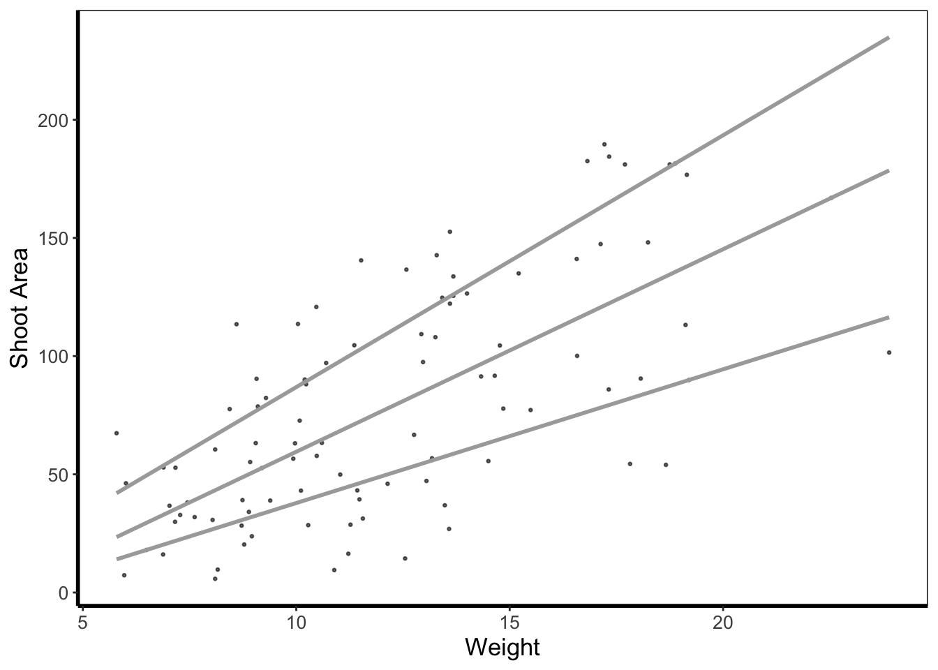
Heatmap
Heatmaps are a great tool to visualise spatial patterns. ggplot2 can easily handle such data using geom_bin2d() to allow us to see if our data is more (or less) clustered.
ggplot(aes(x = leafarea, y = shootarea), data = flower) +
    geom_bin2d() +
    labs(y = "Shoot Area", x = "Leaf Area") +
    coord_cartesian(xlim = c(5,25)) +
    theme_rbook()
In this example, lighter blue squares show combinations of leaf area and shoot area where we have more data, and dark blue shows the converse.
Hex map
A similar version to geom_density2d() is geom_hex(). The only difference between the two is that the squares are replaced with hexagons. Note that geom_hex() requires you to first install an additional package called hexbin.
library(hexbin)

ggplot(aes(x = leafarea, y = shootarea), data = flower) +
    geom_hex() +
    labs(y = "Shoot Area", x = "Leaf Area") +
    coord_cartesian(xlim = c(5,25)) +
    theme_rbook()
Contour map
Similar to a heatmap we can make a contour map using geom_density_2d(). The way to read this figure is much the same way as you’d read a topographical map showing mountains or peaks. The central polygon represents the space (amongst shoot and leaf area) where there are most observations. As you “step” down this mountain to the next line, we step down in the number of counts. Think of this as showing where points are most clustered, as in geom_bin2d().
ggplot(aes(x = leafarea, y = shootarea), data = flower) +
    geom_density2d() +
    labs(y = "Shoot Area", x = "Leaf Area") +
    coord_cartesian(xlim = c(5,25)) +
    theme_rbook()
We can then expand on this using the statistics layer, via stat_nameOfStatistic. For instance, we can use the calculated “level” (representing the height of contour) to fill in our figure. To do so, we’ll swap out geom_density_2d() for stat_density_2d() which will allow us to colour in the contour map.
ggplot(aes(x = leafarea, y = shootarea), data = flower) +
    stat_density_2d(aes(fill = stat(level)), geom = "polygon") +
    labs(y = "Shoot Area", x = "Leaf Area") +
    coord_cartesian(xlim = c(5,25)) +
    theme_rbook()
Warning: `stat(level)` was deprecated in ggplot2 3.4.0.
ℹ Please use `after_stat(level)` instead.
In this case it doesn’t look too pretty given that we don’t have a wide spread of data leading to partly formed polygons.
Cleveland dotplot
The cleveland dotplot is a figure well suited to detect unusual observations (outliers?) in our data. The y axis is simply the order in which the data appears in the dataset. The x axis is our variable of interest. Points far to the left or far to the right are indicative of outliers. ggplot2 does not have a geom specifically designed for a cleveland dotplot, though because of the grammar of graphics framework, we can build it ourselves.
We do this by first using the function rownames(). This function returns the row name of each row. In most data frames, the row names are simply numbers. Once we have this information, we can convert this to numbers using as.numeric(). After doing this we have a vector of numbers from 1 to 96. Keep in mind that such techniques can be used for any sort of figure we want to make. We’ll use the same technique to add horizontal lines for each row of data to replicate the traditional look of a dotchart.
ggplot(flower) +
    geom_hline(aes(yintercept = as.numeric(rownames(flower))), linetype = 2,
             colour = "lightgrey") +
  geom_point(aes(x = leafarea, y = as.numeric(rownames(flower)))) +
  labs(y = "Order in Dataset", x = bquote("Area of leaf"~(cm^2))) +
    theme_rbook()
Pairs plot
For the final figure we will need an additional package, called GGally. Within GGally is a function called ggpairs() which is equivalent to pairs() (part of base R). Both functions produce a scatterplot matrix of all variables of interest. Running diagonally down from left to right are plots showing distributions; either as stacked barcharts or as density plots, in this case coloured according to nitrogen concentration. The bottom plots show the plotted relationships, with variables on the top as the x axis, and the variables on the right plotted as the y axis. For example, the very bottom left plots shows the relationship between number of flowers on the y axis and treatment on the x axis, coloured according to nitrogen concentration. Conversely, the upper plots show either the correlation between variables, when both variables are continuous and the correlation can be calculated, boxplots when the plot is of a factor variable and a continuous variable, or as a stacked barchart when both variables are factors.
Such figures are a fantastic way to quickly show relationships in the dataset. They can of course be used to plot only part of the dataset, for instance using flowers[ ,1:5] to plot the first five columns of the dataset.
We’ve included two additional arguments in the code below. cardinality_threshold = forces GGally to plot all of the variables in our dataset (where it normally wants fewer variables) as well as progress = to avoid a progress bar appearing when we run the code.
library(GGally)
flower$block <- factor(flower$block)

ggpairs(flower, aes(colour = nitrogen), cardinality_threshold = NULL, progress = FALSE) +
    theme_rbook()